Causal Estimation methods for Machine learning and Data Science Part II – Propensity Score Matching

Image Source : Google images

1.0 Introduction

In the world of data science, uncovering cause-and-effect relationships from observational data can be quite challenging. In our earlier discussion, we dived into using linear regression for causal estimation, a fundamental statistical method. In this post, we introduce propensity score matching. This technique builds on linear regression foundations, aiming to enhance our grasp of cause-and-effect dynamics. Propensity score matching is crafted to deal with confounding variables, offering a refined perspective on causal relationships. Throughout our exploration, we’ll showcase the potency of propensity scores across various industries, emphasizing their pivotal role in the art of causal inference.

2.0 Structure

We will be traversing the following topics as part of this blog.

  • Introduction to Propensity Score Matching ( PSM )
  • Process for implementing PSM
    • Propensity Score Estimation
    • Matching Individuals
    • Stratification
    • Comparison and Causal Effect Estimation:
  • PSM implementation from scratch using python
    • Generating synthetic data and defining variables
    • Training the propensity model using logistic regression
    • Predicting the propensity scores for the data
    • Separating treated and control variables
    • Stratify the data using nearest neighbour algorithm to identify the neighbours for both treated and control groups
    • Calculate Average Treatment Effect on Treated ( ATT ) and Average Treatment Effect on Control ( ATC ) .
    • Calculation of ATE
  • Practical examples of PSM in Retail, Finance, Telecom and Manufacturing

3.0 Introduction to Propensity Score Matching

Propensity score matching is a statistical method used to estimate the causal effect of a treatment, policy, or intervention by balancing the distribution of observed covariates between treated and untreated units. In simpler terms, it aims to create a balanced comparison group for the treated group, making the treatment and control groups more comparable.

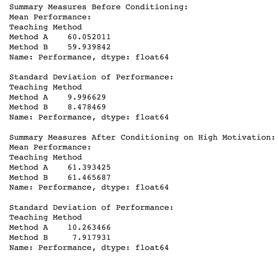
Consider a retail company evaluating the impact of a customer loyalty program on purchase behavior. The company wants to understand if customers enrolled in the loyalty program (treatment group) show a significant difference in their average purchase amounts compared to non-enrolled customers (control group). Covariates for these groups include customer demographics (age, income), historical purchase patterns, and frequency of interactions with the company.

To measure the the difference in purchase amounts between these two groups, we need to factor in the covariates in the group age, income, historical purchase patterns, and interaction frequency. This is because there can be substantial differences in the buying propensities between subgroups based on demographics like age or income. So to get a fair difference between these groups its imperative to make these groups comparable so that you can accurately measure the impact of the loyalty program.

The propensity score serves as a balancing factor. It’s like a ticket that each customer gets, representing their likelihood or “propensity” to join the loyalty program based on their observed characteristics (age, income, etc.). Propensity score matching then pairs customers from the treatment group (enrolled in the program) with similar scores to those from the control group (not enrolled). By doing this, you create comparable sets of customers, making it as if they were randomly assigned to either the treatment or control group.

4.0 Process to implement causal estimation using Propensity Score Matching ( PSM )

PSM is a meticulous process designed to balance the covariates between treated (enrolled in the loyalty program) and untreated (not enrolled) groups, ensuring a fair comparison that unveils the causal effect of the program on purchase behavior. Let’s delve into the steps of this approach, each crafted to enhance comparability and precision in our causal estimation journey.

4.1. Propensity Score Estimation: Unveiling Likelihoods

The journey commences with Propensity Score Estimation, employing a classification model like logistic regression to predict the probability of a customer enrolling in the loyalty program based on various covariates. The idea of the classification model is to capture the conditional probability of enrollment given the observed customer characteristics, such as demographics, historical purchase patterns, and interaction frequency.

The resulting propensity score (PS) for each customer represents the likelihood of joining the program, forming a key indicator for subsequent matching. Classification models like Logistic regression’s ability to discern these probabilities provides a nuanced understanding of enrollment likelihood, emphasizing the significance of each covariate in the decision-making process.

The PS serves as a foundational element in the Propensity Score Matching journey, guiding the way to a balanced and unbiased comparison between treated and untreated individuals.

4.2. Matching Individuals: Crafting Equivalence

Once we have the propensity scores, the next step is Matching Individuals. Think of it like finding “loyalty twins” for each customer – someone from the treatment group (enrolled in the loyalty program) matched with a counterpart from the control group (not enrolled), all based on similar propensity scores. The methods for this matching process vary, from simple nearest neighbor matching to more sophisticated optimal matching. Nearest neighbor matching pairs customers with the closest propensity scores, like pairing a loyalty member with a non-member whose characteristics align closely. On the other hand, optimal matching goes a step further, finding the best pairs that minimize differences in propensity scores. These methods aim for a quasi-random pairing, making sure our comparisons are as unbiased as possible. It’s like assembling pairs of customers who, based on their propensity scores, could have been randomly assigned to either group in the loyalty program evaluation.

4.3. Stratification: Ensuring Comparable Strata

Stratification is like sorting our matched customers into groups based on their propensity scores. This helps us organize the data and makes our analysis more accurate. It’s a bit like putting customers with similar likelihoods of joining the loyalty program into different buckets. Why? Well, it minimizes the chance of mixing up customers with different characteristics. For example, if we didn’t do this, we might end up comparing loyal customers who joined the program with non-loyal customers who have very different behaviors. Stratification ensures that, within each group, customers are pretty similar in terms of their chances of joining. It’s a bit like creating smaller, more manageable sets of customers, making our analysis more precise, especially when it comes to evaluating the impact of the loyalty program.

4.4. Comparison and Causal Effect Estimation: Unveiling Impact

Once we’ve organized our customers into strata based on propensity scores, we dive into comparing the mean purchase amounts of those who joined the loyalty program (treated, Y=1) and those who didn’t (untreated, Y=0) within each stratum.

Once the above is done we calculate the Average Causal Effect ( ACE ) for each stratum.

ACEs=Ys1​−Ys0​

This equation calculates the Average Causal Effect (ACE) for a specific stratum (s). It’s the difference between the mean purchase amount for treated ( Ys1​ ) and untreated ( Ys0​ ), individuals within that stratum.

Next we take the Weighted average of stratum specific ACE’s.

ACE = ∑sACEs * Ws

Here, we take the sum of all stratum-specific ACEs, each multiplied by its proportion (ws) of individuals in that stratum. It gives us an overall Average Causal Effect (ACE) that considers the contribution of each stratum based on its size.

ACE measures how much the loyalty program influenced purchase amounts. If ACEs is positive, it suggests the program had a positive impact on purchases in that stratum. The weighted average considers stratum sizes, providing a comprehensive assessment of the program’s overall impact.

5.0 Implementing PSM from scratch

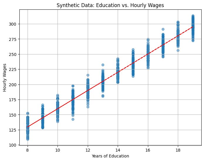
Let us now work out an example to demonstrate the concept of propensity scoring. We will generate some synthetic data and then develop the code to implement the estimation method using propensity score matching.

We will start by importing the necessary library files

import numpy as np
import pandas as pd
from sklearn.linear_model import LogisticRegression
from sklearn.neighbors import NearestNeighbors
from sklearn.preprocessing import StandardScaler
from sklearn.metrics import mean_absolute_error

Next let us synthetically generate data for this exercise.

# Generate synthetic data
np.random.seed(42)
# Covariates
n_samples = 1000
age = np.random.normal(35, 5, n_samples)
income = np.random.normal(50000, 10000, n_samples)
historical_purchase = np.random.normal(100, 20, n_samples)
# Convert age as an integer
age = age.astype(int)
# Treatment variable (loyalty program)
treatment = np.random.choice([0, 1], n_samples, p=[0.7, 0.3])
# Outcome variable (purchase amount)
purchase_amount = 50 + 10 * treatment + 5 * age + 0.5 * income + 2 * historical_purchase + np.random.normal(0, 10, n_samples)

# Create a DataFrame
data = pd.DataFrame({
    'Age': age,
    'Income': income,
    'HistoricalPurchase': historical_purchase,
    'Treatment': treatment,
    'PurchaseAmount': purchase_amount
})
data.head()

Let us look in detail on the above code

  1. Setting Seed: np.random.seed(42) ensures reproducibility by fixing the random seed.
  2. Generating Covariates:
    • age: Simulates ages from a normal distribution with a mean of 35 and a standard deviation of 5.
    • income: Simulates income from a normal distribution with a mean of 50000 and a standard deviation of 10000.
    • historical_purchase: Simulates historical purchase data from a normal distribution with a mean of 100 and a standard deviation of 20.
  3. Converting Age to Integer: age = age.astype(int) converts the ages to integers.
  4. Generating Treatment and Outcome:
    • treatment: Simulates a binary treatment variable (0 or 1) representing enrollment in a loyalty program. The p=[0.7, 0.3] argument sets the probability distribution for the treatment variable.
    • purchase_amount: Generates an outcome variable based on a linear combination of covariates and a random normal error term.
  5. Creating DataFrame:
    • data: Creates a pandas DataFrame with columns ‘Age,’ ‘Income,’ ‘HistoricalPurchase,’ ‘Treatment,’ and ‘PurchaseAmount’ using the generated data.

This synthetic dataset serves as a starting point for implementing propensity score matching, allowing you to compare the outcomes of treated and untreated groups while controlling for covariates.

Next let us define the variables for the propensity modelling step

# Step 1: Propensity Score Estimation (Logistic Regression)
X_covariates = data[['Age', 'Income', 'HistoricalPurchase']]
y_treatment = data['Treatment']
# Standardize covariates
scaler = StandardScaler()
X_covariates_standardized = scaler.fit_transform(X_covariates)

First we start by selecting the covariates (features) that will be used to estimate the propensity score. In this case, it includes ‘Age,’ ‘Income,’ and ‘HistoricalPurchase.’

After that we select the treatment variable. This variable represents whether an individual is enrolled in the loyalty program (1) or not (0).

After this we standardize the covariates using the fit_transform method. Standardization involves transforming the data to have a mean of 0 and a standard deviation of 1.

The standardized covariates will then used in logistic regression to predict the probability of treatment. This propensity score is a crucial component in propensity score matching, allowing for the creation of comparable groups with similar propensities for treatment. Let us see that part next

# Fit logistic regression model
propensity_model = LogisticRegression()
propensity_model.fit(X_covariates_standardized, y_treatment)

The logistic regression model is trained to understand the relationship between the standardized covariates and the binary treatment variable.This model learns the patterns in the covariates that are indicative of treatment assignment, providing a probability score that becomes a key element in creating balanced treatment and control groups.

In the next step, this model will be used in calculating probabilities, and in this case, predicting the probability of an individual being in the treatment group based on their covariates.

# Predict propensity scores
propensity_scores = propensity_model.predict_proba(X_covariates_standardized)[:, 1]
# Addd the propensity scores to the data frame
data['propensity'] = propensity_scores
data.head()

Here we utilize the trained logistic regression model (propensity_model) to predict propensity scores for each observation in the dataset. The predict_proba method returns the predicted probabilities for both classes (0 and 1), and [:, 1] selects the probabilities for class 1 (treatment group). After predicting the probabilities we create a new column in the DataFrame (data) named ‘propensity’ and populates it with the predicted propensity scores.

The propensity scores represent the estimated probability of an individual being in the treatment group based on their covariates. In the context of the problem, the “treatment” refers to whether an individual has enrolled in the loyalty program of the company. A higher propensity score for an individual indicates a higher estimated probability or likelihood that this person would enroll in the loyalty program, given their observed characteristics.

As seen earlier propensity score matching aims to create comparable treatment and control groups. Adding the propensity scores to the dataset allows for subsequent steps in which individuals with similar propensity scores can be paired or matched.

# Find the treated and control groups
treated = data.loc[data['Treatment']==1]
control = data.loc[data['Treatment']==0]

# Fit the nearest neighbour on the control group ( Have not signed up) propensity score
control_neighbors = NearestNeighbors(n_neighbors=1, algorithm="ball_tree").fit(control["propensity"].values.reshape(-1, 1))

This section of the code is aimed at finding the nearest neighbors in the control group for each individual in the treatment group based on their propensity scores. Let’s break down the steps and provide intuition in the context of the problem statement:

Line 45 creates a subset of the data where individuals have received the treatment (enrolled in the loyalty program) and line 46 creates a subset for individuals who have not received the treatment.

Line 49 uses the Nearest Neighbors algorithm to fit the propensity scores of the control group. It’s essentially creating a model that can find the closest neighbor (individual) in the control group for any given propensity score. The choice of n_neighbors=1 means that for each individual in the treatment group, the algorithm will find the single nearest neighbor in the control group based on their propensity scores.

In the context of the loyalty program, this step is pivotal for creating a balanced comparison. Each treated individual is paired with the most similar individual from the control group in terms of their likelihood of enrolling in the program (propensity score). This pairing helps to mitigate the effects of confounding variables and allows for a more accurate estimation of the causal effect of the loyalty program on purchase behavior.

We will see the step of matching people from treated and control group next

# Find the distance of the control group to each member of the treated group ( Individuals who signed up)
distances, indices = control_neighbors.kneighbors(treated["propensity"].values.reshape(-1, 1))

In the above code, the goal is to find the distances and corresponding indices of the nearest neighbors in the control group for each individual in the treated group.

Line 51, uses the fitted Nearest Neighbors model (control_neighbors) to find the distances and indices of the nearest neighbors in the control group for each individual in the treated group.

  • distances: This variable will contain the distances between each treated individual and its nearest neighbor in the control group. The distance is a measure of how similar or close the propensity scores are.
  • indices: This variable will contain the indices of the nearest neighbors in the control group corresponding to each treated individual.

In propensity score matching, the objective is to create pairs of treated and control individuals with similar or close propensity scores. The distances and indices obtained here are crucial for assessing the quality of matching. Smaller distances and appropriate indices indicate successful pairing, contributing to a more reliable causal effect estimation.

Let us now see the process of causal estimation using the distance and indices we just calculated

# Calculation of the Average Treatment effect on the Treated ( ATT)
att = 0
numtreatedunits = treated.shape[0]
print('Number of treated units',numtreatedunits)
for i in range(numtreatedunits):
  treated_outcome = treated.iloc[i]["PurchaseAmount"].item()
  control_outcome = control.iloc[indices[i][0]]["PurchaseAmount"].item()
  att += treated_outcome - control_outcome
att /= numtreatedunits
print("Value of ATT",att)

The above code calculates the Average Treatment Effect on the Treated (ATT). Let us try to understand the intuition behind the above step.

Line 53, att : The ATT is a measure of the average causal effect of the treatment (loyalty program) on the treated group. It specifically looks at how the purchase amounts of treated individuals differ from those of their matched controls.

Line 54 : numtreatedunits: The total number of treated individuals.

Line 56, initiates a for loop to iterate through each of the treated individuals. For each treated individual, the difference between their observed purchase amount and the purchase amount of their matched control is calculated. The loop iterates through each treated individual, accumulating these differences in att.

A positive ATT indicates that, on average, the treated individuals had higher purchase amounts compared to their matched controls. This would suggest a positive causal effect of the loyalty program on purchase amounts.A negative ATT would imply the opposite, indicating that, on average, treated individuals had lower purchase amounts than their matched controls.

In our case the ATT is negative, indicating that on average treated individuals have lower purchase amount that their matched controls.

What these processes achieves is that by matching each treated individual with their closest counterpart in the control group (based on propensity scores), we create a balanced comparison, reducing the impact of confounding variables. The ATT represents the average difference in outcomes between the treated and their matched controls, providing an estimate of the causal effect of the loyalty program on purchase behavior for those who enrolled.

Next, similar to the ATT we calculate the Average treatment of Control ( ATC ). Let us look into those steps now.

# Computing ATC
treated_neighbors = NearestNeighbors(n_neighbors=1, algorithm="ball_tree").fit(treated["propensity"].values.reshape(-1, 1))
distances, indices = treated_neighbors.kneighbors(control["propensity"].values.reshape(-1, 1))
print(distances.shape)
# Calculating ATC from the neighbours of the control group
atc = 0
numcontrolunits = control.shape[0]
print('Number of control units',numcontrolunits)
for i in range(numcontrolunits):
  control_outcome = control.iloc[i]["PurchaseAmount"].item()
  treated_outcome = treated.iloc[indices[i][0]]["PurchaseAmount"].item()
  atc += treated_outcome - control_outcome
atc /= numcontrolunits
print("Value of ATC",atc)

Similar to the earlier step, we calculate the average treatment effect on the control group ( ATC ). The ATC measures the average causal effect of the treatment (loyalty program) on the control group. It evaluates how the purchase amounts of control individuals would have been affected had they received the treatment.The loop iterates through each control individual, accumulating the differences between the purchase amounts of the treated individuals’ matched controls and the purchase amounts of the controls themselves.

While ATT focuses on the treated group, comparing the outcomes of treated individuals with their matched controls, ATC focuses on the control group. It assesses how the treatment would have affected the control group by comparing the outcomes of treated individuals’ matched controls with the outcomes of the controls.

Having calculated ATT and ATC its time to calculate Average treatment effect ( ATE ). This can be calculated as follows

# Calculation of Average Treatment Effect
ate = (att * numtreatedunits + atc * numcontrolunits) / (numtreatedunits + numcontrolunits)
print("Value of ATE",ate)

ATE represents the weighted average of the Average Treatment Effect on the Treated (ATT) and the Average Treatment Effect on the Control (ATC). It combines the effects on the treated and control groups based on their respective sample sizes. ATE provides an overall measure of the average causal effect of the treatment (loyalty program) on the entire population, considering both the treated and control groups.

The calculated ate value i.e ( -140.38 ) indicates that, on average, the treatment has a negative impact on the purchase amounts in the entire population when considering both treated and control groups. Negative ATE suggests that, on average, individuals who received the treatment have lower purchase amounts compared to what would have been observed if they had not received the treatment, considering the control group. This also suggests that the loyalty program has not had the desired effect and should rather be discontinued.

Conclusion

Propensity score matching is a powerful technique in causal inference, particularly when dealing with observational data. By estimating the likelihood of receiving treatment (propensity score), we can create balanced groups, ensuring that treated and untreated individuals are comparable in terms of covariates. The step-by-step process involves estimating propensity scores, forming matched pairs, and calculating treatment effects. Through this method, we mitigate the impact of confounding variables, enabling more accurate assessments of causal relationships.

This method has good uses within multiple domains. Let us look at some of the important use cases.

Retail: Promotional Campaign Effectiveness

  • Treated Group: Customers exposed to a promotional campaign.
  • Control Group: Customers not exposed to the campaign.
  • Effects: Evaluate the impact of the promotional campaign on sales and customer engagement.
  • Covariates: Demographics, purchase history, and online engagement metrics.

In retail, understanding the effectiveness of promotional campaigns is crucial for allocating marketing resources wisely. The treated group in this scenario consists of customers who have been exposed to a specific promotional campaign, while the control group comprises customers who have not encountered the campaign. The goal is to assess the influence of the promotional efforts on sales and customer engagement. To ensure a fair comparison, covariates such as demographics, purchase history, and online engagement metrics are considered. Propensity score matching helps mitigate the impact of confounding variables, allowing for a more precise evaluation of the promotional campaign’s actual impact on retail performance.

Finance: Loan Default Prediction

  • Treated Group: Individuals who have received a specific type of loan.
  • Control Group: Individuals who have not received that particular loan.
  • Effects: Assess the impact of the loan on default rates and repayment behavior.
  • Covariates: Credit score, income, employment status.

In the financial sector, accurately predicting loan default rates is crucial for risk management. The treated group here consists of individuals who have received a specific type of loan, while the control group comprises individuals who have not been granted that particular loan. The objective is to evaluate the influence of this specific loan on default rates and overall repayment behavior. To account for potential confounding factors, covariates such as credit score, income, and employment status are considered. Propensity score matching aids in creating a balanced comparison between the treated and control groups, enabling a more accurate estimation of the causal effect of the loan on default rates within the financial domain.

Telecom: Customer Retention Strategies

  • Treated Group: Customers who have been exposed to a specific customer retention strategy.
  • Control Group: Customers who have not been exposed to any such strategy.
  • Effects: Evaluate the effectiveness of customer retention strategies on reducing churn.
  • Covariates: Contract length, usage patterns, customer complaints.

In the telecommunications industry, where customer churn is a significant concern, assessing the impact of retention strategies is vital. The treated group comprises customers who have experienced a particular retention strategy, while the control group consists of customers who have not been exposed to any such strategy. The aim is to examine the effectiveness of these retention strategies in reducing churn rates. Covariates such as contract length, usage patterns, and customer complaints are considered to control for potential confounding variables. Propensity score matching enables a more rigorous comparison between the treated and control groups, providing valuable insights into the causal effects of different retention strategies in the telecom sector.

Manufacturing: Production Process Optimization

  • Treated Group: Factories that have implemented a new and optimized production process.
  • Control Group: Factories continuing to use the old production process.
  • Effects: Evaluate the impact of the new production process on efficiency and product quality.
  • Covariates: Factory size, workforce skill levels, historical production performance.

In the manufacturing domain, continuous improvement is crucial for staying competitive. To assess the impact of a newly implemented production process, factories using the updated method constitute the treated group, while those adhering to the old process make up the control group. The effects under scrutiny involve measuring improvements in efficiency and product quality resulting from the new production process. Covariates such as factory size, workforce skill levels, and historical production performance are considered during the analysis to account for potential confounding factors. Propensity score matching aids in providing a robust causal estimation, enabling manufacturers to make data-driven decisions about process optimization.

Propensity score matching stands as a powerful tool allowing researchers and decision-makers to glean insights into the true impact of interventions. By carefully balancing treated and control groups based on covariates, we unlock the potential to discern causal relationships in observational data, overcoming confounding variables and providing a more accurate understanding of cause and effect. This method has widespread applications across diverse industries, from retail and finance to telecom, manufacturing, and marketing.

“Dive into the World of Data Science Magic: Subscribe Today!”

Ready to uncover the wizardry behind data science? Our blog is your spellbook, revealing the secrets of causal inference. Whether you’re a data enthusiast or a seasoned analyst, our content simplifies the complexities, making data science a breeze. Subscribe now for a front-row seat to unraveling data mysteries.

But wait, there’s more! Our YouTube channel adds a visual twist to your learning journey.

Don’t miss out—subscribe to our blog and channel to become a data wizard.

Let the magic begin!

Causal AI in Business: Estimating the Effect of a Member Rewards Program – Part I

Structure

  1. Introduction to causal analysis
  2. Implementation of causal analysis using DoWhy
  3. Business context – Member loyalty program
  4. Causal analysis process in a nutshell
  5. Process 1 : Defining the problem statement
  6. Process 2 : Data preparation through simulation
  7. Defining treatment and control for membership program
  8. Creation of simulated data for causal analysis
  9. Process 3 : Defining the causal graph structure
  10. Process 4 : Causal identification
    • Identification of back door, front door and instrumental variables
  11. Conclusion – Processes to be implemented in Part II of the series

Introduction

In this series, we’re introducing a paradigm that’s very important in the world of artificial intelligence, Causal AI. While traditional AI focuses on predicting outcomes based on data patterns, Causal AI delves much deeper. It’s all about understanding the ‘why’ behind those patterns, uncovering the intricate cause-and-effect relationships that govern our world. So, if you’ve ever wondered about the true reasons behind data trends, or if you’re curious about how different variables interact to create real-world impacts, then you’re in for an exciting journey.

Imagine you’re running an online streaming platform, and you’ve noticed that whenever you recommend certain songs to users, they not only listen to those songs but also stay on your platform longer, leading to increased revenue.

Traditional AI would say, “When we recommend these songs, users stay longer, and we earn more.” But Causal AI would take it a step further digging deeper to reveal the underlying cause. It might find that the songs you recommend have a specific beat or rhythm that makes users more engaged. It’s like discovering that the secret ingredient in a recipe is a unique spice and explain, “When we recommend these songs, it causes users to stay longer and explore more music, which directly leads to increased revenue.”

This understanding is incredibly valuable. It means you can not only predict but also influence user behavior. You can fine-tune your recommendations to include songs with similar engaging beats, further enhancing user engagement and revenue.

Causal AI doesn’t just stop at stating an effect; it uncovers the causal chain and reveals the hidden connections between variables. It’s like being a detective in the world of data, solving mysteries and using those insights to drive success in various domains. Causal AI has immense implications for fields like healthcare, economics, social sciences, and beyond.

Causal analysis Implementation – Introducing Do Why

When it comes to learning causal analysis, there are different approaches: diving into the theories and building methods from the ground up, or taking advantage of existing packages and tools. The former option is rich in educational value but can be time-consuming. On the other hand, the latter, using specialized packages, can get the job done quickly but might leave you in the dark about what’s happening beneath the surface. In this series, we’re offering a hybrid approach. We’ll leverage a powerful package, DoWhy, while also taking a deep dive into the underlying theory.

Speaking of packages, there are several exceptional ones available, such as DoWhy, CausalML, CausalImpact, EconML, and more. Our journey into the world of causal analysis begins with DoWhy.

But why DoWhy? The answer is simplicity. DoWhy allows us to conduct complex causal analyses with just a few lines of code, making it a practical choice. However, don’t let this simplicity fool you. Behind each line of code lies a profound theoretical foundation, shaping every aspect of the analysis process.

In this series, we’re pulling back the curtain. We won’t just show you how to execute essential causal analysis steps; we’ll also explore the theories that underpin them. For example, consider the crucial task of identifying causal effects. DoWhy makes it look easy with a single line of code. But beneath that simplicity lies a sequence of steps, including:

  1. Building a causal graph
  2. Identifying causal effects
  3. Ensuring identifiability
  4. Estimating causal effects

Understanding each of these steps is critical to get an intuitive understanding of what we are attempting to do . In this series we will break down each of the implementation steps into its component processes and then we’ll dissect these process to its core, understanding why we perform each step and how it contributes to our intuitive comprehension of causal relationships. So, join us as we bridge the gap between theory and practice, empowering you to wield the true power of Causal AI.

Problem Statement

As this is an introductory series, we will delve with a simple problem statement. This is taken from the example available in Microsoft research on estimating the effect of a Member Rewards program from the following link. Let us first understand the business context for this problem statement

Business Context – Members loyalty program

Image source : https://emarsys.com/learn/blog/best-retail-customer-loyalty-programs/

In today’s competitive business landscape, companies strive to attract and retain customers by offering various loyalty programs and subscription services. One common question that arises in these scenarios is whether these programs truly have a positive impact on business outcomes. To answer this question, we need to go beyond simple correlation and apply causal analysis techniques. In this blog post, we will explore how causal analysis can help us estimate the effect of a member rewards program on total sales, providing valuable insights for businesses.

Importance of the Problem:
The impact of a member rewards program on total sales is a critical aspect for businesses to evaluate. By understanding the causal relationship between offering such a program and customer spending, companies can make informed decisions about resource allocation, marketing strategies, and program optimization. Answering the question of whether the program is effective allows businesses to measure its return on investment, identify areas for improvement, and enhance customer loyalty.
The problem of estimating the effect of a member rewards program is just one example of many business problems that can be addressed using causal analysis. Consider the following scenarios:

  1. Pricing Strategy: A company wants to determine the impact of a price change on sales volume. Causal analysis can help isolate the effect of price from other factors and provide insights into optimal pricing strategies.
  2. Marketing Campaigns: Businesses invest significant resources in marketing campaigns. Causal analysis can help measure the effectiveness of different marketing channels, messages, or promotions, enabling companies to allocate their marketing budget wisely.
  3. Product Development: When introducing a new product or feature, companies need to assess its impact on customer satisfaction and sales. Causal analysis can uncover the causal relationship between the product and desired outcomes, guiding product development decisions.

Causal Analysis in a Nutshell:
Causal analysis is an analytical approach that aims to understand cause-and-effect relationships between variables. Unlike correlational analysis, which examines associations between variables, causal analysis goes a step further to determine the true causal impact of an intervention or treatment on an outcome of interest. Let us look at all the steps involved in causal analysis. Many of the terms defined in these steps might sound alien at this point of time. However by end of this series you would pretty well understand the nuances of all these terms.

Steps in causal analysis
  1. Problem Statement Definition:
    To conduct a meaningful analysis, we define the problem statement and research question clearly. For instance, we pose the question: “What is the causal effect of the membership loyalty program on buying patterns?” Here, the focus is on understanding how the loyalty program influences customers’ buying propensities.
  2. Data Collection and Cleaning:
    In order to analyze the impact of a membership loyalty program on customer retention, we begin by collecting and cleaning relevant data. This may include customer profiles, enrollment information, and purchase history. For example, we gather data on the number of months a customer has been a member, their total spendings, and the frequency of their purchases.
  3. Causal Graph Specification:
    Constructing a causal graph allows us to visually represent the hypothesized causal relationships among variables in the membership loyalty program. Consider variables such as enrollment in the program, customer demographics, purchase behavior, and retention rates. For example, the graph may show that program enrollment affects customer satisfaction, which in turn influences their likelihood of remaining loyal to the brand. By specifying the causal graph, we aim to capture the potential causal pathways and identify confounding variables.
  4. Identification of Causal Effect:
    Identifying the causal effect involves determining the variables that need to be controlled for to estimate the impact of the loyalty program accurately. For instance, we identify potential confounders that could bias the estimation, such as age, income, or previous purchase frequency, which may affect both enrollment in the program and customer retention. The objective is to identify and account for the variables that could influence the causal relationship between the loyalty program and customer retention.
  5. Selection of Estimation Method:
    Based on the data characteristics and assumptions made in the causal graph, we select an appropriate estimation method. For example, we may choose propensity score matching, logistic regression with covariate adjustment, or survival analysis. The selected method should address confounding variables and provide reliable estimates of the causal effect. The objective is to choose a statistical technique that best suits the data and assumptions to estimate the impact accurately.
  6. Estimation of Causal Effect:
    Using the chosen estimation method, we estimate the causal effect of the membership loyalty program on customer retention. By running the statistical analysis and adjusting for confounding variables, we quantify the impact of the program. For example, we may find that customers who participate in the loyalty program have a 20% higher likelihood of remaining loyal compared to non-participants. The objective is to obtain a quantitative measure of the program’s impact on customer retention and assess its statistical significance.
  7. Sensitivity Analysis:
    To test the robustness of the estimated causal effect, we conduct sensitivity analyses. This involves exploring the sensitivity of the results to different model specifications, inclusion/exclusion of variables, or alternative estimation techniques. For example, we may vary the set of confounding variables or use different statistical models to assess the stability of the estimated effect. The objective is to evaluate the robustness of the findings and ensure that the estimated causal effect is not overly sensitive to modeling choices.

By applying causal analysis techniques, businesses can move beyond mere observations and correlations, gaining deeper insights into the drivers of business outcomes. This empowers decision-makers to make evidence-based choices, optimize strategies, and maximize their competitive advantage. So, let’s roll up our sleeves, delve into the exciting world of causal analysis . Together, we’ll uncover the story behind customer behaviors, the impact of our membership rewards program, and the strategies that will drive our business success.

Process 1 : Defining the problem statement

In causal analysis, it is crucial to define the problem statement and research question clearly to conduct a meaningful analysis. In the context of the membership loyalty program, we can define the problem statement as follows:

“What is the causal effect of the membership loyalty program on buying patterns?”

This problem statement aims to investigate the impact of the loyalty program on customers’ purchasing behaviors and understand whether the program has a positive influence on their buying propensities.

Alongside the problem statement, we can also define the counterfactual question:

“If customers had not enrolled in the membership loyalty program, how would their buying patterns differ?”

This counterfactual question explores the hypothetical scenario where customers did not participate in the program and seeks to determine the difference in their purchasing behaviors compared to the observed scenario.

Causal analysis processes, such as data preparation, causal graph specification, identification, estimation, and refutation, are aligned with providing answers to these questions. The data preparation stage involves cleaning and transforming the data to facilitate the analysis of the loyalty program’s effect on buying patterns. The specification of a causal graph helps identify the variables and their relationships relevant to the research question. The identification step determines whether the causal effect can be estimated given the available data and assumptions. Estimation techniques are then applied to estimate the actual causal effect. Finally, refutation methods are used to test the robustness and sensitivity of the causal model to different assumptions and specifications.

Next, let us now prepare the data required for our analysis.

Process 2 : Data preparation through simulation

Let’s embark on our journey of causal analysis by creating a simulated dataset for our problem statement. Imagine we have a bustling online platform with 10,000 customers, each with their unique preferences and behaviors. Some of these customers have eagerly signed up for our membership rewards program, while others have chosen not to participate. To add some excitement, let’s assign each signing-up customer a specific month when they joined the program, ranging from January to December.

import numpy as np
# Defining the users and the number of months
num_users = 10000
num_months = 12
# Random generation of sign up months
signup_months = np.random.choice(np.arange(1, num_months), num_users) * np.random.randint(0,2, size=num_users)

The code snippet provided generates a simulated dataset for the problem statement. Let’s break it down step by step:

  1. num_users = 10000: This line sets the number of users in our dataset to 10,000. Each user represents a customer on our online platform.
  2. num_months = 12: This line sets the number of months we want to simulate in our dataset. In this case, we have 12 months, representing a year.
  3. signup_months = np.random.choice(np.arange(1, num_months), num_users) * np.random.randint(0, 2, size=num_users): This line generates random signup months for the users in our dataset. Let’s break it down further:
  • np.arange(1, num_months): This generates an array containing numbers from 1 to num_months - 1, representing the available signup months from January to December
  • np.random.choice(...): This function randomly selects signup months for each user from the array generated in the previous step. The num_users parameter specifies the number of choices to make.
  • np.random.randint(0, 2, size=num_users): This generates an array of random 0s and 1s, representing whether a user has signed up (1) or not (0). The size parameter specifies the size of the array.
  • This performs element-wise multiplication between the two arrays. As a result, users who have not signed up (0) will have a signup month of 0, and users who have signed up (1) will have a randomly assigned signup month.

Creating this dataset allows us to explore the impact of our membership rewards program on total sales and delve into the realm of causal analysis. By simulating customer behaviors, we can examine how different factors, such as program participation and signup month, influence customer spending patterns. Through this process, we can unravel the causal relationships that drive our business outcomes and gain valuable insights for decision-making.

To conduct our analysis on the membership program, we create a dataframe that contains the necessary data. The dataframe, named ‘df’, includes the following information:

  1. User ID: Each unique user is assigned a unique ID ranging from 1 to 10,000. This allows us to identify and track individual users throughout the analysis.
  2. Signup Month: This column indicates the month in which a specific user signed up for the membership program. The signup month is represented by a number between 1 and 12. A value of 0 indicates that the user has not signed up for the program. For example, a user with a signup month of 3 indicates they joined the program in March.
  3. Month: This column represents the months of the year, ranging from 1 to 12. It indicates the time period for which we have data on customer purchases and program participation.
  4. Purchase Presence: This feature indicates whether a customer made a purchase in a particular month. It is designed in a way that ensures every customer has a presence in each month of the year. For instance, a value of 1 indicates that the customer made a purchase during that month, while a value of 0 indicates no purchase.
  5. Spend: This column represents the aggregated purchase amount for each customer in a given month. The values are randomly generated based on a Poisson distribution with a mean of 500. This simulates the varying spending patterns of customers throughout the year.

The code snippet used to create the dataframe is as follows:

df = pd.DataFrame({
    'user_id': np.repeat(np.arange(num_users), num_months),
    'signup_month': np.repeat(signup_months, num_months),
    'month': np.tile(np.arange(1, num_months+1), num_users),
    'spend': np.random.poisson(500, num_users*num_months)
})

In this code, we utilize the np.repeat() function to repeat the values of user_id and signup_month for each month, ensuring that each user has an entry for every month in the dataframe. Similarly, the np.tile() function is used to replicate the sequence of months for each user. Lastly, the np.random.poisson() function generates random purchase amounts based on a Poisson distribution with a mean of 500.

The resulting dataframe df provides the necessary data to analyze the impact of the membership program on customer purchasing behavior. It allows us to examine the relationship between signup months, customer purchases, and spending patterns over time. Now that we have simulated the basic data set, let us introduce some important concepts of causal analysis i.e treatment group and control groups.

Defining treatment and control for membership program

In causal analysis, two essential concepts that play a vital role in evaluating the impact of a membership program are the treatment group and the control group. These groups are integral to understanding the causal effects of the program on customer behavior and outcomes. To know more about treatment group and control group you can refer to this link.

The treatment group in the context of our membership program refers to customers who have actively signed up and participated in the program. These individuals have voluntarily chosen to engage with the program and are exposed to the additional benefits, rewards, and experiences offered. By being part of the treatment group, these customers potentially experience a different set of circumstances compared to the control group.

On the other hand, the control group consists of customers who have not signed up for the membership program. They represent a baseline or reference group that reflects what would happen in the absence of the program. These customers do not receive the program’s benefits, rewards, or any specific treatment related to membership. The control group provides a comparison point to evaluate the impact of the program by serving as a counterfactual scenario.

By distinguishing between the treatment and control groups, we can assess the causal effect of the membership program on various outcomes, such as customer spending, engagement, loyalty, or any other relevant metrics. Understanding the distinct characteristics and behaviors of both the treatment and control groups enables us to explore questions such as:

  • How does customer spending differ between those who signed up for the program and those who did not?
  • What is the incremental impact of the program on customer retention or lifetime value?

Answering these questions requires careful analysis of the treatment and control groups, allowing us to draw valid causal inferences and make informed decisions regarding the membership program’s efficacy and potential optimization.

Having understood about treatment group and control group let us define them in our data set.

The above code manipulates the data frame to simulate the treatment effect and generate data for the treatment and control groups.

# A customer is in the treatment group if and only if they signed up
df["treatment"] = df["signup_month"]>0
# Simulating an effect of month (monotonically decreasing--customers buy less later in the year)
df["spend"] = df["spend"] - df["month"]*10
# Simulating a simple treatment effect of 100
after_signup = (df["signup_month"] < df["month"]) & (df["treatment"])
df.loc[after_signup,"spend"] = df[after_signup]["spend"] + 100
df

Let us understand the processes which we have implemented in the code block above to simulate the data for our analysis.

  1. Defining the Treatment Group: The line df["treatment"] = df["signup_month"]>0 creates a new column named “treatment” in the data frame. A customer is assigned to the treatment group if their “signup_month” is greater than zero, indicating that they have signed up for the membership program. This step distinguishes between the customers who have actively engaged with the program (treatment group) and those who have not (control group).
  2. Simulating the Effect of Time: The line df["spend"] = df["spend"] - df["month"]*10 simulates a time-related effect on customer spending. It reduces the “spend” values based on the corresponding “month” values in a monotonically decreasing manner. This simulation implies that customers tend to spend less as the year progresses.
  3. Simulating a Treatment Effect: The line after_signup = (df["signup_month"] < df["month"]) & (df["treatment"]) creates a Boolean mask to identify the customers who signed up before the current month (indicating they are eligible for the treatment) and are still in the treatment group. This condition represents the period after customers have signed up but are still active members of the program.
  4. Applying the Treatment Effect: The line df.loc[after_signup,"spend"] = df[after_signup]["spend"] + 100 modifies the “spend” values for the customers who meet the condition defined by the “after_signup” mask. It adds a treatment effect of 100 to their spending, representing an increase in spending as a result of being part of the membership program.

By applying these simulations, the code generates a data frame that reflects the characteristics of the treatment and control groups. It incorporates the impact of time on customer spending and introduces a specific treatment effect for the customers who signed up and are still active members. This data frame allows for further analysis and estimation of the causal effect of the membership program on customer spending.

Process 3 : Defining the causal graph structure

In the context of causal analysis, constructing a causal graph is a fundamental step as it allows us to visually and systematically represent the relationships between variables within a causal system. A causal graph serves as a graphical depiction of the causal connections between variables, with directed edges indicating the direction of causation. When creating a causal graph, it is essential to have a deep understanding of the domain under study, as the structure of the graph should accurately reflect the true causal relationships that exist within that domain. By incorporating domain knowledge into the construction of the causal graph, we can ensure that the variables and their relationships depicted align with our understanding of how they influence one another in the real-world context. Ultimately, a well-designed causal graph provides a clear and organized representation of the causal structure, facilitating subsequent steps in the causal analysis process. To understand different types of causal graphs and its effect on causal analysis you can refer the following link.

In our problem statement, the outcome which we are trying to understand is whether there is any change in the spending pattern after the sign up month. To do this we need to get the average monthly spending before the signup month and after the signup month. The signup month is an important variable, which in our case is the treatment. For the purpose of our analysis, we take any random month as the signup month, lets say month = 3. The average spending from month 1 to month 2 will be treated as a new variable ‘pre-spends’ and the average spending from month 4 – 11 will be post spends. Often its the buying experiences in the pre-spending period which influences the decision to join the membership program. Once a customer has signed up for the membership program, that decision will influence the post-spending also. So from a causal analysis, the relationship can be represented as follows.

Another important causal relationship to consider is the connection between the signup months and the treatment group assignment. The signup month variable directly influences whether a customer is categorized as part of the treatment group or not. For example, if a customer signs up in month 3, they are included in the treatment group. Additionally, the signup month has a direct relationship with post-spends, as it is associated with seasonal factors that can impact customer spending behavior. For instance, customers who sign up during holiday months might exhibit different post-spending patterns compared to those who sign up during non-holiday months. Understanding and exploring these relationships within a causal analysis framework can provide valuable insights into the effects of signup months on the treatment assignment and subsequent spending behaviour.

In the context of the above causal graph, we need to introduce a new concept called confounding. In causal analysis, a confounder refers to a variable that is associated with both the treatment variable and the outcome variable. It confounds the relationship between the treatment and the outcome because it may independently influence the outcome, creating a spurious association. Confounding variables can lead to biased estimates of the causal effect if not properly accounted for in the analysis.

In this case, the signup month can be considered a confounder. It is associated with both the treatment variable (membership program signup) and the outcome variable (post-spends). The signup month may influence the outcome through its relationship with seasonality and other factors that affect customer spending patterns.

Apart from the signup month, there may be other confounding variables that could impact both the treatment and the outcome. These confounders might include factors such as:

  1. Customer demographics: Variables like age, gender, income level, or occupation can influence both the decision to sign up for the membership program and post-spending behavior. For example, customers in higher income brackets may be more likely to join the program and spend more.
  2. Purchase history: The customers’ past purchasing behavior, including the frequency and value of purchases, can be a confounder. Customers who are frequent purchasers or who have a history of high-value purchases may exhibit different spending patterns after signing up for the membership program.
  3. Geographic location: The geographical location of customers may affect both their likelihood of signing up and their spending patterns. Customers from different regions may have different preferences, access to stores or products, or be influenced by local economic factors.

It is important to note that there may also be unobserved or unidentified confounders that could impact the relationship between the treatment and the outcome. These are confounding variables that are not included in the available dataset or are unknown. Unidentified confounders can introduce bias into the causal analysis and affect the accuracy of the estimated causal effects. Researchers must carefully consider and address both identified and unidentified confounders to obtain reliable causal estimates in their analysis. Please refer to the attached link to know more about confounders

Although we have identified some variables that have a direct influence on the treatment and outcome variables ( confounders ) , it is important to acknowledge that there may be other variables that impact the treatment variable but do not directly affect the outcome variable. Examples of such variables could include the type of products purchased, the length of a user’s account, or the geographic location of the customer. Since we may not have access to all these variables or they may not be directly measurable, we introduce a new variable called an instrumental variable, denoted as ‘z’, in causal analysis. An instrumental variable is a variable that is causally related to the independent variable of interest (treatment) but is not causally related to the outcome variable (post-spends). It helps address potential omitted variable bias and improves the validity of causal inference by isolating the causal effect of the treatment on the outcome.

Let us now take into account all these relationships and then represent the final causal graph for this problem statement.

In this causal graph “Z” is the instrumental variable that is causally related to Treatment (“Program Signup in month i ) but not causally related to “post_spends” (the outcome variable). To know more about instrument variables, you can refer the attached link.

To carry on with our causal analysis, which is about identifying whether the membership program had any effect or not, we need to transform the dataset and extract the relevant data. Let’s consider the example of a customer who signed up in the 3rd month. To do this, we modify the data frame by filtering out the customers who either did not sign up (signup_month = 0) or signed up in the 3rd month (signup_month = 3).

# Defining the signup month
i = 3
# Creation of the data frame for customers who have signed up for 4th month

df_i_signupmonth = (
    df[df.signup_month.isin([0, i])]
    .groupby(["user_id", "signup_month", "treatment"])
    .apply(
        lambda x: pd.Series(
            {
                "pre_spends": x.loc[x.month < i, "spend"].mean(),
                "post_spends": x.loc[x.month > i, "spend"].mean(),
            }
        )
    )
    .reset_index()
)

The code snippet performs the following steps:

  1. We define the signup month of interest as ‘i’, which is set to 3 (representing the 3rd month).
  2. We create a new data frame, ‘df_i_signupmonth’, by selecting the rows from the original data frame where the signup month is either 0 (indicating no signup) or ‘i’ (the month of interest).
  3. Next, we group the data frame by ‘user_id’, ‘signup_month’, and ‘treatment’.
  4. Using the ‘apply’ function, we calculate the average pre-spending and post-spending for each customer who falls into the specified signup month category. The pre_spends are computed by taking the mean of ‘spend’ for the months before the signup month (i.e., where ‘month’ < i), and the post_spends are computed by taking the mean of ‘spend’ for the months after the signup month (i.e., where ‘month’ > i).
  5. Finally, we reset the index of the data frame to have a clean and organized structure.

The resulting ‘df_i_signupmonth’ data frame contains the pre_spends and post_spends for each customer who signed up in the 3rd month (or did not sign up at all). This transformed dataset allows us to analyze the average treatment effect for customers in the specified signup month, providing insights into how the membership program influenced their spending patterns.

The data frame after these transformation will look as below.

The created data frame, ‘df_i_signupmonth’, is structured in a way that enables further causal analysis. It contains the average spends before and after the signup month for each customer, allowing us to examine the causal effects of the membership program.

Implementation the above processes in Do-why

Now that we have seen some of the initial processes, let us try implementing them using the do-why package. This package can be pip installed as follows.

!pip install dowhy
!pip install EconML

Once the package is installed, we import the package and initialise the causal graph as follows

import dowhy
# Define the causal graph object 
causal_graph = """digraph {
treatment[label="Program Signup in month i"];
pre_spends;
post_spends;
Z->treatment;
pre_spends -> treatment;
treatment->post_spends;
signup_month->post_spends;
signup_month->treatment;
}"""

This code defines a causal graph using the DOT language. It models the relationship between treatment (program signup in month i), pre_spends, post_spends, Z (unobserved confounder), and signup_month. Arrows indicate causal connections. This graph suggests that Z affects both treatment and pre_spends, treatment affects post_spends, and signup_month influences treatment and post_spends. This graph is used in DoWhy to identify and estimate causal effects in the presence of unobserved confounding (Z).

Now that we have defined the causal graph and implemented that in do-why, let us analyse the causal path and identify all the components required for causal analysis

Process 4 : Causal Identification

Causal identification refers to the process of determining whether a causal relationship can be inferred between a treatment or intervention and an outcome variable of interest. It involves establishing a causal link by identifying the effect of a specific cause (treatment) on a specific effect (outcome) while considering and controlling for potential confounding factors.

Identifying the causal effect is a critical step in conducting a causal analysis of a membership program. The objective is to determine the impact of the program on customer behavior, specifically their spending patterns. To identify the causal effect, we need to carefully consider the relationship between the treatment variable (program signup in a particular month) and the outcome variable of interest (average post-spends after signup), while accounting for potential confounding factors.

For example, let’s consider a scenario where the membership program offers exclusive discounts and promotions to customers who sign up during holiday months. If we only compare the average post-spends of customers who signed up during holiday months with those who did not sign up, we may mistakenly attribute any differences solely to the program. However, the observed differences could be influenced by other factors such as increased holiday spending trends.

To address this, we need to identify and control for potential confounding variables that could affect both the treatment and the outcome variable. In this case, factors like customers’ purchasing habits prior to signing up for the program, their demographics, or seasonal effects on spending patterns could act as confounders. By including these variables in our analysis and accounting for their influence, we can more accurately isolate the causal effect of the membership program on post-spends.

Causal identification involves the following.

  • Identification of backdoor variables: Backdoor variables are variables that are common causes of both the treatment and the outcome. They create confounding bias and can distort the estimated treatment effect if not properly accounted for. Identifying and adjusting for backdoor variables is crucial in establishing a causal relationship between the treatment and outcome. To know more about back door variables and its effects, please refer to this link.

In our context we have only one back door path as shown below.

VariableRelationship Characteristics
Signup-MonthBack Door Variable
Fork type Connection
Conditioning required on the variable to adjust for the effect on outcome

The only back door path we have is the path from treatment > Sign up month > post spends. This causal path involves a fork type of association and therefore to get an unbiased estimate of the effect of the treatment on the outcome we need to condition on the variable sign up month. We will address these in a little while from now.

For our problem statement of membership program, we don’t have any front door path as seen from the figure above.

  • Identification of instrumental variables: Instrumental variables are variables that are causally related to the treatment but not directly related to the outcome. They are used in situations where there are unobserved confounders or measurement errors. Instrumental variables help to identify the causal effect of the treatment by exploiting their relationship with the treatment variable. You can learn more about instrument variables from this post

We have two instrument variables for our problem statement as seen in the figure below.

By carefully considering backdoor variables, instrumental variables and front door variables causal path analysis allows for a more comprehensive understanding of the causal relationships between the treatment and outcome variables. It helps to mitigate confounding biases, identify indirect effects, and provide insights into the underlying causal mechanisms at play.

Next we will implement these in do-why

# Initialising the causal model
model = dowhy.CausalModel(data=df_i_signupmonth,
                     graph=causal_graph.replace("\n", " "),
                     treatment="treatment",
                     outcome="post_spends")
# Visualising the model
model.view_model()
from IPython.display import Image, display
display(Image(filename="causal_model.png"))

In this code snippet using DoWhy:

  1. Data Specification: data=df_i_signupmonth specifies the dataset (df_i_signupmonth) containing relevant variables.
  2. Graph Specification: graph=causal_graph.replace("\n", " ") provides the causal graph in DOT format, specifying the relationships between variables.
  3. CausalModel Initialization: dowhy.CausalModel(...) initializes a causal model.
  • treatment="treatment" indicates the treatment variable.
  • outcome="post_spends" specifies the outcome variable.

This sets up the structure for causal analysis in DoWhy. The causal graph is crucial for identifying and estimating causal effects, and the treatment and outcome variables are essential components for conducting causal inference.

Having identified the causal relationship, the next task is to get into the important area of causal estimation. We will discuss about the causal estimation and the rest of the process in the second part of the series. Before we sign off on this first part, let us summarise our learning so far.

Wrapping up

In the initial segment of our exploration into causal analysis, we embarked on a journey unraveling the intricacies of causality. Beginning with a comprehensive introduction to the essence of causation, we delved into the significance of the problem statement and the crucial role of the DoWhy package in this domain. The process kicked off with the generation of synthetic data, followed by the critical task of specifying a causal graph. The focal point then shifted to the identification of causal effects, laying the foundation for the second part of our series.

In the second part of the series, we will navigate through the nuanced terrain of selecting estimation methods, a pivotal step in the causal analysis workflow. The journey continues with the estimation of causal effects, exploring the intricacies of propensity score estimation and culminating in the calculation of the Average Treatment Effect (ATE). The DoWhy package will serve as our guiding compass, enabling a practical implementation of these concepts. As we unravel these layers, a holistic understanding of causal analysis will emerge, bridging the theoretical with the practical to empower a deeper grasp of this fascinating field.

Causal Analysis Foundation Series : Back door, Front door and Instrumentals in Causal Analysis

Structure

  1. Introduction
  2. Back door variables
  3. Examples of effects on blocking different nodes in back door paths
  4. Importance of identifying all back door paths
  5. Back door adjustments
  6. Code example for back door adjustments
  7. Front door adjustments
  8. Front door variable adjustment
  9. Code example for front door adjustment
  10. Instrumental variables
  11. Code examples for conditioning on instrumental variables
  12. Conclusion

Introduction

Building upon our previous exploration of causal graphs, where we delved into the intricate dance of associations through chains, forks, and colliders, as well as the powerful concept of d-separation, we now venture into even deeper territory in the realm of causal analysis. In this part of our journey, we introduce you to three pivotal players in the world of causal inference: back door variables, front door variables, and instrumental variables. These concepts emerge as essential tools when we encounter scenarios where straightforward causal understanding becomes elusive due to the complexities of confounding, hidden variables, and unobserved factors. As we navigate through this blog, we’ll uncover how back door, front door, and instrumental variables act as guiding beacons, illuminating otherwise obscure causal pathways and enabling us to tease out the true effects of our interventions. So, let’s embark on this enlightening expedition to unveil the intricacies of these variables and how they illuminate the path in our quest for causal understanding.

Back door variables:

The back door path is a key concept in causal analysis that provides a systematic way to address the challenge of confounding variables and uncover true causal relationships. Intuitively, it’s like finding a controlled path that helps us navigate around confounders to understand the direct causal impact of one variable on another.

One effective way to obtain the true causal effect without confounders is through interventions, where we actively manipulate variables to observe their effects.

However, interventions are not always feasible due to ethical, practical, or logistical constraints. For instance, studying the effects of smoking on lung health by exposing individuals to smoking is unethical and harmful or investigating the impact of a natural disaster on a community’s mental health might require an intervention that triggers such an event, which is clearly not feasible.

This is where the significance of observational data comes into play. Observational data consists of information collected without direct intervention, reflecting real-world scenarios.As we discussed in an earlier blog on causal graphs, blocking paths is crucial to ensure that the effect we observe is indeed a direct causal relationship and not distorted by confounding. Back door paths are essentially the paths that lead to confounding, and identifying and blocking them becomes essential when working with observational data. Identifying all the back door paths and appropriately conditioning on them is a powerful strategy to achieve this. By conditioning on these paths, we effectively neutralize the impact of confounding variables and obtain causal estimates akin to those obtained through interventions. This technique empowers us to make informed decisions and draw meaningful conclusions from observational data.

In the upcoming sections, we will delve deeper into how we can identify back door paths using illustrative examples. This understanding will equip us with valuable tools to distinguish true causal relationships from spurious associations in complex datasets.

Let us look at the causal graph given above. From the graph we can see two back door paths from the treatment variable to the outcome. These back door paths has the effect of bringing spurious correlations between the treatment and the outcome because of confounding. As we saw in the blog on causal graph and confounding , to eliminate these spurious correlations and to get the real causal effect between the treatment and outcome variable, we need to block the flow of association through these paths. One way to achieve this is through conditioning on the different variables in the back door paths. We saw this phenomenon on the blog on causal graphs. Let us consider the graph represented below which shows the conditioning on M2 and SEC.

We will get the same effect i.e blocking the back door paths if we condition on on M1 & SEC and/or M3 & SEC.

So by blocking the back door paths, we are eliminating all spurious correlations between the treatment and outcome giving us the real causal effects.

To illustrate the concept further, consider the following examples:

Example 1: Student Performance and Study Hours

Suppose we’re exploring the causal link between sleep duration ((X)) and student performance ((Y)) while considering study hours ((Z)) as a potential confounder. It’s conceivable that students who sleep longer might have more time and energy to dedicate to studying, and this extra study time might enhance their performance.

Direct Path: If we disregard confounding, we might hastily conclude that more sleep directly leads to better academic performance. However, the confounding factor of study hours could be influencing both sleep duration and performance.

Back Door Path: In this context, the back door path would involve controlling for study hours ((Z)). By comparing students who put in similar study hours, we can better uncover the genuine causal relationship between sleep duration and performance. This approach helps us mitigate the influence of the potential confounder, study hours, thus providing a clearer picture of the true impact of sleep duration on academic performance.

Example 2: Yoga, Sleep quality and Mental well-being

Let’s consider a scenario where we’re investigating the causal relationship between practicing yoga ((X)) and mental well-being ((Y)), while considering sleep quality ((Z)) as a potential confounder. People who regularly practice yoga might experience improved sleep quality, and sleep quality could also influence their mental well-being.

Direct Path: Without accounting for sleep quality, we might hastily conclude that practicing yoga directly enhances mental well-being. Yet, the presence of sleep quality as a confounder might impact both the decision to practice yoga and mental well-being.

Back Door Path: In this context, the back door path could involve controlling for sleep quality ((Z)). By comparing individuals with similar sleep quality, we can effectively isolate the genuine causal connection between practicing yoga and mental well-being. This approach helps us mitigate the confounding effect of sleep quality, allowing us to assess the true impact of practicing yoga on mental well-being without undue influence.

Importance of Identifying All Back Door Paths:

Identifying and adjusting for all relevant back door paths is crucial in causal analysis because it helps us avoid drawing incorrect conclusions due to confounding. By considering these paths, we can isolate the true causal relationship between variables and gain accurate insights into how changes in one variable affect another. Failure to consider back door paths can lead to biased estimates and incorrect causal interpretations.

Back door path identification is a strategic approach to untangle the complexity of causal relationships in the presence of confounding variables. By adjusting for these paths, we ensure that our conclusions about causality are accurate and reliable, even in the face of hidden influences. Let us now look at what adjusting for back door paths means

Back door adjustment

In the world of understanding cause and effect, things can get tricky when hidden factors, known as confounding variables, cloud our view. This is where the back door criterion comes in. It’s like a guide that helps us untangle the mess and find out what truly causes what. In our earlier example, lets say we want to know if practicing yoga (X) really improves mental well-being (Y). But there’s a sneaky factor: sleep quality (Z). People who practice yoga tends to sleep well. Now, instead of doing interventions, which can be tricky, we can adjust by considering sleep quality. This is back door adjustment. It’s like simulating interventions without actually intervening. By doing this, we uncover the real connection between yoga and health while avoiding the confusion caused by that sneaky factor. So, the back door criterion is like a secret tool that helps us figure out real cause-and-effect relationships, even when things are a bit tangled up.

Mathematically, the back door adjustment brings in “conditioning” to counteract the impact of confounders. For three variables – let’s call them teaching method (X), student performance (Y), and socioeconomic background (Z) – the equation reads:

P(Ydo(X))=∑ZP(YX,Z)⋅P(Z)

Now, let’s put this into a relatable classroom scenario. We’re looking at two teaching methods (Method A and B) used by students of different socioeconomic statuses (Low, Medium, and High SES) to see how they perform. Our dataset captures all this complexity, noting down the teaching method, socioeconomic status, and performance for each student.

Now, let’s use some simple code to apply this equation. In this example, we’ll focus on the back door path when we zero in on students with Low SES. By doing this, we make sure we account for the influence of socioeconomic status, and this helps us uncover the genuine impact of the teaching method on student performance.

# Given data for the student example
data = np.array([
    [0, 0, 1],  # Method A, Low SES, Pass
    [1, 1, 0],  # Method B, High SES, Fail
    [0, 0, 1],  # Method A, Low SES, Pass
    [1, 2, 1],  # Method B, Medium SES, Pass
    [1, 2, 0],  # Method B, Medium SES, Fail
    [0, 1, 0],  # Method A, High SES, Fail
    [1, 1, 1],  # Method B, High SES, Pass
    [0, 2, 1]   # Method A, Medium SES, Pass
])

# Extract columns for easier calculations
X = data[:, 0]  # Teaching method
Y = data[:, 2]  # Student performance
Z = data[:, 1]  # Socioeconomic status

# Calculate the back door path with conditioning for all values of X
p_Y_do_X_values = []
for x_val in np.unique(X):
    print('value of X',x_val)
    p_Y_do_X_proof = 0

    # Step 1: Start with the definition
    for w in np.unique(Z):
        print('value of Z',w)
        # Step 3: Break down P(y | do(t), w)
        
        p_Y_given_t_w = np.nan_to_num(np.sum(Y[(X == x_val) & (Z == w)]) / np.sum((X == x_val) & (Z == w)))
        # Step 4: Substitute into the equation
        p_w_given_do_t = np.nan_to_num(np.mean(Z[X == x_val]) / np.sum(X == x_val))
        # Step 5: Back door criterion
        p_Y_do_X_proof += p_Y_given_t_w * p_w_given_do_t
    p_Y_do_X_values.append(p_Y_do_X_proof)
    
# Print the results for all values of X
for i, x_val in enumerate(np.unique(X)):
    print(f"P(Y | do(X={x_val})) = {p_Y_do_X_values[i]:.4f}")

The purpose of this code is to get an intuitive understanding on what is going on in the equation. Here we have considered a toy data set.Let’s break down the code and its high-level explanation in the context of the back door equation:

Intuitive Explanation:
This code calculates the adjusted probability (P(Y | do(X))) for various values of (X) using the back door path. It iterates over different values of (X) and considers the influence of confounder (Z) to account for potential bias. The back door path approach allows us to adjust for confounding variables and isolate the causal effect of (X) on (Y).
Imagine we’re in a classroom where we’re trying to understand how different teaching methods ((X)) affect student performance ((Y)), while taking into account their socioeconomic status ((Z)) which might act as a confounder. The goal is to adjust for the confounding effect of (Z) on the relationship between (X) and (Y).

  1. Looping Over Values of (X): The code iterates over each unique value of (X) (different teaching methods). For each (X) value, it calculates the adjusted probability (P(Y | do(X))) using the back door path equation.
  2. Conditioning on (Z) (Confounder): Inside the loop, the code further iterates over each unique value of (Z) (different socioeconomic statuses). It considers each combination of (X) and (Z) to calculate the adjusted probability. This conditioning on (Z) helps us control for its influence.
  3. Adjustment using Back Door Path: For each (X) value and (Z) value combination, the code calculates the probability (P(Y | X = x_{\text{val}}, Z = w)), which represents the likelihood of a student passing given a certain teaching method and socioeconomic status.
  4. Weighted Sum for Adjustment: The code then calculates (P(w | do(t))) using the mean of (Z) values where (X = x_{\text{val}}). This corresponds to the proportion of students with a specific socioeconomic status in the context of the chosen teaching method.
  5. Back Door Adjustment: It multiplies the calculated probabilities of passing ((P(Y | X = x_{\text{val}}, Z = w))) by the corresponding weight ((P(w | do(t)))) and sums up these adjusted probabilities across all (Z) values. This adjustment accounts for the confounding effect of socioeconomic status and isolates the causal effect of the teaching method ((X)) on student performance ((Y)).
  6. Output and Interpretation: The adjusted probabilities for each value of (X) are printed. These adjusted probabilities represent the true causal effects of teaching methods on student performance while considering the influence of socioeconomic status.

In this example we have demonstrated how the back door path is operationalized through iteration, conditioning, and weighted adjustment. This process helps us uncover causal relationships by accounting for confounding variables and yielding insights free from biases introduced by hidden factors.

Having seen back door paths and back door adjustments, let us look at what front door adjustment is.

Front Door Adjustments

In the previous section we discussed how back door paths and adjustments can help us unveil causal relationships. However, what if we’re faced with a scenario where we don’t have access to these back door variables? Imagine we have data generated based on a certain causal graph, but we can’t observe one of the crucial back door variables. This means our usual back door adjustments won’t work. In such cases, the front door criterion offers a solution. It’s a bit like taking a different path to get the same result.

Imagine a scenario where we want to understand how a cause, X (let’s say a new teaching method), affects an effect, Y (student performance). It’s plausible that other variables we may not observe directly, like a student’s motivation or background, could influence both the teaching method chosen (X) and student performance (Y). These unobserved variables are essentially the confounders that can muddy our attempts to establish a causal link between X and Y.

Now, suppose we don’t have access to data on these unobserved confounders. In such cases, establishing causality between X and Y becomes challenging because we can’t directly block the confounding paths through these unobserved variables. However, we observe another variable, M (let’s say the student’s engagement level or effort), that is influenced by X and influences Y.

The variable M is called as a mediator and it plays a significant role in getting the causal effect. It acts as an intermediary step that helps us understand the causal effect of X on Y, even when the direct path from X to Y is blocked by unobserved or unobservable variables (the confounders).

Front Door Variable Adjustment:

Front door variable adjustment is a method used to uncover the causal effect of X on Y through the mediator M, even when the direct path between X and Y is blocked by unobserved or unobservable variables. Let us look at the equation of the front door adjustment

P(y|do(X=x))=∑zP(z|x)∑x′P(y|x′,z)P(x′)

Now, let’s dissect this equation step by step:

  1. Intervention on X: (X = x) represents the value of X when we intervene or change it to a specific value, denoted as (x). For example, if we want to find the probability that Y equals 1 when we intervene and set X to 1: [ P(Y | do(x)) { when Y = 1 and X = 1} ]
  2. Values of X before Intervention: (X = x’) represents the values of X before any intervention. This is found within the inner summation. For instance:
  • (P(z = 0 | x = 1) * [∑x′ P(Y = 1 | x’, z = 0) P(x’)] ) This part considers the probability of Z being 0 given X is 1, and then it sums over all possible values of X’ before the intervention. It calculates the contribution to the overall probability of Y = 1 when X is intervened upon.
  • Similarly, (P(z = 1 | x = 1) * [∑x P(Y = 1 | x’, z = 1) P(x’)]) accounts for the probability of Z being 1 given X is 1, and it sums over all possible values of X’ before the intervention.

Now that we have seen the equations, let us break down the equation and provide an interpretation of the process using code. We will give a step by step explanation and relate it to the front door adjustment criteria. To illustrate the front door adjustment criteria, we’ll use a causal scenario involving three variables: X (the treatment), Z (the mediator), and Y (the outcome).

Step 1: Simulating Data

# Simulate the distribution of X before intervention
p_x_before = np.array([0.4, 0.6])  # P(X=x')
x_before = np.random.choice([0, 1], size=n_samples, p=p_x_before)

Here, we start by simulating the distribution of X before any intervention. In this example, we have two possible values for X: 0 and 1. This represents different treatment options.

Step 2: Simulate the distribution of Z given X

# Simulate the distribution of Z given X
p_z_given_x = np.array([[0.7, 0.3], [0.2, 0.8]])  # P(Z=z | X=x')
z_given_x = np.zeros(n_samples)
for i in range(n_samples):
    z_given_x[i] = np.random.choice([0, 1], size=1, p=p_z_given_x[x_before[i]])

Now, we simulate the distribution of Z given X. This represents how the mediator (Z) behaves depending on the treatment (X). We have conditional probabilities here. For example, when X=0, the probabilities for Z=0 and Z=1 are 0.7 and 0.3, respectively.

Step 3: Simulate the distribution of Y given X, Z

# Simulate the distribution of Y given X, Z
p_y_given_xz = np.array([[[0.9, 0.1], [0.2, 0.8]], [[0.6, 0.4], [0.1, 0.9]]])

Here, we simulate the distribution of Y given X and Z. This represents how the outcome (Y) is influenced by both the treatment (X) and the mediator (Z). The nested array structure corresponds to conditional probabilities. For example, when X=0 and Z=0, the probability of Y=1 is 0.9.

Step 4: Normalize the Conditional Probability Distributions

# Normalize the conditional probability distributions
p_y_given_xz_norm = p_y_given_xz / np.sum(p_y_given_xz, axis=2, keepdims=True)

To ensure that our conditional probability distributions sum to 1, we normalize them. This normalization is crucial for accurate calculations.

Step 5: Calculate P(y=1 | do(X=x))

# Calculate P(y=1 | do(X=x))
x_intervention = 1
p_y_do_x = 0

for z_val in [0, 1]:
    p_z_given_x_intervention = p_z_given_x[x_intervention, z_val]
    p_y_given_xz_intervention = p_y_given_xz_norm[x_intervention, z_val, 1]  # P(Y=1 | X=x, Z=z)
    p_x_before_intervention = p_x_before[x_intervention]

    p_y_do_x += p_z_given_x_intervention * p_y_given_xz_intervention * p_x_before_intervention

This is where we apply the front door adjustment criteria. We want to find the probability of Y=1 when we intervene and set X to a specific value (x_intervention). We do this by considering different values of Z (the mediator) and calculating the contribution of each value to the final probability. We use the normalized conditional probability distributions to ensure accurate calculations.

Practical Use Case: Imagine X represents a medical treatment, Z is a biological mediator, and Y is a patient’s health outcome. The code simulates how we can estimate the effect of the treatment (X) on health (Y) while accounting for the mediator (Z). By adjusting for Z, we isolate the direct effect of the treatment, which is essential in medical research to understand treatment efficacy.

In summary, this code demonstrates the front door adjustment criteria by simulating a causal scenario and calculating the causal effect of a treatment variable while considering a mediator variable. It ensures that we account for the mediator’s influence on the outcome when estimating causal effects.

Instrumental Variables :

Imagine you want to know if eating more vegetables makes people healthier. But here’s the issue: people who eat more veggies might also do more exercise, and that exercise could be the real reason they’re healthier. So, there’s a sneaky variable, exercise, that you can’t really measure, but it’s affecting both eating veggies and being healthy.

Instrumental variables are like detective tools in such situations. They’re special variables that you can see and control. You use them to help figure out the real cause.

Here’s how they work: You find an instrumental variable that’s linked to eating veggies (X) but doesn’t directly affect health (Y). It’s like a stand-in for the exercise you can’t measure. Then, you use this instrumental variable to uncover if eating more veggies really makes people healthier.

So, instrumental variables help cut through the confusion caused by hidden factors, letting you discover the true cause-and-effect relationship between things, even when you can’t see all the pieces of the puzzle.

Selection of instrumental variables : Instrumental variables are carefully chosen based on specific criteria. They should exhibit a correlation with the Outcome variable (Y) however, they must not have any direct causal effect on the outcome (Y) apart from their influence on the treatment. This criterion ensures that the IV only affects the outcome through its impact on the treatment, making it a valid instrument.

Causal Effect on the Treatment Variable:One critical characteristic of an instrument variable is that it has a causal effect on the treatment variable (X). This means that changes in the IV lead to changes in X. This causal link is essential because it enables the IV to affect the treatment variable in a way that can be exploited to estimate causal effects.

Random Assignment:An ideal instrumental variable is one that is randomly assigned or naturally occurring in a way that is akin to randomization. This random assignment ensures that the IV is not influenced by any other confounding variables. In other words, the IV should not be correlated with any unobserved or omitted variables that might affect the outcome. Random assignment strengthens the validity of the IV approach and helps in isolating the causal relationship between X and Y.

Let us now generate code to understand the role of instrument variables in causal analysis. We will take an example on education level and higher wages to explain the concept of instrument variables. This example is heavily inspired by the example demonstrated in the attached link.

Let us first define the problem first

In many real-world scenarios, there is a common observation: individuals with higher levels of education tend to earn higher wages. This positive correlation between education and wages suggests that, on average, people with more years of schooling tend to have higher incomes. Let us generate some synthetic data to elucidate this fact and ask some questions on this phenomenon.

import numpy as np
import matplotlib.pyplot as plt

# Set a random seed for reproducibility
np.random.seed(0)

# Generate synthetic data
n_samples = 1000
education_years = np.random.randint(8, 20, n_samples)  # Simulate years of education (e.g., between 8 and 20)
# Simulate hourly wages as a linear function of education with added noise
hourly_wages = 15 * education_years + 10 + np.random.normal(0, 10, n_samples)

# Create a scatter plot to visualize the correlation
plt.figure(figsize=(8, 6))
plt.scatter(education_years, hourly_wages, alpha=0.5)
plt.title('Synthetic Data: Education vs. Hourly Wages')
plt.xlabel('Years of Education')
plt.ylabel('Hourly Wages')
plt.grid(True)

# Add a trendline to visualize the positive correlation
z = np.polyfit(education_years, hourly_wages, 1)
p = np.poly1d(z)
plt.plot(education_years, p(education_years), "r--")

plt.show()

Now, the question arises: Does this positive correlation imply a causal relationship? In other words, does getting more education directly cause individuals to earn higher wages? However, keep in mind that correlation alone does not prove causation. There would be limitations of inferring causality from the correlations between years of education and hourly wages. Here’s an analysis of this specific scenario and our choice of actions

  1. Causality Requires Controlled Experiments: To establish a causal relationship between an independent variable (in this case, years of education) and a dependent variable (hourly wages), it’s ideal to conduct controlled experiments. In a controlled experiment, researchers can randomly assign individuals to different levels of education and then observe the impact on wages. Random assignment helps ensure that any observed differences in wages are likely due to the manipulation of the independent variable (education) rather than other confounding factors.
  2. Non-Random Assignment in the Real World: However in the real world, we often cannot conduct controlled experiments, especially when it comes to factors like education. Education is typically a choice made by individuals based on various factors such as personal interests, socioeconomic background, career goals, and more. It’s not randomly assigned like it would be in an experiment.
  3. Endogeneity and Confounding: When individuals choose their level of education based on their personal circumstances and goals, this introduces the possibility of endogeneity. Endogeneity means that there may be unobserved or omitted variables that influence both education choices and wages. These unobserved variables are the confounders which we have dealt with in depth in other examples. For example, personal motivation, intelligence, or family background could be confounding factors that affect both education choices and earning potential.
  4. Correlation vs. Causation: The positive correlation between education and wages simply means that, on average, individuals with more education tend to earn higher wages. However, this correlation does not, by itself, prove causation. It could be that individuals who are naturally more motivated or come from wealthier families are both more likely to pursue higher education and to earn higher wages later in life.

Let us take that the unobserved confounder in our case is the motivation level of induvial. Let us again generate some data to study its relationship with both the treatment ( education ) and outcome ( higher wages )

import numpy as np

import matplotlib.pyplot as plt

# Set a random seed for reproducibility

np.random.seed(0)

# Generate synthetic data for education years and hourly wages (same as before)

n_samples = 1000

education_years = np.random.randint(8, 20, n_samples)  # Simulate years of education (e.g., between 8 and 20)

hourly_wages = 15 * education_years + 10 + np.random.normal(0, 10, n_samples)

# Generate synthetic data for motivation levels

motivation_levels = 0.5 * education_years + 0.3 * hourly_wages + np.random.normal(0, 5, n_samples)

# Create scatter plots to visualize correlations

plt.figure(figsize=(12, 5))

# Education vs. Motivation Levels

plt.subplot(1, 2, 1)

plt.scatter(education_years, motivation_levels, alpha=0.5)

plt.title('Education vs. Motivation Levels')

plt.xlabel('Years of Education')

plt.ylabel('Motivation Levels')

plt.grid(True)

# Hourly Wages vs. Motivation Levels

plt.subplot(1, 2, 2)

plt.scatter(hourly_wages, motivation_levels, alpha=0.5)

plt.title('Hourly Wages vs. Motivation Levels')

plt.xlabel('Hourly Wages')

plt.ylabel('Motivation Levels')

plt.grid(True)

plt.tight_layout()

plt.show()

In this synthetic data, we’ve introduced motivation levels as a function of both education years and hourly wages, with some added random noise. As seen in the scatter plots, there is a positive correlation between motivation levels and both education years and hourly wages. This example is only to illustrate how an unobserved confounder (motivation levels) can influence both the treatment variable (education) and the outcome (hourly wages), potentially leading to a spurious correlation between education and wages.

However we have a problem here. We know that motivation level is a good confounder which will influence both the treatment and outcome. However we cant observe or collect data for a variable like motivation levels. So without getting data on the confounder how to we adjust the confounder to get this true causal effect between the treatment and outcome ? This is where instrumental variables (IVs) come into play.

This is how we will go about this task

  1. Identify an Instrument: An instrumental variable (IV) is a variable that has causal relationship with the treatment variable (education) but does not have a direct causal effect on the outcome (hourly wages). The IV should only affect the outcome through its impact on the treatment.
  2. Random Assignment: The IV should be assigned randomly or at least exogenously (not influenced by other confounding variables). This ensures that the IV is not subject to the same confounding factors as education.

In practice, finding a suitable instrumental variable can be challenging. It needs to meet the criteria of relevance (correlated with education) and exogeneity (not directly affecting wages). Once an appropriate IV is identified, it can help us estimate the causal effect of education on wages while addressing the issue of unobserved confounders like motivation

A good instrumental variable (IV) in the case of education and higher wages would be a variable that affects a person’s level of education but does not directly affect their wages. This IV should be correlated with education and exogenous, meaning it’s not influenced by the same factors that affect wages. One potential IV in this context is “compulsory schooling laws.”

Here’s how it works:

  1. Compulsory Schooling Laws: In some regions or countries, there are laws that require children to stay in school until a certain age or grade level. These laws effectively determine the minimum level of education a person must receive.
  2. Relevance: Compulsory schooling laws are relevant because they impact the educational attainment of individuals. People are compelled to stay in school up to a certain level, which influences their years of education.
  3. Exogeneity: The decision to implement compulsory schooling laws is typically made by governments and is not influenced by individual motivations, abilities, or job opportunities. Therefore, it can be considered exogenous in the context of individual wage determinants.
  4. Causal Effect: Compulsory schooling laws have a causal effect on education because they mandate a minimum level of schooling. However, they do not directly affect wages. The relationship between these laws and wages is mediated through the educational attainment they enforce.

Let us now generate more synthetic data to show the desired effect between instrument variables and other variables.

import numpy as np

import matplotlib.pyplot as plt

# Number of samples

n_samples = 1000

# Generate compulsory schooling levels (IV)

compulsory_schooling = np.random.randint(10, 16, size=n_samples)  # Random values between 10 and 15

# Generate education levels influenced by compulsory schooling

education = compulsory_schooling + np.random.normal(0, 2, size=n_samples)  # Adding some noise

# Generate wages influenced by education

wages = 1000 + 500 * education + np.random.normal(0, 1000, size=n_samples)  # Adding noise

# Generate random motivation levels

motivation = np.random.normal(50, 20, size=n_samples)  # Random normal distribution

# Create subplots

fig, axs = plt.subplots(1, 3, figsize=(18, 5))

# Plot education vs. compulsory schooling

axs[0].plot(compulsory_schooling, education, 'bo', alpha=0.5)

axs[0].set_xlabel("Compulsory Schooling Years")

axs[0].set_ylabel("Education Years")

axs[0].set_title("Positive Correlation: Education vs. Compulsory Schooling")

# Plot wages vs. compulsory schooling

axs[1].plot(compulsory_schooling, wages, 'go', alpha=0.5)

axs[1].set_xlabel("Compulsory Schooling Years")

axs[1].set_ylabel("Hourly Wages")

axs[1].set_title("Positive Correlation: Wages vs. Compulsory Schooling")

# Plot motivation vs. compulsory schooling

axs[2].plot(compulsory_schooling, motivation, 'ro', alpha=0.5)

axs[2].set_xlabel("Compulsory Schooling Years")

axs[2].set_ylabel("Motivation Level")

axs[2].set_title("No Correlation: Motivation vs. Compulsory Schooling")

plt.tight_layout()

plt.show()

From the plots, we can clearly observe the positive correlation between the instrument variable (compulsory schooling) and both the treatment (education) and the outcome (hourly wages). . Furthermore, we know that the instrument (compulsory schooling) has a causal effect on the treatment (education) because it determines the minimum number of years an individual must attend school. This satisfies one of the key conditions for a valid instrument.

Another critical condition for a valid instrument is that it should not be correlated with confounding variables that might distort the causal relationship. In our case, we can see from the plots that there is no apparent correlation between compulsory schooling and motivation levels, which is a good sign. This lack of correlation suggests that our instrument is not influenced by unobserved factors that could confound our analysis.

In summary, these plots demonstrate the significance of using an instrument variable in causal analysis. They illustrate that a well-chosen instrument can exhibit a clear causal effect on the treatment while also having a positive correlation with both the treatment and the outcome. Moreover, the absence of correlation between the instrument and potential confounders enhances the credibility of our causal inferences. Instrumental variables provide a powerful way to disentangle causation from correlation in situations where direct causality is challenging to establish, making them a valuable tool in causal analysis.

Wrapping up

In this exploration of causal inference, we’ve delved into three essential concepts: the back door criterion, the front door criterion, and instrumental variables. The back door criterion serves as our guide in identifying the necessary variables for adjusting causal relationships and helps us uncover the true causal effects in observational data. Meanwhile, the front door criterion reveals an intriguing pathway where we can understand the impact of an exposure on an outcome, even when the direct path is blocked by unobserved variables. Finally, instrumental variables emerge as powerful tools to address endogeneity and establish causality by leveraging variables with known causal effects and correlations with both the treatment and the outcome.

These methods are not merely theoretical constructs; they play a pivotal role in extracting causal insights from real-world data. By diligently following the criteria of these causal inference techniques, researchers can navigate the complex landscape of observational data, disentangle confounding relationships, and ultimately gain a deeper understanding of cause and effect. These tools empower us to make more informed decisions, whether in public health, economics, or any field where causal relationships matter. As we continue to refine these methods and develop new ones, the horizon of causal inference expands, offering us ever more precise insights into the complex web of causality that shapes our world.

Causal Analysis Foundation Series : Causal Graphs – A powerful tool for Causal Analysis

Image Source : Google images, medium.com

Structure

  1. Introduction to causal graphs
  2. Representation of causality in causal graphs
  3. Components of Causal Graphs
  4. Different modes for flow of association between nodes
  5. Code example for conditioning in association through chains
  6. Association through forks
  7. Intuitive examples of association through forks
  8. Association through colliders
  9. Intuitive examples of association through colliders
  10. D-separation
  11. Examples of D-separation with different types of conditioning
  12. Conclusion

Introduction

Causal graphs, also known as causal diagrams or directed acyclic graphs (DAGs), are powerful tools used in causal analysis to represent and understand the causal relationships between variables. They provide a visual representation of how different variables interact and influence each other, shedding light on the complex web of cause and effect. Causal graphs play a fundamental role in causal analysis by helping us identify and estimate the causal effects of interventions or treatments on specific outcomes of interest. By visualizing the causal relationships, we can better understand the underlying mechanisms and make more informed decisions based on solid evidence.

For example, consider a study investigating the impact of a new marketing campaign on product sales. A causal graph can depict the relationships between variables such as the marketing campaign (treatment), sales volume (outcome), and other variables like product quality, customer awareness, demand, customer satisfaction and loyalty. By analyzing the causal graph, we can identify the key factors influencing sales and estimate the true causal effect of the marketing campaign on sales, while accounting for other variables that may also impact sales.

Causal graph for marketing campaign

In another example, let’s consider a healthcare study examining the effectiveness of a new drug in treating a specific disease. A causal graph can represent the relationships between variables such as the drug treatment (treatment), patient health outcomes (outcome), and potential confounding variables such as age, comorbidities, and lifestyle factors.

Causal graph for healthcare study

In both of these examples, causal graphs provide a clear visual representation of the causal relationships, helping us identify potential confounding factors and understand the pathways through which the treatment influences the outcome. This understanding is crucial for accurate estimation of causal effects and drawing meaningful conclusions from the data.

In the following sections, we will delve deeper into the construction and interpretation of causal graphs, exploring their significance in causal analysis and understanding how they guide the estimation of causal effects.

So, let’s embark on this journey into the world of causal graphs and unravel the secrets of cause and effect.

Representation of causality in causal graphs

In a causal graph, variables are represented as nodes, and the causal relationships between them are depicted using directed edges or arrows. The directionality of the arrows signifies the direction of causation. For example, if variable A influences variable B, there will be an arrow pointing from A to B in the graph.

The purpose of causal graphs is to provide a clear and structured representation of the causal relationships among variables. They help to identify the direct and indirect paths through which variables influence each other, facilitating the estimation of causal effects. Causal graphs also aid in identifying potential confounding variables, which are factors associated with both the treatment and the outcome, and guide the selection of appropriate statistical techniques to address confounding bias.

In our marketing campaign graph, we can understand the causal relationship between marketing campaign and sales. From the graph we can see that marketing campaigns help in creating customer awareness, which in turn creates demand ultimately leading to higher sales. There are also other causal paths which leads to higher sales from the node ‘product quality’. All these representations of the interrelationships between variables have to be derived based on our domain understanding. Causal graph in short can be considered as a visual representation of domain understanding through a web of causes and effects.

Causal variables influencing customer demand

Examining causal graphs helps in identifying key variables which influence the final outcome. We can also understand the role of different confounding variables enabling estimation of the true causal effect of any variable with the desired outcome.

Components of Causal Graphs

Nodes are the fundamental components of a causal graph. They represent the variables involved in the analysis, such as the treatment, outcome, confounders, and mediators. Each node corresponds to a specific variable and plays a distinct role in the causal relationships depicted by the graph.

Causal graph for study influencing impact of new teaching methods

For example, in a study evaluating the impact of a new teaching method on student performance, the nodes could include the teaching method (treatment), student performance (outcome), student’s socioeconomic status (confounder), and student’s motivation (mediator). Each of these nodes represents a distinct variable that is of interest in the analysis. Let us now understand each of these components as shown in the above graph.

The different roles that variables can play in a causal graph are:

  • Treatment: A treatment is a variable that is manipulated in the causal graph. For example, in a study of the effect of teaching methods on student performance, the treatment would be the different methods adopted by teachers in the school.
  • Outcome: The outcome is the variable that we are interested in measuring. In our example the performance of the student is the outcome which manifests the effect of the treatment.
  • Confounder: A confounder is a variable that is associated with both the treatment and the outcome. Confounders can bias the results of a study if they are not taken into account. For example, Socio Economic Status ( SES ) can also be a confounder, meaning that it is associated with both the new teaching method and student performance. For example, schools with higher SES are more likely to implement new teaching methods, and they are also more likely to have students who perform well. This means that it is difficult to say whether the new teaching method is actually causing the improvement in student performance, or whether it is simply because the students are from higher SES backgrounds.
  • Mediator: A mediator is a variable that is affected by the treatment and then affects the outcome. Mediators can help to explain how the treatment works. In our case student motivation can be a mediator. The new teaching methods might motivate the students which in turn will influence their performance.
  • Shared effects : In addition to the above mentioned variables, there can also be another type like the share effects. The variable that is caused by both the treatment and the outcome is called a common effect or a shared effect. In our example, the reputation of the school is influenced by both the teaching method (treatment) and student performance (outcome). The reputation of the school is a common effect of both the treatment and the outcome variables in this scenario.

Causal graphs depict the logical flow of causation, showing the connections between variables and how they interact. By following the arrows in the graph, we can trace the pathways of influence and identify the direct and indirect effects between variables. Having explored the roles of variables and the flow of causation, the next section will delve into the various ways in which the association flows between nodes in a causal graph. Understanding these different patterns of association is crucial for uncovering the underlying causal mechanisms and estimating the causal effects accurately.

Different modes for flow of association between nodes

In a causal graph, the association between nodes can flow in different ways, indicating various types of relationships and causal pathways. Here are some common ways in which association flows between nodes:

  • Chain: A chain refers to a sequence of nodes connected by directed edges, where the association flows from one node to the next. In our example of the study on new teaching methods and student performance , we can see that there is a chain association between teaching methods, student motivation and student performance.
Association through chains

You can identify other chain associations within the causal network.

In a causal graph, a chain refers to a sequence of variables where each variable is influenced by the preceding variable in the chain. In a causal chain A -> B -> C, where A is the direct cause of B and B is the direct cause of C, changes in A can propagate through the chain and affect the subsequent variables. When A undergoes a change, it leads to a corresponding change in B. This change in B, in turn, influences C. The magnitude and direction of the changes in B and C are determined by the strength and nature of the causal relationships between the variables.

For example, in our example by introducing better teaching methods (change in A), it is likely to improve the motivation level of the students (change in B), which can subsequently lead to better exam performance (change in C).

To understand the unique and direct causal effect of each variable on the outcome variable, we need to introduce independence between variables which are not directly connected in the causal chain. Independence can be brought about by conditioning on the mediator variable. For example by conditioning on the motivation levels of students we can make teaching methods and student performance independent. Let us explore the intuition behind this with a detailed example

In the study comparing teaching methods A and B and their impact on student performance, the causal graph indicates that teaching methods influence student motivation, which subsequently affects their performance. To understand the effect of conditioning on motivation levels, let’s consider two groups: students with high motivation and those with low motivation.

Conditioning on motivation level means that we selectively analyze the performance of students within each motivation group. By doing so, we focus on the relationship between teaching methods and performance within each group, while considering motivation as a mediator variable.

In this context, conditioning on motivation level means that if we know a student is highly motivated, their performance is likely to be higher, regardless of the teaching method they receive. By conditioning on motivation, the information about the teaching method becomes redundant in predicting performance. Thus, conditioning blocks the influence of the teaching method on performance, as the impact is already explained by the student’s motivation level.

In simpler terms, conditioning on motivation level makes teaching methods and student performance independent. By taking into account the motivation level of students, we remove the direct influence of teaching methods on performance. Instead, performance is explained by the level of motivation, making the teaching method redundant in predicting performance within each motivation group.

Let us implement a simple exercise, to demonstrate the effect of conditioning based on the above use case.

import numpy as np
import pandas as pd
import seaborn as sns
import matplotlib.pyplot as plt

# Set a random seed for reproducibility
np.random.seed(42)

# Generate synthetic data
n_students = 100
teaching_methods = np.random.choice(['Method A', 'Method B'], size=n_students)
motivation_levels = np.random.choice(['Low', 'High'], size=n_students)
performance = np.random.normal(loc=60, scale=10, size=n_students)

# Create a DataFrame
data = pd.DataFrame({'Teaching Method': teaching_methods, 'Motivation Level': motivation_levels, 'Performance': performance})

# Summary measures before conditioning
mean_performance_before = data.groupby('Teaching Method')['Performance'].mean()
std_dev_performance_before = data.groupby('Teaching Method')['Performance'].std()

# Summary measures after conditioning on high motivation
high_motivation_data = data[data['Motivation Level'] == 'High']
mean_performance_after = high_motivation_data.groupby('Teaching Method')['Performance'].mean()
std_dev_performance_after = high_motivation_data.groupby('Teaching Method')['Performance'].std()

# Display summary measures
print("Summary Measures Before Conditioning:")
print(f"Mean Performance:\n{mean_performance_before}\n")
print(f"Standard Deviation of Performance:\n{std_dev_performance_before}\n")

print("Summary Measures After Conditioning on High Motivation:")
print(f"Mean Performance:\n{mean_performance_after}\n")
print(f"Standard Deviation of Performance:\n{std_dev_performance_after}\n")

Let’s break down the exercise and connect it with student performance:

Intuition Behind the Exercise:

  1. Teaching Methods Influence Motivation: In the causal graph, teaching methods are shown to influence student motivation, which then affects student performance. This suggests that the choice of teaching method may indirectly impact performance through its influence on motivation.
  2. Conditioning on Motivation: Conditioning on a variable means that we are controlling for its effects. In this case, conditioning on motivation involves considering student performance while holding motivation levels constant. It allows us to isolate the impact of teaching methods on performance within specific motivation groups.

Connection with Student Performance:

  1. Before Conditioning:
  • Mean Performance: Calculating the mean performance before conditioning gives us an overall average performance for each teaching method, considering all students irrespective of their motivation levels.
  • Standard Deviation: The standard deviation provides a measure of the variability or spread of performance scores.
  1. After Conditioning on High Motivation:
  • Mean Performance: Calculating the mean performance after conditioning on high motivation provides an average performance for each teaching method but only among highly motivated students. This isolates the effect of teaching methods on performance within the high motivation group.
  • Standard Deviation: The standard deviation after conditioning gives us a measure of how performance varies within the high motivation group for each teaching method.

Connection with Student Performance (Intuitive Perspective):

  • Before Conditioning: If we only look at mean performance without considering motivation levels, it might be influenced by both the direct impact of teaching methods and the indirect impact through motivation. The standard deviation gives us a sense of the overall variability in performance.
  • After Conditioning on High Motivation: By focusing on highly motivated students, we aim to remove the potential influence of motivation on performance. If, after conditioning, the mean performance still differs between teaching methods, it suggests a direct impact of teaching methods on performance within the highly motivated subgroup.

In simpler terms, the exercise helps us understand how teaching methods might independently affect the performance of highly motivated students when we control for the variable of motivation. It provides insights into whether the observed performance differences are primarily due to teaching methods or if motivation plays a significant role.

Having learned about the flow of association through chains, let us understand the type of influence through forks.

  • Fork: A fork occurs when two or more nodes have a common cause, and their association is explained by this shared cause. It represents an indirect effect, where the association flows through a common parent node.
Association through forks

In a causal graph, a fork structure represents a scenario where a common cause influences two variables independently, leading to a causal association between these variables. Let’s consider the example of student performance we dealt earlier, where socio-economic status (SES) acts as the common cause for both teaching methods (Method A and Method B) and student performance.

In this context, socio-economic status can affect a student’s access to educational resources, parental support, and overall learning environment. Now, let’s examine the flow of association from socio-economic status to teaching methods and student performance:

  1. Socio-economic status (SES) → Teaching Methods:
    Students from different socio-economic backgrounds may have varying opportunities to access certain teaching methods. For instance, schools in low-income neighborhoods might have limited resources, leading to a preference for a particular teaching method (Method A or Method B). Thus, SES indirectly influences the selection of teaching methods.
  2. Socio-economic status (SES) → Student Performance:
    Students with higher socio-economic status often have access to better educational resources and a supportive learning environment. This can positively impact their academic performance. Conversely, students from lower socio-economic backgrounds may face challenges due to limited resources and support, potentially affecting their performance.

In the fork structure, socio-economic status acts as the common cause, influencing both teaching methods and student performance . The presence of socio-economic status in the causal graph can create an association between teaching methods and student performance, but it’s crucial to remember that this association is not causal. Instead, it’s the result of both variables being influenced by a common underlying factor, SES.

In the fork structure of a causal graph, there is a flow of influence from Teaching Methods (TM) to Student Performance (SP) through the common cause, Socio-Economic Status (SES). This means that the choice of teaching methods can indirectly impact student performance via its influence on SES. Let’s explore some intuitive examples to understand this flow of influence:

  1. Example 1 – High-Performing Schools:
    Consider a high-performing school in an affluent neighborhood where students have access to well-funded schools, highly qualified teachers, and various educational resources. In this scenario, the school might prefer a specific teaching method (Method A) that has shown promising results in previous years. As a result, students from this school, influenced by the selected teaching method and other resources, tend to perform well in exams and achieve higher academic outcomes. In this case, the causal influence from Method A to Student Performance passes through the higher SES associated with the school’s location.
  2. Example 2 – Low-Performing Schools:
    Now, let’s consider a low-performing school situated in a socioeconomically disadvantaged area. Due to budget constraints and limited resources, the school may opt for a different teaching method (Method B) that fits within their financial constraints. Students in this school may face challenges related to their SES, such as lack of access to tutoring or extracurricular activities. Consequently, the academic performance of these students might be adversely affected by these socio-economic factors. Here, the causal influence from Method B to Student Performance is mediated through the lower SES associated with the school’s location.

In both examples, we see how the choice of teaching methods (Method A and Method B) indirectly impacts student performance by acting through the common cause, Socio-Economic Status (SES). The flow of influence through SES highlights the importance of considering and accounting for confounding factors like SES in causal analysis to accurately estimate the true causal effect of teaching methods on student performance.

Conditioning on Socio-Economic Status (SES) can make Teaching Methods (TM) and Student Performance (SP) independent in the fork structure of the causal graph. By controlling for the common cause (SES), we can eliminate the indirect influence that Teaching Methods might have on Student Performance through SES, thereby making them independent. Let’s explore some intuitive examples to understand this concept:

Example 1 – SES as an Equalizer:
Consider a scenario where two schools, School X and School Y, have different teaching methods (Method A and Method B) but similar SES levels. School X follows Method A, while School Y adopts Method B. However, both schools are located in the same socio-economic neighborhood with comparable resources and facilities. When we compare the academic performance of students from both schools, we find that there is no significant difference between the groups. In this case, conditioning on SES equalizes the influence of the teaching methods on student performance, and the variables become independent.

Example 2 – SES as a Confounder:
Now, let’s consider another situation where two schools, School P and School Q, implement different teaching methods (Method C and Method D). However, School P is located in a higher SES area with ample educational resources, while School Q is situated in a lower SES neighborhood with limited access to educational facilities. When we compare the student performance between the schools, we may observe that School P’s students perform better on average than School Q’s students. In this case, SES acts as a confounding factor, as it influences both the choice of teaching methods and student performance. By conditioning on SES, we can control for this confounding effect and analyze the true causal impact of teaching methods on student performance independently.

By conditioning on Socio-Economic Status can help disentangle the causal relationship between Teaching Methods and Student Performance by removing the influence of the common cause. This process ensures that any observed associations between the variables are not biased by the influence of SES, leading to a more accurate understanding of the causal effects of different teaching methods on student performance.

Having understood the chain and fork structure let us understand the next important causal association structure which is the collider.

  1. Collider: A collider is a node in a causal graph where two or more causal paths converge. It is a point of intersection that can induce a spurious association between its parents when conditioning on the collider.

Colliders are quite different from chains and forks . Chains represent a direct causal relationship between variables, where one variable causally influences the other in a sequential manner. In contrast, forks indicate two variables that are causally influenced by a common cause, but they are not directly related to each other. On the other hand, colliders represent a scenario where two variables have a common effect, and conditioning on the collider variable can lead to spurious associations between its parent variables. Unlike chains and forks, colliders are unique in that they block the path between its parent variables and make them independent when it is not conditioned on. Let us understand the collider in detail with our example

In the context of our example, a collider, also known as an immoral node, plays a significant role in the causal graph. The teaching methods variable acts as a collider because it has incoming edges from both Teacher Quality and Socio-Economic Status (SES). Colliders represent a specific scenario where two variables have a common effect, and conditioning on the collider can lead to spurious associations between its parent variables.

In this case, Teacher Quality and SES are likely to influence the choice of teaching methods. For instance, in schools with high-quality teachers and resources (higher SES), there might be a preference for adopting innovative teaching methods. Conversely, schools with limited resources and lower teacher quality might stick to traditional teaching methods. However, the teaching methods themselves do not directly influence either Teacher Quality or SES.

When we condition on the teaching methods variable, it opens up a pathway of influence from Teacher Quality to SES. For instance, if we compare schools with different teaching methods, we might observe that schools with innovative teaching methods have higher teacher quality and higher SES. However, this association is spurious, as the true relationship between Teacher Quality and SES is not influenced by teaching methods but rather by their shared influence on teaching methods.

Colliders or immorality in a causal graph can create spurious associations when conditioning on the collider variable. It highlights the importance of careful analysis and understanding of causal graphs to avoid making erroneous inferences based on observed associations that are not truly causal.

Conditioning on any descendant of a collider can also lead to the flow of association between the parents of the colliders. In our education example, where Teaching methods is the collider variable, conditioning on its descendant, Student motivation, can open a path between the parents of the collider, which are Teacher quality and Socioeconomic status (SES).

Let’s illustrate this scenario further:

  1. Teacher Quality (Parent of Teaching methods): This variable influences the choice of Teaching methods in a school. Schools with high-quality teachers may adopt different teaching methods compared to schools with lower-quality teachers.
  2. Socioeconomic Status (Parent of Teaching methods): SES of students’ families can also influence the selection of Teaching methods in schools. Schools in areas with higher SES might have access to more resources and funding, allowing them to implement different teaching methods.
  3. Teaching Methods (Collider): As previously discussed, this variable is influenced by both Teacher quality and SES. Conditioning on its descendant, Student motivation, may happen unintentionally when we study the relationship between Teaching methods and Student performance.
  4. Student Motivation (Descendant of Teaching methods): Teaching methods can affect students’ motivation, as certain teaching approaches may inspire and engage students more effectively.

Now, if we condition on Student motivation (by comparing the performance of students who are highly motivated and those with low motivation), we may inadvertently open a path between Teacher quality and Socioeconomic status. This means that any observed association between Teacher quality and Student performance may not be solely due to the direct causal relationship but may also be influenced by the path through Teaching methods and Student motivation.

This illustrates the importance of understanding the causal structure in a causal graph and the potential for bias when conditioning on descendants of colliders. Proper handling of colliders and their descendants is essential to draw accurate causal inferences and avoid spurious associations in causal analysis.

The different type of associations, flow of associations, blocking flow of association are all important in the context of understanding an important concept in causal graphs called D-seperation. Let us see that now

D-Separation

D-separation, short for “dependency separation,” is a concept used in causal inference and graphical models to determine whether two sets of variables in a causal graph are independent or conditionally independent given a third set of variables. It helps to identify which paths between variables are blocked or unblocked based on the observed data and the causal relationships represented in the graph.

In D-separation, we use the concept of “blocking” to determine whether paths between variables are open (unblocked) or closed (blocked) for information flow. A path between two variables is considered open if there is no blocking variable in the path, and it allows information flow between those variables. On the other hand, a path is considered blocked if there is at least one blocking variable in the path, which prevents information flow between the variables.

D-separation involves three types of relationships between sets of variables in a causal graph:

  1. Active Paths: An active path is an open path that allows information flow between variables. It is not blocked by any of the conditioning variables.
  2. Inactive Paths: An inactive path is a closed path that does not allow information flow between variables. It is blocked by at least one of the conditioning variables.
  3. Potentially Active Paths: A potentially active path can be either active or inactive depending on the specific values of the conditioning variables.

By identifying the active and inactive paths between sets of variables, we can determine whether those variables are independent or conditionally independent given the conditioning variables. D-separation is a powerful tool in causal inference as it allows us to identify which associations between variables are likely due to causal relationships and which are spurious.

Let us now look at various graphs and find D-separation between the variables.

Examples of D-separation

To understand concept of blocked paths, active paths and d-separation, let us go back to the example we have been discussing so far as depicted below

Let us now consider the flow of association between Teaching Quality ( TQ ) and Student Performance ( SP ). As seen from the below figure there are three paths to for the flow of association from TQ to SP

Path1 : TQ >> TM >> SR >> SP

Path2 : TQ >> TM >> SM >> SP

Path3 : TQ >> TM >> SEC >> SP

Let us now look at how these paths can be blocked. As we saw in the previous examples on chains, forks and colliders, paths can be blocked by conditioning on these variables. Let us start with conditioning on an empty set i.e no conditioning at all.

Case 1 : Conditioning on empty set ( No conditioning )

In this case as seen in the figure above, the only active path is through the chain type association in Path 2.

Path 1 and Path 3 would be blocked because SR and TM are colliders for those paths and you have seen that in the case of collider when there is no conditioning on the collider, then the path is blocked.

Having seen the example let us look at the definition of d-separation. D-separation is a concept used in causal analysis and graphical models to determine the independence or conditional independence between two sets of nodes, X and Y. It involves examining all the possible paths connecting any node in set X to any node in set Y and evaluating whether these paths are blocked or influenced by another set of nodes, Z. When all paths between X and Y are blocked by Z, we say that X and Y are d-separated by Z, indicating that they are independent or conditionally independent given Z. D-separation plays a crucial role in analyzing causal relationships and making causal inferences from observational data, helping researchers identify valid causal effects and avoid spurious associations in complex causal structures.

In our case TQ ( set X ) and SP ( set Y )are not d-separated when conditioning on the empty set ( set Z )as there is one active path between these nodes.

Case 2 : Conditioning on SM

Let us look at the case when we condition on SM. In this case, like the earlier case path 1 is blocked at the collider SR. Path 2 becomes blocked in this case as there is a conditioning at SM which will block the influence flowing from TQ. Patch 3 opens at the collider TM because of the conditioning on SM. This is because SM is a descendant of TM and any conditioning on the collider or any descendants of the collider opens the path for the influence to flow from TQ >> TM >> SEC >> SP.

As we have an open path between TQ and SP, these variables are not D-separated.

Case 2 : Conditioning on SM and SEC

When we condition on both SM and SEC, we block Path 3 also. This is because, SEC is a fork and conditioning on the fork blocks the path.

Now we have a condition where all the paths between TQ and SP are blocked. This entails that TQ and SP are d-separated which entails these variables are independent when conditioning on SM and SEC.

Case 3 : Conditioning on SM , SEC and SR

When we condition on SR, Path 1 opens up as SR is a collider. The other paths remain blocked as seen from the previous case. This means that TQ and SP are not d-separated.

Intuition for d-separation

The concept of D-separation is fundamental to causal analysis and provides a framework to understand how the presence of certain nodes can block or open causal paths between other nodes in the graph.

When we have a set of nodes Z, D-separation helps us identify whether Z acts as a “shield” that blocks the flow of influence between two other sets of nodes, X and Y. If all the paths between X and Y are blocked by Z, it implies that X and Y are independent or conditionally independent given Z. In other words, conditioning on the nodes in set Z eliminates the confounding effects that may exist between X and Y due to their shared relationships with Z.

This concept is highly relevant in causal analysis because it enables to discern true causal relationships from spurious associations. By identifying the nodes that act as “confounders” we can appropriately adjust for these variables when estimating causal effects and making valid causal inferences from observational data.

Conclusion

In conclusion, causal graphs play a pivotal role in advancing causal analysis and enhancing our understanding of cause-and-effect relationships in complex systems. By visually representing the causal relationships between variables, these graphs provide valuable insights into the underlying mechanisms that drive outcomes in various fields. They help us identify and control for confounding factors, mediating variables, and colliders, allowing for more accurate and reliable causal inference from observational data.

Embracing causal graphs in our research and decision-making processes can lead to better policy recommendations, improved healthcare interventions, and enhanced understanding of social dynamics. As we continue to delve into the world of causal analysis, we are encouraged to explore further the diverse applications of causal graphs in tackling real-world problems.

In our future blog posts, we will delve into more advanced topics in causal analysis, including counterfactual reasoning, sensitivity analysis, and techniques for causal identification and estimation. By expanding our knowledge and utilization of causal graphs, we can make more informed decisions, contribute to cutting-edge research, and shape a better understanding of the cause-and-effect relationships that govern the world around us.

Causal AI Foundation Series : Confounders in Causal Analysis

Structure

  1. What are confounding variables ?
  2. Importance of identifying the confounders
  3. Confounding bias and ways of removing it
  4. Unraveling Simpson’s Paradox: The Impact of Confounders on Correlation and Causation
  5. Mitigating the Influence of Confounders through Adjustment Formulae
  6. Conclusion

Introduction

Today, we’ll embark on a journey to unravel the mysteries of confounding and understand its significant role in causal inference. To start, let’s dive into a simple and relatable example: a beachside shop that sells both ice creams and summer hats. During the scorching summer days, the shop owner notices an intriguing trend – a strong positive correlation between the sales of ice creams and summer hats. It seems that on days when more ice creams are sold, more summer hats fly off the shelves as well.

Hat sales correlated with ice cream sales

At first glance, one might assume a direct causal relationship between these two items – selling more ice creams causes an increase in summer hat sales, or vice versa. However, as we delve deeper into the underlying factors influencing this pattern, we come across a lurking variable that plays a pivotal role – the temperature. On hot summer days, people are naturally drawn to buy both ice creams and summer hats to beat the heat and enjoy the sunshine. In this scenario, the temperature acts as a confounding variable, affecting both ice cream and summer hat sales independently.

Summer heat as confounder for hat sales and ice cream sales

As we explore the concept of confounding further, we will uncover its potential to lead us astray when estimating causal effects in various scenarios. Confounding variables can introduce biases in our analysis, leading to incorrect conclusions about cause-and-effect relationships. Join us on this enlightening journey as we learn about the intricacies of confounding, its implications in causal analysis, and how to tackle it to obtain accurate and meaningful insights. So, let’s unravel the mysteries of confounding and enhance our understanding of causal inference together!

Importance of identifying the confounders

“Correlation is not causation” is a well-known phrase that serves as a poignant reminder of the potential pitfalls in making causal inferences solely based on observed associations. Let’s explore this idea through an example. Consider a study that examines the relationship between reading ability and shoe size in a group of students. Surprisingly, the study finds a strong positive correlation between these two variables – students with larger shoe sizes tend to have better reading skills. However, it would be misguided to conclude that bigger feet somehow enhance reading abilities or vice versa.

Ageing as the confounder for shoe size and reading skills

In this example, the concept of confounding comes into play. The lurking variable here is age. As students grow older, both their shoe sizes and reading abilities tend to increase. Age acts as a confounder, influencing both shoe size and reading ability independently. Therefore, the observed correlation between shoe size and reading ability is not indicative of a causal relationship between the two. Instead, it underscores the importance of carefully considering potential confounding factors before drawing any causal conclusions.

The phrase “correlation is not causation” serves as a cautionary reminder to remain vigilant in distinguishing between mere associations and genuine causal relationships. Without accounting for confounding variables, we risk falling prey to erroneous conclusions and misinterpretations of data. As we delve deeper into the realms of causal analysis, it becomes evident that understanding and addressing confounding is essential to unraveling the true cause-and-effect dynamics hidden within our observations.

Confounding bias and ways of removing it

Confounding bias poses a significant challenge in causal analysis, as it can lead to misleading conclusions and inaccurate assessments of the true causal relationship between a treatment and an outcome. A classic example of confounding bias arises when evaluating the efficacy of a new drug. Suppose the drug is primarily prescribed to older individuals, who are at higher risk for the targeted disease. Here, age acts as the confounder, influencing both the prescription of the drug and the likelihood of experiencing the disease outcome. Consequently, any adverse outcome in health among patients taking the drug could be mistakenly attributed to the drug’s effects, when in reality, it might be due to the age-related risk factors.

To disentangle the genuine impact of the new drug from the confounding effect of age, randomized controlled trials (RCTs) offer a powerful solution. In RCTs, patients are randomly assigned to either the treatment group, receiving the new drug, or the control group, receiving a placebo or standard treatment. Randomization ensures that potential confounders, like age, are evenly distributed among the groups, eliminating the bias that might have skewed the results in observational studies. By comparing the outcomes of both groups, researchers can confidently identify the true causal effect of the drug, making informed decisions about its efficacy and safety. Randomization helps to overcome confounding bias and strengthens the validity of causal analysis, providing more reliable evidence for medical practitioners and researchers.

Unraveling Simpson’s Paradox: The Impact of Confounders on Correlation and Causation

The well-known adage “correlation does not imply causation” reminds us that just because two variables are correlated, it doesn’t necessarily mean that one causes the other. This is especially true when confounding variables come into play, causing a spurious correlation or even a reversal of the direction of the association.

Simpson’s paradox is a classic example that exemplifies this phenomenon. It occurs when the relationship between two variables changes when a third variable, a confounder, is not taken into account. The confounding variable influences both the correlated variables, leading to a misleading overall conclusion.

Consider the pass percentage of female and male students in a semester.

Female studentsMale Students
Semester Pass percentage78% ( 78/100)81% ( 81/100)
Table 1 : Overall pass percentage

At first glance, we observe that male students have a slightly higher pass percentage, seemingly indicating better academic performance. However, upon closer examination, we discover that the elective choices of students play a significant role.

Female studentsMale Students
Elective A ( Easy elective)92% ( 23/25)87% ( 67/77)
Elective B ( Tough elective)73% ( 55/75)61% ( 14/23)
Table 2 : Breakup of pass percentage

When we analyze the pass percentages for each elective separately, we find that female students outperform male students in both difficult and easy electives. This means that, in reality, female students perform better in each category. However, the composition of elective choices creates an illusion of male students having an advantage in the overall results. Female students tend to opt for more challenging electives with lower pass rates, while male students prefer easier electives with higher pass rates. This disparity in the choice of electives is what creates the illusion of better performance of male students than that of the female students.

This example illustrates the importance of considering confounders in causal analysis. Failing to account for confounding variables can lead to erroneous conclusions and the misinterpretation of correlations. In this case the confounding variable is the choice of electives.The causal graph in this case is as represented below

Elective as confounder influencing gender and result

A more equitable comparison in this case were to first condition on the electives and then compare the results of both male and female students. This entails considering the students who take the same elective as a group and then comparing the pass percentage of the male and female students within these groups. For example take students who take elective A, and then compare the pass percentage of male and female students ( 87% v/s 92% ). This is the essence of one of the methodologies to address Simpson’s paradox called the adjustment formulae. Let us look at the intuition behind the adjustment formulae next.

Mitigating the Influence of Confounders through Adjustment Formulae

In our earlier example, we delved into the intricacies of Simpson’s Paradox, where a seemingly straightforward comparison between the overall pass percentages of female and male students (78% vs. 81%) revealed a nuanced distortion. This distortion arose from the fact that female students disproportionately opted for more challenging courses, thus affecting their overall pass rate. The pivotal question that emerges is how to render this comparison more equitable, while factoring in the complexities introduced by confounding variables.

To address this quandary, let’s embark on a hypothetical scenario: envisage a student population entirely comprised of females. Within this context, the dynamics of the study population undergo a transformation. In the original scenario, the proportion of female students taking the demanding elective course was 77%, while the proportion opting for the less challenging course stood at 24%. We can now recalculate the overall pass percentage for female students using an alternative approach:

Overall Pass Percentage of Females = Pass Percentage in Demanding Course × Proportion of Females in Demanding Course + Pass Percentage in Less Challenging Course × Proportion of Females in Less Challenging Course

With calculations in mind, this results in:

Overall Pass Percentage of Females = 73% × 77% + 92% × 24% = 78%

Now, let’s transport ourselves to a hypothetical scenario where the entire student population consists solely of females. Although the individual pass percentages for the distinct courses remain unchanged (73% and 92%), what does undergo modification is the relative frequency or proportion of students opting for each course. With all students being females, the proportion of students enrolling in the demanding course would become (75 + 23)/200 = 49%. Similarly, the frequency of female students enrolling in the less challenging course would be (77 + 25)/200 = 51%.

In light of this adjustment, the recalculated overall pass percentage for the hypothetical all-female student population becomes:

Overall Pass Percentage (All-Female Scenario) = 73% × 49% + 92% × 51% ≈ 83%

Similarly the overall pass percentage if we consider all students be males would be

Overall Pass Percentage (All-male Scenario) = 62% × 49% + 87% × 51% ≈ 75%

Now these are comparable numbers which clearly indicate that female pass percentage is far better than the male pass percentage. The revised formulae which we used above is called the adjustment formulae.

This exercise showcases the influence of confounders on causal inferences and illustrates how adjustments, akin to this hypothetical scenario, can be applied to mitigate their impact. By understanding and effectively addressing confounding variables, we can attain a clearer and more accurate representation of the true relationships underlying the data.

Conclusion

In conclusion, our journey through the intricate landscape of confounding has unveiled a fundamental truth: causation is not correlation. We’ve delved into the nuances of confounding variables, those sneaky influencers that can distort the apparent relationship between our variables of interest. The adjustment formulae have emerged as our trusty tools, helping us navigate the labyrinth of observational data by accounting for these confounders.

Understanding the distinction between causation and correlation is paramount in unraveling the true nature of relationships within data. Confounding variables, often hidden in the shadows, can lead us astray if not properly acknowledged and addressed. The adjustment formulae act as our guiding light, allowing us to discern the genuine causal effects from mere associations.

As we part ways with confounding, let’s carry forth this wisdom: in the pursuit of understanding causation, we must tread carefully, armed with the knowledge that correlation does not imply causation. By diligently adjusting for confounders, we can unearth the threads of true causation, weaving a clearer narrative in the intricate tapestry of observational analysis.

Causal AI Foundation Series : Treatment group and Control group

Structure

  1. Treatment and Control group in causality
  2. Assignment of individuals to treatment and control groups
  3. Role of randomization in selection of treatment and control groups
  4. Covariates and balancing covariates for treatment and control group
  5. Python code exercises on covariate balancing
  6. Conclusion

Introduction

Causal analysis is a powerful tool that finds its applications in diverse fields like healthcare, social sciences, and business. It’s the key to unlocking the secrets of cause-and-effect relationships, empowering us to make well-informed decisions. In this exciting journey through causal analysis, our first stop is to dive deep into the world of treatment and control groups. These groups are the building blocks of estimating causal effects, and we’re about to uncover their vital role.

Treatment and Control Group

In causal analysis, a treatment group consists of individuals who receive a particular intervention. In contrast, a control group consists of individuals or subjects who do not receive the intervention being studied.Let us look at an example.

Consider a marketing campaign aimed at increasing customer engagement on a company’s website. The treatment group would be the customers who are exposed to the campaign, while the control group would be customers who are not exposed to any promotional activities. By comparing the website engagement metrics between the treatment group and the control group, marketers can assess the effectiveness of the campaign in driving customer engagement.

Let us consider another example in the healthcare domain. Imagine a clinical trial studying the effectiveness of a new drug for treating a certain medical condition. The treatment group consists of participants who receive the new drug, while the control group comprises participants who receive a placebo or standard treatment. By comparing the outcomes between the treatment group and the control group, researchers can determine whether the new drug has a significant impact on improving the condition.

By carefully designing and analyzing studies using these groups, researchers can draw reliable conclusions about the impact of the treatment on the outcome variable. Treatment groups and control groups are essential components of causal analysis for several reasons:

  1. Establishing Causality: By comparing the outcomes of the treatment group and control group, helps establish a cause-and-effect relationship
  2. Minimizing Bias: The use of control groups helps minimize bias and confounding in the estimation of the causal effect. By ensuring that the only difference between the treatment and control groups is the presence or absence of the treatment, researchers can attribute any observed differences in outcomes to the treatment itself, rather than other factors that may influence the outcome.
  3. Counterfactual Analysis: Control groups enables creation of counterfactual scenario, representing what would have happened to the treatment group had they not received the treatment. By comparing the actual outcomes of the treatment group with the hypothetical outcomes of the control group, researchers can estimate the causal effect of the treatment.

Assignment of individuals to treatment or control groups

Individuals are assigned to the treatment group or control group through a process called randomization. Randomization involves randomly assigning individuals to either group, ensuring that each individual has an equal chance of being assigned to either group. This helps minimize bias and ensures that the groups are comparable.

Here are some examples illustrating treatment group and control group in different scenarios:

  1. Clinical Trials: In a clinical trial for testing a new drug, participants are randomly assigned to either the treatment group, where they receive the experimental drug, or the control group, where they receive a placebo or standard treatment. The treatment group is used to assess the effectiveness of the new drug compared to the control group.
  2. Education Interventions: In an educational study investigating the impact of a teaching method on student performance, students in the treatment group might receive the new teaching method, while those in the control group receive the traditional teaching method. The treatment group is used to evaluate the effectiveness of the new teaching method.
  3. Marketing Campaigns: In a marketing study evaluating the effectiveness of a promotional campaign, customers might be divided into a treatment group, exposed to the campaign, and a control group, not exposed to the campaign. The treatment group helps assess the impact of the campaign on customer behavior compared to the control group.

Having see the mechanism of assigning individuals to either groups let us explore the role of randomization in the whole exercise.

Role of randomization in selection of treatment and control groups

Randomization plays a crucial role in assigning individuals to treatment and control groups in causal analysis. It is a fundamental principle that helps ensure the validity and reliability of the findings. By randomly assigning individuals to groups, we introduce an element of chance that reduces the potential for biases that may creep up.

Consider a clinical trial investigating the efficacy of a new drug. Randomization ensures that participants have an equal chance of being assigned to either the treatment group receiving the drug or the control group receiving a placebo ( standard treatment ). Randomization will help avoid selection bias like for instance, individuals with higher risk levels are assigned to the treatment group. As you know individuals with higher risk also can have higher adverse outcomes. This will make these two groups less comparable as one group contains individuals with higher risk factor than the other. So any of the outcomes because of this will be more attributed to the risk factor than the efficacy of the treatment. This is where randomization comes into play. By the process of randomization an individual with a certain risk factor has the chance of being assigned to either of these groups making the groups more comparable.

Covariates and balancing covariates for treatment and control group

Another important factor to consider when assigning individuals into treatment and control group is the influence of covariates. Covariates refer to additional variables or factors that may influence both the assignment of individuals to the treatment or control group and the outcome of interest.

For example in a clinical trial, covariates like age, gender, ethnicity, and medical history can influence both the assignment to treatment groups and the treatment outcomes. For example, older age or the presence of specific medical conditions may affect how individuals respond to the drug or experience side effects. To ensure a fair comparison between treatment and control groups, it is important to consider these covariates. By comparing individuals with similar covariate values across the treatment and control groups, researchers can create balanced comparisons. For instance, comparing the outcomes of individuals aged 50-60 in both groups allows for a more balanced comparison, as it takes into account the potential influence of age on the outcome. On the other hand, comparing individuals aged 50-60 in the treatment group with individuals aged 20-30 in the control group would not provide a balanced comparison, as age is not adequately controlled for. By balancing the covariates, researchers can make more accurate inferences about the treatment effect and minimize the potential confounding effects of covariates on the outcome.

Let us look at a sample code, which attempts to explain the concept of covariate balancing through randomization

import numpy as np
import matplotlib.pyplot as plt

# Generate synthetic data
np.random.seed(0)

# Sample data for Age and Medical History before randomization
age_before = np.random.normal(45, 10, 200)
med_history_before = np.random.choice([0, 1], size=200, p=[0.7, 0.3])

# Sample data for Age and Medical History after randomization
age_after = np.random.normal(50, 8, 200)
med_history_after = np.random.choice([0, 1], size=200, p=[0.5, 0.5])


# Create subplots
fig, axes = plt.subplots(2, 2, figsize=(12, 10))

# Plot Age before and after randomization
axes[0, 0].hist(age_before, bins=20, alpha=0.6, color='blue', label='Before Randomization')
axes[0, 0].set_title('Age Distribution Before Randomization')
axes[0, 0].legend()

axes[0, 1].hist(age_after, bins=20, alpha=0.6, color='red', label='After Randomization')
axes[0, 1].set_title('Age Distribution After Randomization')
axes[0, 1].legend()

# Plot Medical History before and after randomization
axes[1, 0].hist(med_history_before, bins=[-0.5, 0.5, 1.5], rwidth=0.8, alpha=0.6, color='blue', label='Before Randomization')
axes[1, 0].set_title('Medical History Distribution Before Randomization')
axes[1, 0].set_xlabel('Medical History (0: No, 1: Yes)')
axes[1, 0].set_ylabel('Frequency')
axes[1, 0].set_xticks([0, 1])
axes[1, 0].legend()

axes[1, 1].hist(med_history_after, bins=[-0.5, 0.5, 1.5], rwidth=0.8, alpha=0.6, color='red', label='After Randomization')
axes[1, 1].set_title('Medical History Distribution After Randomization')
axes[1, 1].set_xlabel('Medical History (0: No, 1: Yes)')
axes[1, 1].set_ylabel('Frequency')
axes[1, 1].set_xticks([0, 1])
axes[1, 1].legend()

plt.tight_layout()
plt.show()

Let us explain this exercise and provide an intuitive understanding. In the context of randomized experiments, balancing covariates means ensuring that the distribution of certain variables (covariates) is similar or “balanced” between the treatment and control groups. This balance is crucial because it helps eliminate or reduce the potential influence of these covariates on the outcome, allowing researchers to make more accurate inferences about the treatment effect.

In the provided exercise with histograms, we’re examining two hypothetical covariates: Age and Medical History. Here’s how it connects to the concept of balancing covariates:

  1. Visualizing Covariate Distributions Before Randomization:
  • In the first histogram (Age Distribution), we see the distribution of ages in both the treatment and control groups before randomization.
  • Before randomization, the age distributions in the treatment and control groups may be quite different. This lack of balance means that the average age in one group could be significantly different from the other.
  1. Visualizing Covariate Distributions After Randomization:
  • In the second histogram (Medical History Distribution), we see the distribution of medical history (a binary covariate) in both groups before and after randomization.
  • After randomization, the distributions of medical history in the treatment and control groups should ideally be more balanced. This balance suggests that roughly equal proportions of individuals with and without a medical history condition are present in both groups.

The exercise relates to the concept of balancing covariates in the following ways:

  • Before Randomization: If covariates like age or medical history are imbalanced between treatment and control groups before randomization, it could lead to confounding effects. For example, if the treatment group has significantly older participants, any observed differences in the outcome may be due to age rather than the treatment itself.
  • After Randomization: The goal of randomization is to create groups that are comparable in terms of observed and unobserved covariates. After randomization, we hope to achieve balance in covariate distributions. This balance allows us to attribute any observed differences in outcomes between groups more confidently to the treatment, rather than to covariates.

This exercise illustrates the importance of ensuring covariate balance between treatment and control groups. Achieving this balance through randomization is a fundamental principle of experimental design, as it helps us isolate the true effect of the treatment variable while minimizing the impact of other covariates.

Another way of balancing based on covariates is stratification. Stratification involves dividing the population into strata based on specific covariate values and then randomly assigning individuals from each stratum to the treatment and control groups. This ensures that the groups are balanced within each stratum, even if there are differences across strata. For example, in a study examining the impact of a fitness program on weight loss, participants can be stratified by initial body mass index (BMI) categories, and within each category, individuals are randomly assigned to the treatment or control group. This helps control for the potential effect of the covariate BMI on the outcome. Let us look at an exercise where we achive stratification

import numpy as np
import matplotlib.pyplot as plt
import seaborn as sns

# Simulated data
np.random.seed(0)
n_samples = 200

# Generate age data
age = np.random.choice(['18-30', '31-45', '46-60', '61+'], size=n_samples)

# Create a function to simulate blood pressure based on age and treatment
def simulate_blood_pressure(age, treatment):
    base_pressure = {'18-30': 120, '31-45': 130, '46-60': 140, '61+': 150}
    treatment_effect = {'Treatment': -10, 'Control': 0}
    return base_pressure[age] + treatment_effect[treatment] + np.random.normal(0, 5)

# Create a DataFrame to store the data
import pandas as pd
data = pd.DataFrame({'Age': age})

# Assign treatment based on age strata
data.loc[data['Age'] == '18-30', 'Treatment'] = np.random.choice(['Treatment', 'Control'], size=len(data.loc[data['Age'] == '18-30'] ), p=[0.5, 0.5])
data.loc[data['Age'] == '31-45', 'Treatment'] = np.random.choice(['Treatment', 'Control'], size=len(data.loc[data['Age'] == '31-45'] ), p=[0.3, 0.7])
data.loc[data['Age'] == '46-60', 'Treatment'] = np.random.choice(['Treatment', 'Control'], size=len(data.loc[data['Age'] == '46-60'] ), p=[0.2, 0.8])
data.loc[data['Age'] == '61+', 'Treatment'] = np.random.choice(['Treatment', 'Control'], size=len(data.loc[data['Age'] == '61+'] ), p=[0.1, 0.9])

# Simulate blood pressure
data['BloodPressure'] = data.apply(lambda row: simulate_blood_pressure(row['Age'], row['Treatment']), axis=1)

# Create boxplots to visualize blood pressure by treatment within each age category
plt.figure(figsize=(10, 6))
sns.boxplot(data=data, x='Age', y='BloodPressure', hue='Treatment', palette='Set2')
plt.title('Blood Pressure by Age and Treatment')
plt.xlabel('Age')
plt.ylabel('Blood Pressure')
plt.show()

In the provided code, we are stratifying the population based on different age groups and then assigning treatment or control groups within each stratum.

  1. ’18-30′ Age Group: For individuals aged between 18 and 30, we want to balance the treatment and control groups, so we use a 50-50 split. This ensures that within this age group, half of the individuals receive treatment, and the other half serve as the control group.
  2. ’31-45′ Age Group: For individuals aged between 31 and 45, we assign a different split. In this case, we have a 30-70 split. This means that a smaller proportion (30%) of individuals in this age group receive treatment, while a larger proportion (70%) serve as the control group.
  3. ’46-60′ Age Group: For individuals aged between 46 and 60, we assign an even more skewed split towards the control group. We use a 20-80 split, meaning that only 20% of individuals in this age group receive treatment, while 80% serve as the control group.
  4. ’61+’ Age Group: Finally, for individuals aged 61 and above, we have the most skewed split towards the control group. We use a 10-90 split, where only 10% of individuals in this age group receive treatment, while 90% serve as the control group.

The rationale behind these varying splits is to ensure that within each age stratum, the treatment and control groups are balanced according to the chosen probabilities. This accounts for potential differences in treatment effects across different age categories and allows for more precise analysis by controlling for the influence of age as a covariate. Stratification helps prevent bias and ensures that comparisons between treatment and control groups are meaningful within each age stratum.

Balancing covariates through techniques mentioned above helps reduce bias by ensuring that treatment and control groups are comparable with respect to the relevant covariates. This improves the validity of the causal inference drawn from the analysis.

Conclusion.

In this blog post, we explored the significance of treatment group and control group in causal analysis. The treatment group represents individuals who are exposed to a specific treatment or intervention, while the control group consists of individuals who do not receive the treatment and serve as a baseline for comparison.

We discussed the importance of randomization in assigning individuals to treatment and control groups. Randomization ensures that participants have an equal chance of being assigned to either group, minimizing selection bias and allowing for unbiased estimation of the treatment effect. Randomization helps create comparable groups, making it more likely that any observed differences in outcomes between the groups are due to the treatment rather than pre-existing characteristics.

Additionally, we delved into the concept of covariates, which are factors that may influence both the treatment assignment and the outcome. Covariates can include demographic information, medical history, or other relevant factors. Balancing covariates between treatment and control groups is crucial to ensure a fair comparison and reduce confounding. Techniques such as matching, stratification, and regression adjustment can be employed to achieve balance and improve the accuracy of causal inference.

By understanding the role of treatment group and control group, the assignment of individuals, the role of randomization, and the importance of balancing covariates, we gain valuable insights into the process of conducting causal analysis. Considering these factors enhances the validity of causal inferences and strengthens the conclusions drawn from the analysis.

In our future posts, we will dive deeper into the counterfactual question and explore sensitivity analysis, which further expands our understanding of the treatment and control groups and their impact on causal analysis. Stay tuned for more insights on this fascinating topic!

Build you Computer Vision Application – Part VI: Road pothole detector using Tensorflow Object Detection API

This is the sixth post of the series were we build a road sign and pothole detection application. We will be using multiple methods through out this series which includes computer vision techniques using opencv, annotating images using labelImg, mastering Tensorflow object detection API, Training objection detection using transfer learning, Object detection on video etc. This series will be split across 8 posts.

1. Introduction to object detection

2. Data set preparation and annotation Using LabelImg

3. Building your object detection model from scratch using Image pyramids and sliding window

4. Building your road pothole detector using RCNN

5. Building your road pothole detector using YOLO

6. Building you road pothole detector using Tensorflow object detection API ( This Post)

7. Building your video analytics application for detecting potholes

8. Deploying your video analytics application for detection of potholes

In this post we will discuss in detail the process for training an object detector using the Tensorflow Object Detection API(TFODAPI).

Introduction

Over the past few posts of this series we explored many frameworks through which we created object detection models to detect potholes on road. All the frameworks which we explored till post 5 were about some specific type of model. However in this post we are going to do something different. In this post we will learn about a great utility to do object detection and its called Tensorflow Object Detection API ( TFODAPI ). This is a great API with which we would be able to train custom object detection models using different types of networks. In this post we will use TFODAPI to build our pothole detector. Let us dive in.

Installation of Tensorflow Object Detection API

The pre-requisite for Tensorflow Object Detection is the installation of Tensorflow. To install Tensorflow on your machine you can follow the following link.

Once Tensorflow is installed, we can proceed with the installation of TFODAPI . This installation has 4 major steps.

  1. Downloading Tensorflow model garden
  2. Protobut installation / compilation
  3. COCO API installation
  4. Install object detection API.

You can do these step wise installation using the following link.

If the installation steps are correct, on testing your installation you should get the following screen

Once all the installations are correct you will have the following folder structure.

Please note that in the installation link provided above, the root folder would be named as 'Tensorflow', however in the installation followed here the root folder is named as 'TFODAPI'. Other than that, the important folder which you need to verify is the /models folder and the other folders created under it. Once this structure is in place, we can get into the next step which is to start the training process using the Custom object detector.

Training a Custom Object detector

Having installed the Tensorflow object detection API, its now the time to get to the training process. In the training process we will be covering the following processes

  • Create the workspace for training
  • Generate tf records from the annotated dataset
  • Configure the training pipeline and monitor progress
  • Export the resulting model and use it to detect porholes

Let us start with the first process

Workspace for training

We start off, creating the following sub-folders within our existing folder structure.

We first create a folder called workspace, under the TFODAPI folder. The workspace folder is where we keep all the training configurations. Let us look at the subfolders of the workspace folder.

training_pothole : This folder is where the training process gets implemented. Each time we do a training, it is advisable to create a new training_pothole subfolder. This folder has different subfolders under it as follows.

annotations : This folder will contain the train and test data in a format called tf.records. We will see how to create the tf.records in short while.

exported-models :After the training is complete we export the model object to do inference using the train model. This folder will contain the model we will use for inference.

images : This folder contains the raw train and test images which we want to train.

models : This folder will contain a subfolder for each training job we implement. For example, I have created the current training using a ssd_resnet50 model. So you will find a folder related to that as shown in the image below

Once the training is initiated you will have all the training related checkpoints and also the *.config file which contains all the parameters within this subfolder.

pre-trained-models : This folder contains the pre-trained models which we use to initiate our training process. So every type of pretrained model we use will be in a separate subfolder as shown in the image below.

These are the different folders which you will have to create to initiate the training process.

Having seen all the constituent folders within the workspace, let us now get into the training process. As a first step in the training process, let us create the train and test records.

Creating train and test records

Before creating the train and test records, we will have to split the total data into train and test sets using the train_test_split function in scikit learn. After creating the train and test sets, we will move those files inside the train and test folders which are within the images folder. We will do all these processes in the Jupyter notebook.

We will start by importing the necessary library files

import glob
import pandas as pd
import os
import random
from sklearn.model_selection import train_test_split
import shutil

Next let us change our current directory in the Jupyter notebook to the TFODAPI directory. Please note that you will have to give the correct path where your root folder lies instead of the path which is represented here below

!cd /BayesianQuest/Pothole/TFODAPI

Let us also list down all the images we annotated in post 2. We will be using the same set of images in this post.

# List down all the annotated images
random.seed(123)
# Initialize the folder where the annotated images are placed
datafolder = '/BayesianQuest/Pothole/data/annotatedImages'
# List down all the images in the data folder
images = glob.glob(datafolder + '/*.jpeg')
print(len(images))
images

As seen in the output, I have taken around 18 images for this process. The number of images you want to use, is your prerogative, more the better.

Let us now sort the images and the split the data into train and test sets.

# Let us sort the images and the split it into train and test sets
images.sort()

# Split the dataset into train-valid-test splits 
train_images, test_images = train_test_split(images,test_size = 0.1, random_state = 123)

print('Total train images :',len(train_images))
print('Total test images:',len(test_images))

After having split the data into train and test sets, we need to move the files into the images folder . We need to create two folders under the images folder and name them train and test.

# Creating the train and test folders inside the workspace images folder
!mkdir workspace/training_pothole/images/train workspace/training_pothole/images/test

Now that we have the train and test folders created let us move the files to the destination folders . We will move the file using the below function.

#Utility function to move images 
def move_files_to_folder(list_of_files, destination_folder):
    for f in list_of_files:
        try:
            shutil.move(f, destination_folder)
        except:
            print(f)
            assert False

Let us move the files using the above function

# Move the splits into their folders
move_files_to_folder(train_images, 'workspace/training_pothole/images/train')
move_files_to_folder(test_images, 'workspace/training_pothole/images/test/')

Next we will explore the creation of tf records, a format which is required to read data into TFODAPI.

Creation of tf.records file from the images

In this section we will switch gears and then go about executing the next process in python scripts.

When initiating training, we will be using many pre-defined methods and classes which comes with the API. Most of them are within the models/research/object_detection folder in our root folder,TFODAPI, as shown below

To utilise them in our training and inference scripts, we need to add those paths in the environment. In linux this can be easily be enabled by running those paths in a shell script ( .sh files). Let us first create a shell script to access all these paths.

Open a text editor,create a file called setup.sh and add the following lines in the file

#!/bin/sh
export  PYTHONPATH=$PYTHONPATH:/BayesianQuest/Pothole/TFODAPI/models/research:/BayesianQuest/Pothole/TFODAPI/models/research/slim

This file basically contains the path to the TFODAPI/models/research and TFODAPI/models/research/slim path. The path to the TFODAPI must be changed according to your specific paths. Also please note that you need to have the script export and the paths in the same line.

For Windows system, you can add these paths to the environment variables.

Once the file is created, save that in the folder TFODAPI as shown below

To execute the shell script, open a terminal and the execute the following commands

There will not be any message or output after executing this script. You will be returned to your terminal prompt after execution.

This will ensure that all the paths are entered as environment variables.

Creation of label maps

TFODAPI requires a label map, which maps each of the labels to an integer value. This label map is used both by the training and detection processes. The mapping is based on the number of classes we have in the pothole_df.csv file we created in post2 of this series.

# Reading the csv file
pothole_df = pd.read_csv('../pothole_df.csv')
pothole_df.head()
pothole_df['class'].unique()

To create a label map open a text editor, name it label_map.pbtxt and include the below mapping in that file.

item {
    id: 1
    name: 'pothole'
}
item {
    id: 2
    name: 'vegetation'
}
item {
    id: 3
    name: 'sign'
}
item {
    id: 4
    name: 'vehicle'
}

This has to be placed in the folder ‘annotation’ in our workspace.

Creation of tf.records

Now we have all the required files to create our tf.records. Let us open the text editor, name it generate_tfrecord.py and insert the following code.

import os
import glob
import pandas as pd
import io
os.environ['TF_CPP_MIN_LOG_LEVEL'] = '2'    # Suppress TensorFlow logging (1)
import tensorflow.compat.v1 as tf
import argparse
from PIL import Image
from object_detection.utils import dataset_util, label_map_util


# Define the argument parser
arg = argparse.ArgumentParser()
arg.add_argument("-l","--labels-path",help="Path to the labels .pbxtext file",type=str)
arg.add_argument("-o","--output-path",help="Path to the output .tfrecord file",type=str)
arg.add_argument("-i","--image_dir",help="Path to the folder where the input image files are stored. ", type=str, default=None)
arg.add_argument("-a","--anot_file",help="Path to the folder where the annotation file is stored. ", type=str, default=None)

args = arg.parse_args()

# Load the labels files
label_map = label_map_util.load_labelmap(args.labels_path)
label_map_dict = label_map_util.get_label_map_dict(label_map)

# Function to extract information from the images
def create_tf_example(path,annotRecords):
    with tf.gfile.GFile(path, 'rb') as fid:
        encoded_jpg = fid.read()
    encoded_jpg_io = io.BytesIO(encoded_jpg)
    image = Image.open(encoded_jpg_io)
    width, height = image.size
    # Get the filename from the path
    filename = path.split("/")[-1].encode('utf8')
    image_format = b'jpeg'
    # Get all the lists to store the records
    xmins = []
    xmaxs = []
    ymins = []
    ymaxs = []
    classes_text = []
    classes = []
    # Iterate through the annotation records and collect all the records
    for index, row in annotRecords.iterrows():
        xmins.append(row['xmin'] / width)
        xmaxs.append(row['xmax'] / width)
        ymins.append(row['ymin'] / height)
        ymaxs.append(row['ymax'] / height)
        classes_text.append(row['class'].encode('utf8'))
        classes.append(label_map_dict[row['class']])
    # Store all the examples in the format we want
    tf_example = tf.train.Example(features=tf.train.Features(feature={
        'image/height': dataset_util.int64_feature(height),
        'image/width': dataset_util.int64_feature(width),
        'image/filename': dataset_util.bytes_feature(filename),
        'image/source_id': dataset_util.bytes_feature(filename),
        'image/encoded': dataset_util.bytes_feature(encoded_jpg),
        'image/format': dataset_util.bytes_feature(image_format),
        'image/object/bbox/xmin': dataset_util.float_list_feature(xmins),
        'image/object/bbox/xmax': dataset_util.float_list_feature(xmaxs),
        'image/object/bbox/ymin': dataset_util.float_list_feature(ymins),
        'image/object/bbox/ymax': dataset_util.float_list_feature(ymaxs),
        'image/object/class/text': dataset_util.bytes_list_feature(classes_text),
        'image/object/class/label': dataset_util.int64_list_feature(classes),
    }))

    return tf_example


def main(_):

    # Create the writer object
    writer = tf.python_io.TFRecordWriter(args.output_path)
    # Get the annotation file from the arguments
    annotFile = pd.read_csv(args.anot_file)
    # Get the path to the image directory
    path = os.path.join(args.image_dir)
    # Get the list of all files in the image directory
    imgFiles = glob.glob(path + "/*.jpeg")
    # Read each of the file and then extract the details
    for imgFile in imgFiles:
        # Get the file name from the path
        fname = imgFile.split("/")[-1]        
        # Get all the records for the filename from the annotation file
        annotRecords = annotFile.loc[annotFile.filename==fname,:]
        tf_example =  create_tf_example(imgFile,annotRecords)
        # Write the records to the required format
        writer.write(tf_example.SerializeToString())
    writer.close()
    print('Successfully created the TFRecord file: {}'.format(args.output_path))
if __name__ == '__main__':
    tf.app.run()

Lines 1-9, we import the necessary library files and in lines 13-19 we define the arguments.

In line 14, we define the path to the label map file ( .pbtxt ) file we created earlier

We define the path where we will be writing the .tfrecord file in line 15. In our case this is the path to the annotations folder.

The next argument we provide in line 16, is the path to the images folder. Here we give either the train folder or test folder.

The final argument, in line 17 is the path to the annotation file i.e pothole_df.csv file.

Next task is to process the label mapping file we created. For processing this file we use two utility functions which are part of the Tensorflow Object detection API, which we imported in line 9. After the processing in line 23, we get a label map dictionary, which is further used in creation of the tf.records files.

In lines 26-67, is a function used for extracting features from the images and the label maps to create the tf.record. Let us look at the function

The parameters to the function are the following

path : This is the path to the image we are going to process

annotRecords : This is the row of the pothole_df.csv file which contains information of the image and the bounding boxes in that image.

Moving on inside the function lines 26-29 implements a module tf.io.gfile for reading the input image file. This module provides an API that is close to Python’s file I/O object. TensorFlow exports these objects as tf.io.gfile, so that you can use these implementations for saving and loading checkpoints, writing to TensorBoard logs, and accessing training data.

In lines 30-31, the image is opened and its dimensions are read.

The filename is extracted from the path in line 33 and in line 34 the file format is defined.

Lines 36-49, extracts the bounding box information in the respective lists and also stores the class name in the string format and also the numerical format from the label map.

Finally in lines 51-63, all these information extracted from the images and its class names are stored in a format called tf.train.Example. Once these information are packed in the tf.train.Example object it gets written to the tf. record format. That takes us to the end of the function and now we will see the complete process , where this function will be called to extract information from the images.

Lines 72-89, is where the process gets executed. Let us see them line by line.

In line 72, the writer is defined using the TfRecordWriter() method and is written to the output folder to the .record format ( for eg. train.record / test.record)

We read the annotation csv file in line 74 and then extracts the path to the image directory in line 76 and lists down all the the image paths in line 78.

We then iterate through each of the image path in line 80 for further feature extraction within the iterative loop.

We extract the file name from the path in line 82 and the get all the annotation information for the file from the annotation csv file in line 84

We extract all the information of the file in line 85 using the create_tf_example() function we saw earlier and get the tf_example object. This object is finally written as a string in the .record in line 87

The writer object is closed after all the image files are processed.

We will save the generate_tfrecord.py in the scripts/preprocessing folder as shown below

To run the file, we will open a terminal and then execute the command in the following format.

$ python generate_tfrecord.py -i [path to images folder] -a [path to annotation csv file] -l [path to label map .pbtxt file] -o [path to the output folder where .record files are written]

For example

Need to run this command for both the train images and test images seperately. Need to change the path of the files folder and also .record name based on whether it is train or test. Once these scripts are executed you will find the train.record and test.record files in the annotation folder as shown below.

That takes us to the end of train and test record processing steps. Next we will start the training process.

Training the Pothole Detection model using pre-trained model

We will not be training the model from scratch, rather we would be fine tuning a pre-trained model for our purpose. The pre-trained model we will be using would be SSD ResNet50 V1 FPN 640×640. These pre-trained models are available in TensorFlow 2 Detection Model Zoo. Later on I would encourage you to implement the same detector using a Faster RCNN model from this repository.

We start our training process by downloading the model we want to implement from the TensorFlow 2 Detection Model Zoo.

Once we click on the link, a .tar.gz file gets downloaded to your local drive. Extract the contents of the tar file and then move the complete folder into the folder pre-trained-models. Since we extracted the model SSD ResNet50 V1 FPN 640×640, our folder, pre-trained-models will have the following structure.

The more models you want to download, you need to maintain seperte folder structure for each of the model you want to use. I have downloded the Faster RCNN model also, and now the structure looks like the following.

Creating the training pipeline

After unloading the contents of the model to the pre-trained models folder, we will now create a new folder under the folder workspace/training_pothole/models and name it my_ssd_resnet50_v1_fpn and then copy the pipeline.config file from the folder pre-trained-models/ssd_resnet50_v1_fpn_640x640_coco17_tpu-8 and place it in the new folder my_ssd_resnet50_v1_fpn you created. Now the structure will look like the below.

Please note that I also have faster_rcnn model here. So for each model you download the structure will look like the above.

Now that we have copied the pipeline.config file, we will have to make changes to the file to cater to our specific purpose.

  • Change 1 : The first change we have to make is in line 3 for the number of classes. We need to change the number of classes to 4
  • Change 2 : The next change is in line 131 for the batch size. Depending on the number of examples, you need to change the batch size.
  • Change 3 : The next optional change is for the number of training steps as in line 152 and 154. Depending on the configuration of your machine you can change it to the number of steps you want to train the model.
  • Change 4 : Path to the check point of the pre-trained model in line 161
  • Change 5 : Change the fine tune checkpoint type to “detection” from the default “classification'” in line 167
  • Change 6 : label_map_path and train record paths , line 172 and 174
  • Change 7: label_map_path and test record paths, line 182 and 186

Now that the config file is customised, its time to start our training process.

Training the model

We have a script which is part of the API to do the training. This can be copied from the folder TFODAPI/models/research/object_detection/model_main_tf2.py. This needs to be placed in the training_pothole folder as shown below.

We are all set to start the training of our model. To start the training, you can change directory to the training_pothole folder and enter the following command on the terminal.

python model_main_tf2.py --model_dir=models/my_ssd_resnet50_v1_fpn --pipeline_config_path=models/my_ssd_resnet50_v1_fpn/pipeline.config

Training is a time consuming process. Depending on the speed of your computer it might take hours to complete. The process might seem stuck as not output would be printed for a long time. However you need to be patient and wait for it to complete. The metrics will be printed every 100 steps, as shown in the output above.

You will be able to monitor the training process using Tensorboard. You need to open a terminal, change directory to training_pothole and then enter the following command in the terminal

You will get the following output and tensorboard will be active on port 6006

Once you click on the link for the port 6006, you will see metrics like the below on tensorboard.

Once training is complete you will find a sessions folder called train and the checkpoints created inside my_ssd folder.

We now need to export the trained models for the inference process. This means that the model object is exported from the latest checkpoint to a new folder from which we will do our predictions.

To get this done, we first need to copy the file, TFODAPI/models/research/object_detection/exporter_main_v2.py and then paste it inside the training_pothole folder.

Now open a terminal change directory into training_pothole, directory and then enter the following command.

 python exporter_main_v2.py --input_type image_tensor --pipeline_config_path models/my_ssd_resnet50_v1_fpn/pipeline.config --trained_checkpoint_dir models/my_ssd_resnet50_v1_fpn/ --output_directory exported-models/my_model

You will now see the model object and the checkpoint information in the exported-models/my_model folder.

We can now initiate the inference process after this.

Inference Process

Inference process is where we test the model on new images. We will implement the inference process using a new script. The code for the inference step is heavily inspired from the following link

Open your text editor, create an new file and name it inference_load_model.py and add the following code into it.

import time
from object_detection.utils import label_map_util
from object_detection.utils import config_util
from object_detection.utils import visualization_utils as viz_utils
from object_detection.builders import model_builder
import os
os.environ['TF_CPP_MIN_LOG_LEVEL'] = '2'    # Suppress TensorFlow logging (1)
import tensorflow as tf
import numpy as np
from PIL import Image
import warnings
warnings.filterwarnings('ignore')   # Suppress Matplotlib warnings
import glob

First we import all the necessary packages. Packages from lines 2-5, are downloaded from the API code we downloaded. These will be available in the object detection folder.

Next we will define some of the paths to the exported model folder.

# Define the path to the model directory
PATH_TO_MODEL_DIR = "exported-models/my_model"
PATH_TO_CFG = PATH_TO_MODEL_DIR + "/pipeline.config"
PATH_TO_CKPT = PATH_TO_MODEL_DIR + "/checkpoint"

Lines 16-18, we define the paths to the model we exported, the config file and the model checkpoint. These information will be used to load the model for predictions.

We will now load the model using the check point information.

print('Loading model... ', end='')
start_time = time.time()

# Load pipeline config and build a detection model
configs = config_util.get_configs_from_pipeline_file(PATH_TO_CFG)
model_config = configs['model']
detection_model = model_builder.build(model_config=model_config, is_training=False)

# Restore checkpoint
ckpt = tf.compat.v2.train.Checkpoint(model=detection_model)
ckpt.restore(os.path.join(PATH_TO_CKPT, 'ckpt-0')).expect_partial()

end_time = time.time()
elapsed_time = end_time - start_time
print('Done! Took {} seconds'.format(elapsed_time))

We load the model in line 26 and restore the checkpoint information in lines 29-30.

Next we will see two utility functions which will be used in the inference cycle.

@tf.function
def detect_fn(image):
    """Detect objects in image."""
    image, shapes = detection_model.preprocess(image)
    prediction_dict = detection_model.predict(image, shapes)
    detections = detection_model.postprocess(prediction_dict, shapes)

    return detections

def load_image_into_numpy_array(path):
    """Load an image from file into a numpy array. """
    return np.array(Image.open(path))

The first function is to generate the detections from the image. Line 39, the image is preprocessed and we do the prediction in line 40 to get the prediction dictionary. The prediction dictionary consists of different elements which are required to create the bounding boxes for the objects. In line 41, the prediction dictionary is preprocessed to get the final detection dictionary which again consists of the elements required for bounding box creation.

The second function in lines 45-47 is a simple one to convert the image into an np.array.

Next we will initialise the labels and also get the path of the test images in lines 49-53

# Get the annotations
PATH_TO_LABELS = "annotations/label_map.pbtxt"
category_index = label_map_util.create_category_index_from_labelmap(PATH_TO_LABELS,use_display_name=True)
# Get the paths of the images
IMAGE_PATHS = glob.glob("BayesianQuest/Pothole/data/test" + '/*.jpeg')

We now have all the components to start the inference process. We will iterate through each of the test images and then create the bounding boxes. Let us see the complete process for that now.

for image_path in IMAGE_PATHS:
    print('Running inference for {}... '.format(image_path), end='')
    # Convert image into a np array
    image_np = load_image_into_numpy_array(image_path)
    # Convert the image array to a tensor after expanding the dimension to include batch size also    
    input_tensor = tf.convert_to_tensor(np.expand_dims(image_np, 0), dtype=tf.float32)
    # Get the detection
    detections = detect_fn(input_tensor)    
    # Get all the objects which were detected
    num_detections = int(detections.pop('num_detections'))
    detections = {key: value[0, :num_detections].numpy()
                  for key, value in detections.items()}
    detections['num_detections'] = num_detections
    # detection_classes should be ints.
    detections['detection_classes'] = detections['detection_classes'].astype(np.int64)
    # Create offset for labels for visualisation
    label_id_offset = 1
    image_np_with_detections = image_np.copy()
    # Visualise the images along with the bounding boxes and labels
    viz_utils.visualize_boxes_and_labels_on_image_array(
            image_np_with_detections,
            detections['detection_boxes'],
            detections['detection_classes']+label_id_offset,
            detections['detection_scores'],
            category_index,
            use_normalized_coordinates=True,
            max_boxes_to_draw=200,
            min_score_thresh=.45,
            agnostic_mode=False)
    # Show the images with bounding boxes
    img = Image.fromarray(image_np_with_detections, 'RGB')
    img.show()    

We iterate through each of the test images in line 55 and then get the detections in line 62 after all the necessary pre-processing in the previous lines.

In the pipeline.config file we defined that the maximum total objects to be 100 ( line 104 of pipeline.config file). Therefore all the elements in the detection dictionary will cater to 100 objects. However the total objects we detected could be far less that what was initialised. So for the next processes, we only need to take those objects which were detected by the model. Lines 64-69, implements the steps for selecting only those objects which were detected.

Once we get only the objects which were detected, its time to visualise the objects along with the bounding boxes and the labels. These steps are implemented in lines 71-86. In line 82, we are specifying a threshold for accepting any objects. Only those objects whose score is greater than the threshold will be visualised.

To implement the script, open the terminal and enter the following command

You should see outputs similar to the below after this script is run.

We can see that the there are some good localisations for the potholes. All these were achieved with very limited images. With more images and better pre-processing techniques, we will be able to get much better results from what we have got now.

What Next ?

So far in this series we have seen different frameworks for object detection. We started with legacy methods like image pyramids and then explored more robust methods like RCNN and YOLO. Finally in this post, we learned to implement object detection using a great utility, Tensorflow Object Detection API. Now we will move ahead from what we have learned so far. The next step is to apply the techniques we learned in some real world scenarios like using it to analyze video files. That will be our endeavor in the next post. To be notified of the next post please subscribe to this blog post .You can also subscribe to our Youtube channel for all the videos related to this series.

You can also access the code base for this series from the following git hub link

Do you want to Climb the Machine Learning Knowledge Pyramid ?

Knowledge acquisition is such a liberating experience. The more you invest in your knowledge enhacement, the more empowered you become. The best way to acquire knowledge is by practical application or learn by doing. If you are inspired by the prospect of being empowerd by practical knowledge in Machine learning, subscribe to our Youtube channel

I would also recommend two books I have co-authored. The first one is specialised in deep learning with practical hands on exercises and interactive video and audio aids for learning

This book is accessible using the following links

The Deep Learning Workshop on Amazon

The Deep Learning Workshop on Packt

The second book equips you with practical machine learning skill sets. The pedagogy is through practical interactive exercises and activities.

The Data Science Workshop Book

This book can be accessed using the following links

The Data Science Workshop on Amazon

The Data Science Workshop on Packt

Enjoy your learning experience and be empowered !!!!

Build you Computer Vision Application – Part V: Road pothole detector using YOLO-V5

This is the fifth post of the series were we build a pothole detection application. We will be using multiple methods through out this series which includes computer vision techniques using Opencv, annotating images using LabelImg, mastering Tensorflow object detection API, Training objection detection using transfer learning, Object detection on video etc. This series will be split across 8 posts.

1. Introduction to object detection

2. Data set preparation and annotation Using LabelImg

3. Building your object detection model from scratch using Image pyramids and sliding window

4. Building your road pothole detector using RCNN

5. Building your road pothole detector using YOLOV5 ( This Post )

6. Building you road pothole detector using Tensorflow object detection API

7. Building your video analytics application for detecting potholes

8. Deploying your video analytics application for detection of potholes

In this post we will build our pothole detector using YOLO-V5. Let us start our process.

Introduction to YOLO

YOLO which stands for “You only look once” is one of the most popular object detector in use. The algorithm is designed in a way that by a single pass of forward propagation the network would be able to generate predictions. YOLO achieves very high accuracy and works really well in real time detection.

YOLO take a batch of images of shape (m, 224,224,3) and then outputs a list of bounding boxes along with its confidence scores and class labels, (pc,bx,by,bw,bh,c).

The output generated will be a grid of dimensions S x S ( eg. 19 x 19 ) with each grid having a set of B anchor boxes. Each box will contain 5 basic dimensions which include a confidence score and 4 bounding box information. Along with these 5 basic information, each box will also have the probabilities of the classes. So if there are 10 classes, there will be in total 15 ( 5 + 10) cells in each box. Let us look at the process in detail

The start of the process in YOLO is to divide the image into a S x S grids. Here S can be any integer value. For our example let us take S to be 4.

Each cell would predict B boxes with a confidence score. Again B can be decided based on the number of objects that can be contained in a cell. An important condition that needs to be met is that the center of the box should be within the cell. These B boxes are called the anchor boxes.

In our case, let us consider that B = 2. So each cell will predict 2 boxes where there is some probability of an object. Let us take the grid as shown in the above picture, where two boxes are predicted. That cell was able to detect a pothole and the car, and we can also see that the center of the boxes are also in the same cell. This process of predicting boxes happens for every cell within the image. In the course of this step multiple overlapping boxes will be predicted across all the grids of the image.

Along with the boxes and confidence scores a class probability map is also predicted. A class probability map gives the likelihood of the presence of a class in each of the cell. For example, vehicle in cell 2,3,4 …. and pothole in cell 9,10,11,…. etc.

The class probability maps enables the network to assign a class map to each of the bounding boxes. Finally non maxima suppression is applied to reduce the number of overlapping boxes and get the bounding boxes of only the objects we want to classify.

Having seen an overview of the end to end process, let us look at the output or predictions from each cell. Let us look specifically at a cell shown in the image below.

Each of the cells predicts a confidence score, which indicates if there is an object in the cell. Along with the confidence score, the bounding boxes of the object and the class of the object is also predicted. The class label can be an integer like 2 or 1 or it could be a one hot encoding representation of the predicted class ( eg. [0,0,1] ).

Having got an overview of YOLO , let us get into the implementation details.

Implementation of YOLO-V5

We will be managing the process through a Jupyter notebook. As this is a pre-trained model, we will not have too many activities to control in the process. The total process of implementation would have the following steps

  1. Downloading the YOLO V5 model files
  2. Preparing the annotated files
  3. Preparing the train, validation and test sets
  4. Implementing the training process
  5. Executing the inference process using the trained model

We will be training our custom Yolo model using Pytorch. Let us start by importing all the packages we require.

import pandas as pd
import os
import glob
from PIL import Image, ImageDraw
import numpy as np
import matplotlib.pyplot as plt
import random
from sklearn.model_selection import train_test_split
import shutil
import torch
from IPython.display import Image  # for displaying images
import os 
import random
import shutil
import PIL

In the first step we clone the official repository of YOLOV5. We do it from the terminal or we can execute the same from Jupyter notebook too. Let us clone the repository from the Jupyter notebook.

! git clone https://github.com/ultralytics/yolov5

After the clone we will find a folder of YOLOV5 created in the folder where the Jupyter notebook resides.

The Yolov5 folder will have many more default folders under it. The folder structure will look like the below.

Please note that the folder ‘potholeData‘ will not be part of the default yolov5 folder. This folder will be created by us in a moment from now.

We will now change directory to the yolov5 folder we created now. All the processes we will execute will be from that folder.

Next we will prepare the annotated file

Prepare annotation file

To prepare the annotated file we will use the annotation csv file which we created in post2. Let us first read the file

# Reading the csv file
pothole_df = pd.read_csv('BayesianQuest/Pothole/pothole_df.csv')
pothole_df.head()

Now we will create a class map, which is a dictionary which maps each of our classes to an integer value.

# First get the list of all classes
classes = pothole_df['class'].unique().tolist()
# Create a dictionary for storing class to ID mapping
classMap = {}

for i,cls in enumerate(classes):
    # Map a class name to an integet ID
    classMap[cls] = i
    
classMap

Next we will extract the bounding box information of the images from excel sheet in a specific format which is required for YoloV5. We also need to store the images and the annotation files ( labels ) in specific folders. Let us create the folders before we extract the bounding box information.

# Create the main data folder
!mkdir potholeData
# Create images and labels data folders
!mkdir potholeData/images
!mkdir potholeData/labels
# Create train,val and test data folders for both images and labels
!mkdir potholeData/images/train potholeData/images/val potholeData/images/test  potholeData/labels/train potholeData/labels/val potholeData/labels/test

After creation of these folders, our folder structure will look like the following

Now that we have created the data folders, let us start extracting the bounding box information. To do that we need to iterate through all the images we have and then get the bounding information in a .txt format, as required by YoloV5. Let us look at the code to do that.

# Creating the list of images from the excel sheet
imgs = pothole_df['filename'].unique().tolist()
# Loop through each of the image
for img in imgs:
    boundingDetails = []
    # First get the bounding box information for a particular image from the excel sheet
    boundingInfo = pothole_df.loc[pothole_df.filename == img,:]
    # Loop through each row of the details
    for idx, row in boundingInfo.iterrows():
        # Get the class Id for the row
        class_id = classMap[row["class"]]
        # Convert the bounding box info into the format for YOLOV5
        # Get the width
        bb_width = row['xmax'] - row['xmin']
        # Get the height
        bb_height = row['ymax'] - row['ymin']
        # Get the centre coordinates
        bb_xcentre = (row['xmin'] + row['xmax'])/2
        bb_ycentre = (row['ymin'] + row['ymax'])/2
        # Normalise the coordinates by diving by width and height
        bb_xcentre /= row['width'] 
        bb_ycentre /= row['height'] 
        bb_width    /= row['width'] 
        bb_height   /= row['height']  
        # Append details in the list 
        boundingDetails.append("{} {:.3f} {:.3f} {:.3f} {:.3f}".format(class_id, bb_xcentre, bb_ycentre, bb_width, bb_height))
    # Create the file name to save this info     
    file_name = os.path.join("potholeData/labels", img.split(".")[0] + ".txt")
    # Save the annotation to disk
    print("\n".join(boundingDetails), file= open(file_name, "w"))

In line 2, we list down all the image ids from the csv file and then iterate through each of the image ids in line 4

We initialize a list in line 5 to capture the bounding box information and the get the bounding box information for the iterated image in line 7.

The bounding box information for each image is iterated through in line 9 and then we extract the class id in line 11 using the classMap dictionary we created.

From lines 14 -19, the bounding box information is extracted. When we created the annotations in post 2, we extracted the co-ordinates of the top left corner and the bottom right corner. However Yolo requires the width, height and the co-ordinates of the center of the image. In these lines we convert the coordinates to what is required by Yolo.

Lines 21-24 , co-ordinates are normalized by diving it by the width and height of the image and these coordinates are written to a text format in line 28.

After executing this step you will be able to see the annotations as txt files in the labels folder.

Having completed the annotation of the data, let us prepare the train, test and validation sets.

Preparing the train, test and validation sets

To train the Yolo model, we need all the train, test & validation images and annotation text files in the respective folders which we created ( eg : ‘/images/train’, ‘labels/train’ etc). In this section we will list down the paths of the images and annotation texts, split the paths to train, test and validation sets and then copy the images and annotation files to the right folders. Let us see how we do that.

First let us get the paths of the annotation text files and images

# Get the list of all annotations
annotations = glob.glob('potholeData/labels' + '/*.txt')
annotations
# Get the list of images from its folder
imagePath = '/media/acer/7DC832E057A5BDB1/JMJTL/Tomslabs/BayesianQuest/Pothole/data/annotatedImages'
images = glob.glob(imagePath + '/*.jpeg')
images

Please note to change the path of the images to the correct path where your images are placed in your system.

Next we sort the images and annotation files and the split the data into train/test/val sets

# Sort the annotations and images and the prepare the train ,test and validation sets
images.sort()
annotations.sort()

# Split the dataset into train-valid-test splits 
train_images, val_images, train_annotations, val_annotations = train_test_split(images, annotations, test_size = 0.2, random_state = 123)
val_images, test_images, val_annotations, test_annotations = train_test_split(val_images, val_annotations, test_size = 0.5, random_state = 123)

Now we will create a utility function to copy the actual files from the source files to the destination folders.

#Utility function to copy images to destination folder
def move_files_to_folder(list_of_files, destination_folder):
    for f in list_of_files:
        try:
            shutil.copy(f, destination_folder)
        except:
            print(f)
            assert False

Let us now copy the files using the above utility function

# Copy the splits into the respective folders
move_files_to_folder(train_images, 'potholeData/images/train')
move_files_to_folder(val_images, 'potholeData/images/val/')
move_files_to_folder(test_images, 'potholeData/images/test/')
move_files_to_folder(train_annotations, 'potholeData/labels/train/')
move_files_to_folder(val_annotations, 'potholeData/labels/val/')
move_files_to_folder(test_annotations, 'potholeData/labels/test/')

Now you will be able to see the images and annotation text files in the respective folders

Now we are ready to start the training.

Training the model

Before initiating the training process we have to create a special file called .yaml file which contains information about the paths to the train, test and val folders and also the class labels. Let us create the yaml file first. Open your text editor and name it 'potholeData.yaml' and copy the following code in it.

train: /BayesianQuest/Pothole/yolov5/potholeData/images/train/
val:  /BayesianQuest/Pothole/yolov5/potholeData/images/val/
test: /BayesianQuest/Pothole/yolov5/potholeData/images/test/

# number of classes
nc: 4

# class names
names: ["pothole","vegetation", "sign","vehicle"]

Please note that for the first three lines, you need to give the full path to your images/train, images/val and images/test folder. The number of class names should be in the exact order in which we have defined the classMap dictionary earlier. You need to save this .yaml file in the data folder

Now its time to start the training. To start the training you need to enter the following command on the Jupyter notebook. Alternatively you can also run the same command on the terminal

!python train.py --img 640 --cfg yolov5m.yaml --hyp data/hyps/hyp.scratch-med.yaml --batch 4 --epochs 500 --data potholeData.yaml --weights yolov5m.pt --workers 4 --name yolo_pothole_det_m

Let us understand each of these parameters we give to initiate training

train.py : This is the training file which comes with the code when we clone the folder. This file contains all the methods to run the training.

img : This is the dimension of the image

cfg : This is the configuration file which defines the model architecture. This file would be available in the folder yolov5/models as shown below.

hyp : These are the hyperparameters for the model which are available in the data/hyp folder

batch : This is the batch size, which you define based on the number of images you have

epochs : Number of training epochs

data : This is the yaml file which we created which has the path to the train/test/val files and also class information.

weights : These are the pre-trained weights of the model which will be automatically downloaded as part of the script. There are three types of models, large, medium and small. These are denoted by the abbreviations 'm' in yolov5m.pt. Here we have selected the medium model. When you run the training process for the first time, this weights file gets downloaded into the yolov5 folder.

Weights file downloading during training execution

workers : This indicate the number of cores/threads which needs to be used for training.

name : This is the name of the folder where the trained model and its checkpoints are stored. When you run the training command line, you will notice that a folder will be created with the same name as shown below. This will be inside a folder called ‘runs‘, which will be created inside the yolov5 folder.

Once the training command is executed, you will see output similar to below on the screen

The training is a time consuming activity and can be visualized on Tensorboard by entering the following command on a terminal. Please note that the terminal should be pointing to the yolov5 folder. The log details required to run Tensorboard will be available in runs/train folder

Once this command is executed, you will find the following output and will be able to visualize the training run on the browser in the following url http://localhost:6006/

Once you open the browser you will find a similar output

Once the training is complete, the trained model weights will be stored in the — name folder you defined during the training process ( runs/train/yolo_pothole_det_m/weights/best.pt ). This weights would be used for your inference cycle.

Inference with the trained model

The inference will also be using a pre-defined script which comes with the Yolov5 package. Inference can be initiated using the following command on the Jupyter notebook.

!python detect.py --source potholeData/images/val/ --weights runs/train/yolo_pothole_det_m/weights/best.pt --max-det 3  --conf-thres 0.005 --classes 0 --name yolo_pothole_det_test_m1

Alternately you can also run the same on the terminal as below

Let us go through each of the parameters

detect.py : This is the file used for inference which is available in the yolov5 folder

source : This is the path where the validation images are kept for inference. You can point this to any folder where you have your images which needs to be predicted on.

weights : This is the path to the weight of the checkpointed model we trained. These weights will be used for inference.

max-det : This is a parameter to define how many objects you want to be detected in an image.

conf-thres : This is a confidence threshold above which you want the predictions to be visualized.

classes : This is a parameter to filter the classes we want to be displayed. In the example we have defined only the pothole class ( 0 ). If we want objects of other classes to be defined, those class ids need to be represented with this parameter. ( eg. –classes 0 3 )

name : This is the path where the detected objects will exist. You will find a folder with the name you defined in the following folder.

Let us look at some of the images we have predicted

We can see that the bounding boxes have localized well. We should note that the number of images we used were very less and still we got some good results. With more images, we will be able to get superior results.

With this we have come to the end of object detection using YOLOV5. Let us quickly recap what we have achieved in this post.

  1. Downloaded the YOLOV5 scripts into our local folder
  2. Learned how to pre-process the data for custom training using YOLOV5.
  3. Trained the model and verified the best model
  4. Used the best model to do inference on our test images.

We have come a long way and are now adept at training and doing inference using an advanced model like YOLOV5. I am sure this will be another great tool with which you could do your object detection project.

What Next ?

Having seen an advanced method like YOLOV5, we will now proceed to learn to use a great tool from Tensorflow called the Tensorflow Object Detection API ( TFODAPI ). Using this API we would be able to build different types of object detection models. We will cover pothole detection using TFODAPI in the next post . Watch this space for more.

To be notified of the next post please subscribe to this blog post .You can also subscribe to our Youtube channel for all the videos related to this series.

You can also access the code base for this series from the following git hub link

Do you want to Climb the Machine Learning Knowledge Pyramid ?

Knowledge acquisition is such a liberating experience. The more you invest in your knowledge enhancement, the more empowered you become. The best way to acquire knowledge is by practical application or learn by doing. If you are inspired by the prospect of being empowered by practical knowledge in Machine learning, subscribe to our Youtube channel

I would also recommend two books I have co-authored. The first one is specialized in deep learning with practical hands on exercises and interactive video and audio aids for learning

This book is accessible using the following links

The Deep Learning Workshop on Amazon

The Deep Learning Workshop on Packt

The second book equips you with practical machine learning skill sets. The pedagogy is through practical interactive exercises and activities.

The Data Science Workshop Book

This book can be accessed using the following links

The Data Science Workshop on Amazon

The Data Science Workshop on Packt

Enjoy your learning experience and be empowered !!!!

Build you computer vision application IV : Building the pothole detector using RCNN

This is the fourth post of the series were we build a pothole detection application. We will be using multiple methods on computer vision which includes annotating images using labelImg, learning about object detection and localisation, mastering Tensorflow object detection API, Training objection detection using transfer learning, Object detection on video etc. This series will be split across 8 posts.

1. Introduction to object detection

2. Data set preperation and annotation Using labelImg

3. Building your object detection model from scratch using Image pyramids and sliding window

4. Building your road pothole detector using RCNN ( This Post )

5. Building your road pothole detector using YOLO

6. Building you road pothole detector using Tensorflow object detection API

7. Building your video analytics application for detecting potholes

8. Deploying your video analytics application for detection of potholes

In the last post we built an object detector from scratch using image pyramids and sliding window techniques. These techniques are legacy techniques, however important, as these techniques lay the foundation to some of the advanced techniques. In this post we will make our foray into an advanced technique by learning about the RCNN family and then will implement an object detector using RCNN. Let us dive in.

RCNN family of object detectors

RCNN framework was originally introduced by Girshik et al. in 2013. There have been several modifications to the original architecture, resulting in better performance over time. For some time the RCNN framework was the go to model for object detection tasks.

Image Source : https://arxiv.org/pdf/1311.2524.pdf

The original RCNN algorithm contains the following key steps

  • Extract regions which potentially contain an object from the input image. Such extractions are called region proposal extractions. The extractions are done using an algorithm like selective search.
  • Use a pretrained CNN to extract features from the proposal regions.
  • Classify each extracted region, using a classifier like Support Vector Machines ( SVM).

The original RCNN algorithm gave much better results than traditional methods like the sliding window and pyramid based methods. However this system was slow. Besides, deep learning was not used for localising the objects in the image and it was mostly left to algorithms like selective search.

A significant improvement was made to the original RCNN algorithm, by the same author, within a year of publishing the original paper. This algorithm was named Fast-RCNN. In this algorithm there were some novel ideas like Region of Interest Pooling layer. The Fast-RCNN algorithm used a CNN for the entire image to extract feature map from it. The region proposals were done on the feature maps extracted from the CNN layer and like the RCNN, this algorithm also used selective search for Region Proposal. A fixed size window from the feature map was extracted and then passed to a fully connected layer to get the output label for the proposal regions. This step was termed as the Region of Interest Pooling. Two sets of fully connected layers were used to get class labels of the regions along with the location of the bounding boxes for each region.

Within couple of months from the publishing of the Fast-RCNN algorithm another algorithm called the Faster-RCNN was published which improved upon the Fast-RCNN algorithm.

The new algorithm had another salient feature called the Region Proposal Network ( RPN), which was introduced to eliminate the need of selective search algorithm and build the capability for region proposal into the R-CNN architecture itself. In this algorithm, anchors were placed uniformly accross the entire image at varying scale and aspect ratios.

The image is split into equally spaced points called the anchor points and at each of the anchor point, 9 different anchors are generated and the Intersection over Union ( IOU ) of the anchors with the ground truth bounding boxes is determined to generate an objectness score. The objectness score is an indicator as to whether there is an object or not.

The objectness score is also used to filter down the number of proposals which will thereby be propogated to the subsequent binary classification and bounding box regression layer.

The binary classifier classifies the proposals as foreground ( containing an object) and background ( no object) and the regressor outputs the delta or adjustments that needs to be made to the reference anchor box, to make it similar to the ground truth bounding boxes. After these two steps in the RPN layer, the proposals are sorted based on the probability score as to whether it is foreground and background and then it undergoes Non maxima suppression to reduce the overlapping bounding boxes.

The reduced number of bounding boxes are then propogated to an ROI pooling layer which reduces the dimensions and then goes through the fully connected layers to the final softmax layers and the regressor layers. The softmax layer detects what type of object it is ( whether it is a pothole or vegetation or sign board etc) and the regressor layer gives the adjusted bounding boxes to that object.

One of the biggest advantages Faster RCNN has achieved over the previous versions is that all the moving parts can be integrated as one single network along with considerable speed in its implementation. We will leave the implementation of Faster RCNN to the subsequent chapter, where you could implement it using Tensorflow object detection API.

Having got an overview of the RCNN family, let us get to the implementation of the RCNN network.

Implementation of pothole object detector using RCNN

Let us quickly get an overview of the steps involved in the implementation of the object detector using RCNN

  1. Creation of data sets with both positive and negative images. For creation of the data sets, we will be using the image annotation details we created in post 2. We will be using the same csv file which we created in post 2.
  2. Use transfer learning technique to build our classifier. The pre-trained model we will be using is the MobileNetV2
  3. Fine tune the pre-trained model as the classifier and save the model
  4. Perform selective search algorithm using opencv for generating regions of proposals
  5. Classify the proposal regions using the fine tuned Image net model
  6. Perform non maxima suppression on the proposal regions

Let us start by importing the packages we require for this implementation

import os
import glob
import pandas as pd
import io
import cv2
import h5py
import numpy as np

from tensorflow.keras.preprocessing.image import ImageDataGenerator
from tensorflow.keras.applications import MobileNetV2
from tensorflow.keras.layers import AveragePooling2D
from tensorflow.keras.layers import Dropout
from tensorflow.keras.layers import Flatten
from tensorflow.keras.layers import Dense
from tensorflow.keras.layers import Input
from tensorflow.keras.models import Model
from tensorflow.keras.optimizers import Adam
from tensorflow.keras.applications.mobilenet_v2 import preprocess_input
from tensorflow.keras.preprocessing.image import img_to_array
from tensorflow.keras.preprocessing.image import load_img
from tensorflow.keras.utils import to_categorical
from tensorflow.keras.models import load_model
from sklearn.preprocessing import LabelBinarizer
from sklearn.model_selection import train_test_split
from sklearn.metrics import classification_report
from sklearn.feature_extraction.image import extract_patches_2d
from imutils import paths
import matplotlib.pyplot as plt
import pickle
import imutils

Data Preprocessing

For data preprocessing we have to convert the data and labels into arrays for us to train our models. We have two classes of data i.e the positive class which pertains to the potholes and the negative class which are those images other than potholes. We have to preprocess both these images seperately.

Let us start the process with the positive class. We will be using the ‘csv’ file which we created in Post 2 for getting the required information on the positive classes. Let us read the csv files and create two empty lists to store the data and labels.

# Reading the csv file
pothole_df = pd.read_csv('pothole_df.csv')

Let us explore the head of the positive class information data frame

pothole_df.head()
figure 1 : Positive class information

Each row of the data frame contains information on the file name of our image along with the localisation information of the pothole. We will be using these information to extract the region of interest ( roi ) from the image. Let us now get to creating the roi’s from this information. To start off we will create two empty lists to store the roi features and the labels.

# Empty lists to store data and labels
data = []
labels = []

Next we will create a function to extract the region of interest(roi’s) from the positive class. This class is similar to the one which we created in the previous post.

Region of interest Extractor for positive and negative classes

# Functions to extract the bounding boxes and preprocess the image
def roiExtractor(row,path):
    img = cv2.imread(path + row['filename'])    
    # Get the bounding box elements
    bb = [int(row['xmin']),int(row['ymin']),int(row['xmax']),int(row['ymax'])]
    # Crop the image
    roi = img[bb[1]:bb[3], bb[0]:bb[2]]
    # Reshape the image
    roi = cv2.resize(roi,(224,224),interpolation=cv2.INTER_CUBIC)    
    # Convert the image to an array
    roi = img_to_array(roi)
    # Preprocess the image
    roi = preprocess_input(roi)    
    return roi

The inputs to the function are each row of the csv file and the path to the folder where the images are placed. We first read the image in line 39.The image is read by concatenating the path to the images folder and the filename listed in the csv file. Once the image is read, the bounding box information for the image is extracted in line 41 and then the image is cropped to get only the positive classes in line 43. The images are then resized to a standard size of (224,224 )in line 45. We resize it to a standard dimension as that is the dimension required for the Mobilenet network. In lines 47-49, the images are converted to arrays and then preprocessed. The preprocess_input() method in line 49 normalises the pixel values so that it is between 0-1.

We will process the images based on the function we just created. We iterate through each row of the csv file ( line 54) and then extract only those rows where the class is ‘pothole’ ( line 55). We get the roi using the roiExtractor function ( line 56) and then append the roi to the list we created (data) ( line 58). The labels for the positive class are also appended to labels ( line 59) .

# This is the path where the images are placed. Change this path to the location you have defined
path = 'data/'
# Looping through the excel sheet rows
for idx, row in pothole_df.iterrows():    
    if row['class'] == 'pothole':
        roi = roiExtractor(row,path)
        # Append the data and labels for the positive class
        data.append(roi)
        labels.append(int(1))
print(len(data))
print(data[0].shape)

I have 31 roi’s of the positive class with a shape of (224,224,3).

Having processed the positive examples, let us now extract the negative examples. As seen in the previous post the negative classes are general images of roads without potholes.

# Listing all the negative examples
path = 'data/Annotated'
roadFiles = glob.glob(path + '/*.jpeg')
print(len(roadFiles))

I have selected 21 negative examples. You are free to get as many of these examples as possible. Only point which should be ensured is that there should be a good balance between the positive and negative class. We will now process the negative class images

# Looping through the images of negative class
for row in roadFiles:
    # Read the image
    img = cv2.imread(row)
    # Extract patches
    patches = extract_patches_2d(img,(128,128),max_patches=2)
    # For each patch do the augmentation
    for patch in patches:        
        # Reshape the image
        roi = cv2.resize(patch,(224,224),interpolation=cv2.INTER_CUBIC)
        #print(roi.shape)
        # Convert the image to an array
        roi = img_to_array(roi)
        # Preprocess the image
        roi = preprocess_input(roi)
        #print(roi.shape)
        # Append the data into the data folder and labels folder
        data.append(roi)
        labels.append(int(0))    

For the negative classes, we iterate through each of the images and then read them in line 69. We then extract two patches each of size (128,128) from the image in line 71. Each patch is then resized to the standard size and the converted to array and preprocessed in lines 75-80. Finally the patches are appended to data and labels are appended as ‘0’.

Let us now take a count of the total examples we have

print(len(data))

We now have 73 examples which comprises of 31 positive classes and 42 ( 21 x 2 patches each ) negative classes.

Preparing the train and test sets

We will now convert the data and labels into arrays and then perform one hot encoding to the labels for preperation of our train and test sets.

# convert the data and labels to NumPy arrays
data = np.array(data, dtype="float32")
labels = np.array(labels)
print(data.shape)
print(labels.shape)
# perform one-hot encoding on the labels
lb = LabelBinarizer()
# Fit transform the labels array
labels = lb.fit_transform(labels)
# Convert this to categorical 
labels = to_categorical(labels)
print(labels.shape)
labels

After one hot encoding the labels array is transformed into a shape (73,2), where the second dimension is the class label. The first class is our negative class [0] and the second one is the positive class [1].

Finally let us create our train and test sets using a 85:15 split. We are taking a higher proportion of train set since we have very less training examples.

# Partition data to train and test set with 85 : 15 split
(trainX, testX, trainY, testY) = train_test_split(data, labels,test_size=0.15, stratify=labels, random_state=42)
print("training data shape :",trainX.shape)
print("testing data shape :",testX.shape)
print("training labels shape :",trainY.shape)
print("testing labels shape :",testY.shape)

Now that we have finished the data processing its time to start our training process

Training a MobilenetV2 model using transfer learning : Warming up phase

We will be building our object detector model using transfer learning process. To build our transfer learned model for pothole detection we will be using MobileNetV2 as our base network. We will remove the top layer and then build our custom layer to cater to our use case. Let us see how we build our network.

# Create the base network by removing the top of the MobileNetV2 model
baseNetwork = MobileNetV2(weights="imagenet", include_top=False,input_tensor=Input(shape=(224, 224, 3)))
# Create a custom head network on top of the basenetwork to cater to two classes.
topNetwork = baseNetwork.output
topNetwork = AveragePooling2D(pool_size=(5, 5))(topNetwork)
topNetwork = Flatten(name="flatten")(topNetwork)
topNetwork = Dense(128, activation="relu")(topNetwork)
topNetwork = Dropout(0.5)(topNetwork)
topNetwork = Dense(2, activation="softmax")(topNetwork)
# Place our custom top layer on top of the base layer. We will only train the base layer.
model = Model(inputs=baseNetwork.input, outputs=topNetwork)
# Freeze the base network so that they are not updated during the training process
for layer in baseNetwork.layers:
    layer.trainable = False

We load the base network in line 106. The base network is the MobileNetV2 and we exclude the top layer by specifying the parameter , include_top=False. We also specify the shape of the input layer.

Its now time to specify our custom network. We build our custom network on top of the output of the base network as shown in line 108. From lines 109-112, we build the different layers of our custom layer starting with the AveragePooling layer and the final Dense layer. In line 113 we define the final Softmax layer for our 2 classes. We then define the model using the Model() class with the inputs as the baseNetwork input and the output as the custom network we have defined in line 115.

In line 117, we specify which layers needs to be trained. Here we are specifying that the base network layers need not be trained. This is because the base network is already pre-trained and our custom layer is the one which is not trained. By specifying that only our custom layer be trained ( or alternatively the base network need not be trained), we are optimising the custom layer. This process can be called the warming up process for the custom layer. Once the custom layer is warmed up after some iterations, we can even specify that some layers of the base network too can be trained. We will perform all these steps.

First let us train our custom layer. We start off the process by defining our training parameters like learning rate, number of epochs and the batch size.

# Initialise the learning rate, epochs and batch size
LR = 1e-4
epoc = 5
bs = 16

You might be surprise that the epochs we have selecte is only 5. This is because since the base network is pre-trained we dont have to train the custom layer for many epochs. Besides we are only warming up the custom layer.

Next let us define the data generator along with the augmentation layer.

# Create a image generator with data augmentation
aug = ImageDataGenerator(rotation_range=40,zoom_range=0.25,width_shift_range=0.2,height_shift_range=0.2,shear_range=0.30,
 horizontal_flip=True,fill_mode="nearest")

In the previous post we implemented manual data augmentation methods. Keras has a great method to do image augmentation during training using the ImageDataGenerator(). It lets us do all the augmentation we did manually in the previous post.

We have now defined most of the moving parts required for training. Lets now define the optimiser and then compile the model and then fit the model with the data set.

# Compile the model
print("[INFO] compiling model...")
opt = Adam(lr=LR)
model.compile(loss="binary_crossentropy", optimizer=opt,metrics=["accuracy"])
# Training the customer head network
print("[INFO] training the model...")
history = model.fit(aug.flow(trainX, trainY, batch_size=bs),steps_per_epoch=len(trainX) // bs,validation_data=(testX, testY),
 validation_steps=len(testX) // bs,epochs=epoc)

Training some layers of the base network

We have done the warm up of the custom head we placed over the base network. Now let us also train some of the layers of the network along with the head. Let us first print out all the layers of the base network to determine the layers we want to train along with our head.

for (i,layer) in enumerate(baseNetwork.layers):
    print(" [INFO] {}\t{}".format(i,layer.__class__.__name__))

In line 134, we iterate through each of the layers of the base network and the print the name of the layer.

We can see that there are 153 layers in the base network. Let us train from layer 140 onwards and freeze all the layers above 140.

for layer in baseNetwork.layers[140:]:
    layer.trainable = True

# Compile the model
print("[INFO] Compiling the model again...")
opt = Adam(lr=LR)
model.compile(loss="binary_crossentropy", optimizer=opt,metrics=["accuracy"])
# Training the customer head network
print("[INFO] Fine tuning the model along with some layers of base network...")
history = model.fit(aug.flow(trainX, trainY, batch_size=bs),steps_per_epoch=len(trainX) // bs,validation_data=(testX, testY),
 validation_steps=len(testX) // bs,epochs=epoc)

With the new training we can see that the accuracy has jumped to 98% from the initial 80%. Let us predict on test set and then print the classification report.

For generating the classification report let us convert the label names into a string as shown below

# Converting the target names as string for classification report
target_names = list(map(str,lb.classes_))

Let us now print the classification report and see how well our model is performing on the test set

# make predictions on the test set
print("[INFO] Generating inference...")
predictions = model.predict(testX, batch_size=bs)
# For each prediction we need to find the index with maximum probability 
predIdxs = np.argmax(predictions, axis=1)
# Print the classification report
print(classification_report(testY.argmax(axis=1), predIdxs,target_names=target_names))

We get the predictions which are in the form of probabilities for each class in line 151. We then extract the id of the class which has the maximum probability using the np.argmax method in line 153. Finally we generate the classification report in line 155. We can see that we have a near perfect classification report as shown below.

Let us also visualise our training accuracy and loss and then save the figure.

# plot the training loss and accuracy
N = epoc
plt.style.use("ggplot")
plt.figure()
plt.plot(np.arange(0, N), history.history["loss"], label="train_loss")
plt.plot(np.arange(0, N), history.history["accuracy"], label="train_acc")
plt.title("Training Loss and Accuracy")
plt.xlabel("Epoch #")
plt.ylabel("Loss/Accuracy")
plt.legend(loc="lower left")
plt.savefig("plot.png")
plt.show()

Let us finally save our model and the label binarizer so that we can use it later in our inference process

MODEL_PATH = "output/pothole_detector_RCNN.h5"
ENCODER_PATH = "output/label_encoder_RCNN.pickle"
# serialize the model to disk
print("[INFO] saving pothole detector model...")
model.save(MODEL_PATH, save_format="h5")
# serialize the label encoder to disk
print("[INFO] saving label encoder...")
f = open(ENCODER_PATH, "wb")
f.write(pickle.dumps(lb))
f.close()

We have completed the training cycle and have saved the model. Let us now implement the inference cycle.

Inference run for pothole detection

In the inference cycle, we will use the model we just built to localise and predict potholes in test images. Let us first load the model and the label encoder which we saved.

MODEL_PATH = "output/pothole_detector_RCNN.h5"
ENCODER_PATH = "output/label_encoder_RCNN.pickle"
print("[INFO] loading model and label binarizer...")
model = load_model(MODEL_PATH)
lb = pickle.loads(open(ENCODER_PATH, "rb").read())

We have downloaded some test files. Lets visualise some of them here

# Please change the path where your files are placed
testpath = 'data/test'
testFiles = glob.glob(testpath + '/*.jpeg')
testFiles

Lets plot one of the images

# load the input image from disk
image = cv2.imread(testFiles[2])
#Resize the image and plot the image
image = imutils.resize(image, width=500)
plt.imshow(image,aspect='equal')
plt.show()

We will use Opencv to generate the bounding boxes proposals for the image. Detailed below are the specific steps for the selective search implementation using Opencv to generate the bounding boxes. The set of proposals would be contained in the variable rects

# Implementing selective search to generate bounding box proposals
print("[INFO] running selective search and generating bounding boxes...")
ss = cv2.ximgproc.segmentation.createSelectiveSearchSegmentation()
ss.setBaseImage(image)
ss.switchToSelectiveSearchFast()
rects = ss.process()

Let us look how many proposals the selective search algorithm has generated

len(rects)

For this specific image as you can see the selective search algorithm has generated 920 proposals. As you know these are regions where there is high probability to find an object. As you might have noticed this specific algorithm is pretty slow in identifying all the bounding boxes.

Next let us extract the region of interest from the image using the bounding boxes we obtained from the selective search algorithm. Let us explore the code

# Initialise lists to store the region of interest from the image and its bounding boxes
proposals = []
boxes = []
max_proposals = 100
# Iterate over the bounding box coordinates to extract region of interest from image
for (x, y, w, h) in rects[:max_proposals]:    
    # Crop region of interest from the image
	roi = image[y:y + h, x:x + w]
    # Convert to RGB format as CV2 has output in BGR format
	roi = cv2.cvtColor(roi, cv2.COLOR_BGR2RGB)
    # Resize image to our standar size
	roi = cv2.resize(roi, (224,224),
		interpolation=cv2.INTER_CUBIC)
	# Preprocess the image
	roi = img_to_array(roi)
	roi = preprocess_input(roi)
	# Update the proposal and bounding boxes
	proposals.append(roi)
	boxes.append((x, y, x + w, y + h))

In lines 200-201, we initialise two lists for storing the roi’s and their bounding box co-oridinates. In line 202, we also define the max number of proposals we want. This step is to improve the speed of computation by eliminating processing of too many proposals. This is a parameter you can vary and I would encourage you to try out different values for this parameter.

Next we iterate through each of the bounding boxes we want, to extract the region of interest and their bounding boxes as detailed in lines 205-215. The various processes we implement are to crop the images, covert the images to RGB format, resize to the desired size and the final normalization of the pixel values. Finally the roi and bounding boxes are updated in lines 217-218 to the lists we created earlier.

Its now time to classify the regions of proposal using the model we fine tuned. Before classification we have to convert the lists to a numpy array. Let us implement these processes.

# Convert proposals and bouding boxes to NumPy arrays
proposals = np.array(proposals, dtype="float32")
boxes = np.array(boxes, dtype="int32")
print("[INFO] proposal shape: {}".format(proposals.shape))
# Classify the proposals based on the fine tuned model
print("[INFO] classifying proposals...")
proba = model.predict(proposals)

Next we will extract those roi’s which are classified as ‘potholes’ from the overall predictions.

# Find the predicted labels 
labels = lb.classes_[np.argmax(proba, axis=1)]
# Get the ids where the predictions are 'Potholes'
idxs = np.where(labels == 1)[0]
idxs

The model prediction gives us the probability of each class. We will find the predicted labels from the probability by taking the argmax of the predicted class probabilities as shown in line 227. Once we have the labels, we extract the indexes of the pothole class in line 229, which in our case is 1.

Next using the indexes we will extract the bounding boxes and probability of the ‘pothole’ class

# Using the indexes, extract the bounding boxes and prediction probabilities of 'pothole' class
boxes = boxes[idxs]
proba = proba[idxs][:, 1]

Next we will apply another filter and take only those bounding boxes which has a probability greater than a threshold value.

print(len(boxes))
# Filter the bounding boxes using a prediction probability threshold
pred_threshold = 0.995
# Select only those ids where the probability is greater than the threshold
idxs = np.where(proba >= pred_threshold)
boxes = boxes[idxs]
proba = proba[idxs]
print(len(boxes))

The threshold has been fixed in this case by experimenting with different values. This is another hyperparameter which needs to be arrived at observing the predictions you obtain for your specific set of images. We can see that before filtering we had 97 bounding boxes which has got reduced to 22 after the filtering. These filtered bounding boxes will be used to localise potholes on the image. Let us visualise the filtered bounding boxes on the image.

# Clone the original image for visualisation and inserting text
clone = image.copy()
# Iterate through the bounding boxes and associated probabilities
for (box, prob) in zip(boxes, proba):
    # Draw the bounding box, label, and probability on the image
    (startX, startY, endX, endY) = box
    cv2.rectangle(clone, (startX, startY), (endX, endY),(0, 255, 0), 2)
    # Initialising the cordinate for writing the text
    y = startY - 10 if startY - 10 > 10 else startY + 10
    # Getting the text to be attached on top of the box
    text= "Pothole: {:.2f}%".format(prob * 100)
    # Visualise the text on the image
    cv2.putText(clone, text, (startX, y),cv2.FONT_HERSHEY_SIMPLEX, 0.25, (0, 255, 0), 1)
# Visualise the bounding boxes on the image
plt.imshow(clone,aspect='equal')
plt.show() 

We clone the image in line 243 and then iterate through the boxes in lines 245 – 254. When we iterate through each box and grab the co-ordinates in line 247 and first draw the rectangle over the image with those co-ordinates in line 248. In the subsequent lines we print the class name and also the probability of the class on top of the bounding box. Finally we visualise the image with the bounding boxes and the text in lines 256-257.

As we can see we have the bounding boxes over the potholes and also regions around them also. However we can see that we have multiple overlapping boxes which ultimately needs to be reduced. So our next task is to apply non maxima suppression to reduce the number of bounding boxes.

Non Maxima Suppression

We will use the same method we used in the previous post for the non maxima suppression. Let us get the function for non maxima suppression. For explanation on this function please refer the previous post

def maxOverlap(boxes):
    '''
    boxes : This is the cordinates of the boxes which have the object
    returns : A list of boxes which do not have much overlap
    '''
    # Convert the bounding boxes into an array
    boxes = np.array(boxes)
    # Initialise a box to pick the ids of the selected boxes and include the largest box
    selected = []
    # Continue the loop till the number of ids remaining in the box is greater than 1
    while len(boxes) > 1:
        # First calculate the area of the bounding boxes 
        x1 = boxes[:, 0]
        y1 = boxes[:, 1]
        x2 = boxes[:, 2]
        y2 = boxes[:, 3]
        area = (x2 - x1) * (y2 - y1)
        # Sort the bounding boxes based on its area    
        ids = np.argsort(area)
        #print('ids',ids)
        # Take the coordinates of the box with the largest area
        lx1 = boxes[ids[-1], 0]
        ly1 = boxes[ids[-1], 1]
        lx2 = boxes[ids[-1], 2]
        ly2 = boxes[ids[-1], 3]
        # Include the largest box into the selected list
        selected.append(boxes[ids[-1]].tolist())
        # Initialise a list for getting those ids that needs to be removed.
        remove = []
        remove.append(ids[-1])
        # We loop through each of the other boxes and find the overlap of the boxes with the largest box
        for id in ids[:-1]:
            #print('id',id)
            # The maximum of the starting x cordinate is where the overlap along width starts
            ox1 = np.maximum(lx1, boxes[id,0])
            # The maximum of the starting y cordinate is where the overlap along height starts
            oy1 = np.maximum(ly1, boxes[id,1])
            # The minimum of the ending x cordinate is where the overlap along width ends
            ox2 = np.minimum(lx2, boxes[id,2])
            # The minimum of the ending y cordinate is where the overlap along height ends
            oy2 = np.minimum(ly2, boxes[id,3])
            # Find area of the overlapping coordinates
            oa = (ox2 - ox1) * (oy2 - oy1)
            # Find the ratio of overlapping area of the smaller box with respect to its original area
            olRatio = oa/area[id]            
            # If the overlap is greater than threshold include the id in the remove list
            if olRatio > 0.40:
                remove.append(id)                
        # Remove those ids from the original boxes
        boxes = np.delete(boxes, remove,axis = 0)
        # Break the while loop if nothing to remove
        if len(remove) == 0:
            break
    # Append the remaining boxes to the selected
    for i in range(len(boxes)):
        selected.append(boxes[i].tolist())
    return np.array(selected)

Let us now apply the non maxima suppression function and eliminate the overlapping boxes.

# Applying non maxima suppression
selected = maxOverlap(boxes)
len(selected)

We can see that by applying non maxima suppression we have reduced the number of boxes from 22 to around 3. Let us now visualise the images with the selected list of bounding boxes after non maxima suppression.

clone = image.copy()
plt.imshow(image,aspect='equal')
for (startX, startY, endX, endY) in selected:
    cv2.rectangle(clone, (startX, startY), (endX, endY), (0, 255, 0), 2)       

plt.imshow(clone,aspect='equal')
plt.show()

We can see that the number of bounding boxes have considerably reduced and have localised well to the two potholes.

With this we have come to the end of object detection using RCNN. Let us quickly recap what we have achieved in this post.

  1. We preprocessed the positive and negative classes of images and then built our train and test sets
  2. Fine tuned the MobileNet model to cater to our use case and made it our classifier.
  3. Built the inference pipeline using the fine tuned classifier
  4. Applied non maxima suppression to get the bounding boxes over the potholes.

We have come a long way and are now adept at implementing an advanced model like RCNN. However there are still variations to this model which we could try. One of the variations we can try is to implement a RCNN for multiple classes. So lets say we predict potholes and also road signs with the same network. Implementing a multiclass RCNN would adopt the same processes with a little variation during the model architecture and training. We will build a multiclass RCNN framework in a future post.

What Next ?

Having seen an advanced method like RCNN, we will go to another advanced method in the next post, which is Yolo. Yolo is a more faster method than RCNN and will enable us to use the road detection process in video files. We will be covering pothole detection using Yolo in the next post and then use it to detect potholes on videos in the subsequent post. Watch this space for more.

To be notified of the next post please subscribe to this blog post .You can also subscribe to our Youtube channel for all the videos related to this series.

You can also access the code base for this series from the following git hub link

Do you want to Climb the Machine Learning Knowledge Pyramid ?

Knowledge acquisition is such a liberating experience. The more you invest in your knowledge enhacement, the more empowered you become. The best way to acquire knowledge is by practical application or learn by doing. If you are inspired by the prospect of being empowerd by practical knowledge in Machine learning, subscribe to our Youtube channel

I would also recommend two books I have co-authored. The first one is specialised in deep learning with practical hands on exercises and interactive video and audio aids for learning

This book is accessible using the following links

The Deep Learning Workshop on Amazon

The Deep Learning Workshop on Packt

The second book equips you with practical machine learning skill sets. The pedagogy is through practical interactive exercises and activities.

The Data Science Workshop Book

This book can be accessed using the following links

The Data Science Workshop on Amazon

The Data Science Workshop on Packt

Enjoy your learning experience and be empowered !!!!

Build you Computer Vision Application – Part III: Pothole detector from scratch using legacy methods (Image Pyramids and sliding window)

This is the third post of the series were we build a road sign and pothole detection application. We will be using multiple methods through out this series which includes computer vision techniques using opencv, annotating images using labelImg, mastering Tensorflow object detection API, Training objection detection using transfer learning, Object detection on video etc. This series will be split across 9 posts.

1. Introduction to object detection

2. Data set preperation and annotation Using labelImg

3. Building your object detection model from scratch using Image pyramids and Sliding window ( This post )

4. Building your road pothole detector using RCNN

5. Building your road pothole detector using YOLO

6. Building you road pothole detector using Tensorflow object detection API

7. Building your video analytics application for detecting potholes

8. Deploying your video analytics application for detection of potholes

In this post we build a custom object detector from scratch progressively using different methods like pyramid segmentation, sliding window and non maxima suppression. These methods are legacy methods which lays the foundation to many of the modern object detection methods. Let us look at the processes which will be covered in building an object detector from scratch.

  1. Prepare the train and test sets from the annotated images ( Covered in the last post)
  2. Build a classifier for detecting potholes
  3. Build the inference pipeline using image pyramids and sliding window techniques to predict bounding boxes for potholes
  4. Optimise the bounding boxes using Non Maxima suppression.

We will be covering all the topics from step 2 in this post. These posts are heavily inspired by the following posts.

Let us dive in.

Training a classifier on the data

In the last post we prepared our training data from positive and negative examples and then saved the data in h5py format. In this post we will use that data to build our pothole classifier. The classifier we will be building is a binary classifier which has a positive class and a negative class. We will be training this classifier using a SVM model. The choice of SVM model is based on some earlier work which is done in this space, however I would urge you to experiment with other classification models as well.

We will start off from where we stopped in the last section. We will read the database from disk and extract the labels and data

# Read the data base from disk
db = h5py.File(outputPath, "r")
# Extract the labels and data
(labels, data) = (db["pothole_features_all"][:, 0], db["pothole_features_all"][:, 1:])
# Close the data base
db.close()

print(labels.shape)
print(data.shape)

We will now use the data and labels to build the classifier

# Build the SVM model
model = SVC(kernel="linear", C=0.01, probability=True, random_state=123)
model.fit(data, labels)

Once the model is fit we will save the model as a pickle file in the output folder.

# Save the model in the output folder
modelPath = 'data/models/model.cpickle'
f = open(modelPath, "wb")
f.write(pickle.dumps(model))
f.close()

Please remember to create the 'models' folder in your local drive in the 'data' folder before saving the model. Once the model is saved you will be able to see the model pickle file within the path you specified.

Now that we have build the classifier, we will use this classifier for object detection in the next section. We will be covering two important concepts in the next section which is important for object detection, Image pyramids and Sliding windows. Let us get familiar with those concepts first.

Image Pyramids and Sliding window techniques

Let us try to understand the concept of image pyramids with an example. Let us assume that we have a window of fixed size and potholes are detected only if they fit perfectly inside the window. Let us look at how well the potholes are detected when using a fixed size window. Take the case of layer1 of the image below. We can see that the fixed sized window was able to detect one of the potholes which was further down the road as it fit well within the window size, however the bigger pothole which is at the near end the image is not detected because the window was obviously smaller than size of the pothole.

As a way to solve this, let us progressively reduce the size of the image, and try to fit the potholes to the fixed window size, as shown in the figure below. With the reduction in size of the image, the object we want to detect also reduces in size. Since our detection window remains the same, we are able to detect more potholes including the biggest one, when the image sizes are reduced. Thereby we will be able to detect most of the potholes which otherwise would not have been possible with a fixed size window and a constant size image. This is the concept behind image pyramids.

The name image pyramids signifies the fact that, if the scaled images are stacked vertically, then it will fit inside a pyramid as shown in the below figure.

The implementation of image pyramids can be done easily using Sklearn. There are many different types of image pyramid implementation. Some of the prominent ones are Gaussian pyramids and Laplacian pyramids. You can read about these pyramids in the link give here. Let us quickly look at the implementation of of pyramids.

from skimage.transform import pyramid_gaussian
for imgPath in allFiles[-2:-1]:
    # Read the image
    image = cv2.imread(imgPath)
    # loop over the layers of the image pyramid and display them
    for (i, layer) in enumerate(pyramid_gaussian(image, downscale=1.2)):
        # Break the loop if the image size is less than our window size
        if layer.shape[1] < 80 or layer.shape[0] < 40:
            break
        print(layer.shape)

From the output we can see how the images are scaled down progressively.

Having see the image pyramids, its time to discuss about sliding window. Sliding windows are effective methods to identify objects in an image at various scales and locations. As the name suggests, this method involves a window of standard length and width which slides accross an image to extract features. These features will be used in a classifier to identify object of interest. Let us look at the code block below to understand the dynamics of the sliding window method.

# Read the image
image = cv2.imread(allFiles[-2])
# Define the window size
windowSize = [80,40]
# Define the step size
stepSize = 40
# slide a window across the image
for y in range(0, image.shape[0], stepSize):
    for x in range(0, image.shape[1], stepSize):
        # Clone the image
        clone = image.copy()
        # Draw a rectangle on the image 
        cv2.rectangle(clone, (x, y), (x + windowSize[0], y + windowSize[1]), (0, 255, 0), 2)
        plt.imshow()

To implement the sliding window we need to understand some of the parameters which are used. The first is the window size, which is the dimension of the fixed window we would be sliding accross the image. We earlier calculated the size of this window to be [80,40] which was the average size of a pothole in our distribution. The second parameter is the step size. A step size is the number of pixels we need to step to move the fixed window accross the image. Smaller the step size, we will have to move through more pixels and vice-versa. We dont want to slide through every pixel and definitely dont want to skip important features, and therefore the step size is a necessary parameter. An ideal step size would depend on the image size. For our case let us experiment with the ‘y’ cordinate size of our fixed window which is 40. I would encourage to experiment with different step sizes and observe the results before finalising the step size.

To implement this method, we first iterates through the vertical distance starting from 0 to the height of the image with increments of the stepsize. We have an inner iterative loop which loops through the horizontal direction ranging from 0 to the width of the image with increments of stepsize. For each of these iterations we capture the x and y cordinates and then extract a rectangle with the same shape of the fixed window size. In the above implementation we are only drawing a rectangle on the image to understand the dynamics. However when we implement this along with image pyramids, we will crop an image size with the dimension of the window size as we slide accross the image. Let us see some of the sample outputs of the sliding window.

From the above output we can see how the fixed window slides accross the image both horizontally and vertically with a step size to extract features from the image of the same size as the fixed window.

So far we have seen the pyramid and the sliding window implementations independently. These two methods have to be integrated to use it as an object detector. However for integrating them we need to convert the sliding window method into a function. Let us look at the function to implement sliding windows.

# Function to implement sliding window
def slidingWindow(image, stepSize, windowSize):    
    # slide a window across the image
    for y in range(0, image.shape[0], stepSize):
        for x in range(0, image.shape[1], stepSize):
            # yield the current window
            yield (x, y, image[y:y + windowSize[1], x:x + windowSize[0]])

The function is not very different from what we implemented earlier. The only difference is as the output we yield a tuple of the x,y cordinates and the crop of the image of the same size as the window Size. Next we will see how we integrate this function with the image pyramids to implement our custom object detector.

Building the object detector

Its now time to bring all what we defined into creating our object detector. As a first step let us load the model which we saved during the training phase

# Listing the path were we stored the model
modelPath = 'data/models/model.cpickle'
# Loading the model we trained earlier
model = pickle.loads(open(modelPath, "rb").read())
model

Now let us look at the complete code to implement our object detector

# Initialise lists to store the bounding boxes and probabilities
boxes = []
probs = []
# Define the HOG parameters
orientations=12
pixelsPerCell=(4, 4)
cellsPerBlock=(2, 2)
# Define the fixed window size
windowSize=(80,40)
# Pick a random image from the image path to check our prediction
imgPath = sample(allFiles,1)[0]
# Read the image
image = cv2.imread(imgPath)
# Converting the image to grayscale
gray = cv2.cvtColor(image, cv2.COLOR_BGR2GRAY)
# loop over the image pyramid
for (i, layer) in enumerate(pyramid_gaussian(image, downscale=1.2)):
    # Identify the current scale of the image    
    scale = gray.shape[0] / float(layer.shape[0])
    # loop over the sliding window for each layer of the pyramid
    for (x, y, window) in slidingWindow(layer, stepSize=40, windowSize=(80,40)):
        # if the current window does not meet our desired window size, ignore it
        if window.shape[0] != windowSize[1] or window.shape[1] != windowSize[0]:
            continue
        # Let us now extract the hog features of this window within the image
        feat = hogFeatures(window,orientations,pixelsPerCell,cellsPerBlock,normalize=True).reshape(1,-1)
        # Get the prediction probabilities for the positive class ( potholesf)
        prob = model.predict_proba(feat)[0][1] 
        
        # Check if the probability is greater than a threshold probability
        if prob > 0.95:            
            # Extract (x, y)-coordinates of the bounding box using the current scale 
            # Starting coordinates
            (startX, startY) = (int(scale * x), int(scale * y))
            # Ending coordinates
            endX = int(startX + (scale * windowSize[0]))
            endY = int(startY + (scale * windowSize[1]))
            # update the list of bounding boxes and probabilities
            boxes.append((startX, startY, endX, endY))
            probs.append(prob)
            
# loop over the bounding boxes and draw them
for (startX, startY, endX, endY) in boxes:
    cv2.rectangle(image, (startX, startY), (endX, endY), (0, 0, 255), 2)       

plt.imshow(image,aspect='equal')
plt.show() 

To start of we initialise two lists in lines 2-3 where we will store the bounding box coordinates and also the probabilities which indicates the confidence about detecting potholes in the image.

We also define some important parameters which are required for HOG feature extraction method in lines 5-7

  1. orientations
  2. pixels per Cell
  3. Cells per block

We also define the size of our fixed window in line 9

To test our process, we randomly sample an image from the list of images we have and then convert the image into gray scale in lines 11-15.

We then start the iterative loop to implement the image pyramids in line 17. For each iteration the input image is scaled down as per the scaling factor we defined.Next we calculate the running scale of the image in line 19. The scale would always be the original shape divided by the scaled down image. We need to find the scale to blow up the x,y coordinates to the orginal size of the image later on.

Next we start the sliding window implementation in line 21. We provide the scaled down version of the image as the input along with the stepSize and the window size. The step size is the parameter which indicates by how much the window has to slide accross the original image. The window size indicates the size of the sliding window. We saw the mechanics of these when we looked at the sliding window function.

In lines 23-24 we ensure that we only take images, which meets our minimum size specification.For any image which passes the minimum size specification, HOG features are extracted in line 26. On the extracted HOG features, we do a prediction in line 28. The prediction gives the probability whether the image is a pothole or not. We extract only probability of the positive class. We then take only those images were the probability is greater than a threshold we have defined in line 31. We give a high threshold because, our distribution of both the positive and negative images are very similar. So to ensure that we get only the potholes, we given a higher threshold. The threshold has been arrived at after fair bit of experimentation. I would encourage you to try out with different thresholds before finalising the threshold you want.

Once we get the predictions, we take those x and y cordinates and then blow it to the original size using the scale we earlier calculated in lines 34-37. We find the starting cordinates and the ending cordinates and then append those coordinates in the lists we defined, in lines 39-40.

In lines 43-47, we loop through each of the coordinates and draw bounding boxes around the image.

Let us look at the output we have got, we can see that there are multiple bounding boxes created around the area were there are potholes. We can be happy that the object detector is doing its job by localising around the area around a pothole in most of the cases. However there are examples where the detector has detected objects other than potholes. We will come to that issue later. Let us first address another important issue.

All the images have multiple overlapping bounding boxes. Having a lot of bounding boxes can sometimes be cumbersome say if we want to calculate the area where the pot hole is present. We need to find a way to reduce the number of overlapping bounding boxes. This is were we use a technique called Non Maxima suppression. The objective of Non maxima suppression is to combine bounding boxes with significant overalp and get a single bounding box. The method which we would be implementing is inspired from this post

Non Maxima Suppression

We would be implementing a customised method of the non maxima suppression implementation. We will be implementing it through a function.

def maxOverlap(boxes):
    '''
    boxes : This is the cordinates of the boxes which have the object
    returns : A list of boxes which do not have much overlap
    '''
    # Convert the bounding boxes into an array
    boxes = np.array(boxes)
    # Initialise a box to pick the ids of the selected boxes and include the largest box
    selected = []
    # Continue the loop till the number of ids remaining in the box is greater than 1
    while len(boxes) > 1:
        # First calculate the area of the bounding boxes 
        x1 = boxes[:, 0]
        y1 = boxes[:, 1]
        x2 = boxes[:, 2]
        y2 = boxes[:, 3]
        area = (x2 - x1) * (y2 - y1)
        # Sort the bounding boxes based on its area    
        ids = np.argsort(area)
        #print('ids',ids)
        # Take the coordinates of the box with the largest area
        lx1 = boxes[ids[-1], 0]
        ly1 = boxes[ids[-1], 1]
        lx2 = boxes[ids[-1], 2]
        ly2 = boxes[ids[-1], 3]
        # Include the largest box into the selected list
        selected.append(boxes[ids[-1]].tolist())
        # Initialise a list for getting those ids that needs to be removed.
        remove = []
        remove.append(ids[-1])
        # We loop through each of the other boxes and find the overlap of the boxes with the largest box
        for id in ids[:-1]:
            #print('id',id)
            # The maximum of the starting x cordinate is where the overlap along width starts
            ox1 = np.maximum(lx1, boxes[id,0])
            # The maximum of the starting y cordinate is where the overlap along height starts
            oy1 = np.maximum(ly1, boxes[id,1])
            # The minimum of the ending x cordinate is where the overlap along width ends
            ox2 = np.minimum(lx2, boxes[id,2])
            # The minimum of the ending y cordinate is where the overlap along height ends
            oy2 = np.minimum(ly2, boxes[id,3])
            # Find area of the overlapping coordinates
            oa = (ox2 - ox1) * (oy2 - oy1)
            # Find the ratio of overlapping area of the smaller box with respect to its original area
            olRatio = oa/area[id]            
            # If the overlap is greater than threshold include the id in the remove list
            if olRatio > 0.50:
                remove.append(id)                
        # Remove those ids from the original boxes
        boxes = np.delete(boxes, remove,axis = 0)
        # Break the while loop if nothing to remove
        if len(remove) == 0:
            break
    # Append the remaining boxes to the selected
    for i in range(len(boxes)):
        selected.append(boxes[i].tolist())
    return np.array(selected)

The input to the function are the bounding boxes we got after our prediction. Let me give a big picture of what this implementation is all about. In this implementation we start with the box with the largest area and progressively eliminate boxes which have considerable overlap with the largest box. We then take the remaining boxes after elimination and the repeat the process of elimination till we get to the minimum number of boxes. Let us now see this implementation in the code above.

In line 7, we convert the bounding boxes into an numpy array and the initialise a list to store the bounding boxes we want to return in line 9.

Next in line 11, we start the continues loop for elimination of the boxes till the number of boxes which remain is less than 2.

In lines 13-17, we calculate the area of all the bounding boxes and then sort them in ascending order in line 19.

We then take the cordinates of the box with the largest area in lines 22-25 and then append the largest box to the selection list in line 27. We initialise a new list for the boxes which needs to be removed and then include the largest box in the removal list in line 30.

We then start another iterative loop to find the overlap of the other bounding boxes with the largest box in line 32. In lines 35-43, we find the coordinates of the overlapping portion of each of the other boxes with the largest box and the take the area of the overlapping portion. In line 45 we find the ratio of the overlapping area to the original area of the bounding box which we iterate through. If the ratio is larger than a threshold value, we include that box to the removal list in lines 47-48 as this has good overlap with the largest box. After iterating through all the boxes in the list, we will get a list of boxes which has good overlap with the largest box. We then remove all those overlapping boxes and the current largest box from the original list of boxes in line 50. We continue this process till there are no more boxes to be removed. Finally we add the last remaining box to the selected list and then return the selection.

Let us implement this function and observe the result

# Get the selected list
selected = maxOverlap(boxes)

Now let us look at different examples after non maxima suppression.

# Get the image again
image = cv2.imread(imgPath)
# Make a copy of the image
clone = image.copy()
for (startX, startY, endX, endY) in selected:
    cv2.rectangle(clone, (startX, startY), (endX, endY), (0, 255, 0), 2)       

plt.imshow(clone,aspect='equal')
plt.show() 
Non maxima suppression

We can see that the bounding boxes are considerably reduced using our non maxima suppression implementation.

Improvement Opportunities

Eventhough we have got reasonable detection effectiveness, is the model we built perfect ? Absolutely not. Let us look at some of the major pitfalls

Misclassifications of objects :

From the outputs, we can see that we have misclassified some of the objects.

Most of the misclassifications we have seen are for vegetation. There are also cases were road signs are also misclassified as potholes.

A major reason we have mis classification is because our training data is limited. We used only 19 positive images and 20 negative examples. Which is a very small data set for tasks like this. Considering the fact that the data set is limited the classifier has done a decent job. Also for negative images, we need to include some more variety, like get some road signs, vehicles, vegetation etc labelled as negative images. So with more positive images and more negative images with little more variety of objects that are likely to be found on roads will improve the classification accuracy of the classifier.

Another strategy is to experiment with different types of classifiers. In our example we used a SVM classifier. It would be worthwhile to use other binary classifiers starting from Logistic regression, Naive Bayes, Random forest, XG boost etc. I would encourage you to try out with different classifiers and then verify the results.

Non detection of positive classes

Along with misclassifications, we have also seen non detection of positive classes.

As seen from the examples, we can see that there has been non detection in cases of potholes with water in it. In addition some of the potholes which are further along the road are not detected.

These problems again can be corrected by including more variety in the positive images, by including potholes with water in it. It will also help to include images with potholes further away along the road. The other solution is to preprocess images with different techniques like smoothing and blurring, thresholding, gradient and edge detection, contours, histograms etc. These methods will help in highliging the areas with potholes which will help in better detection. In addition, increasing the number of positive examples will also help in addressing the problems associated with non detection.

What Next ?

The idea behind this post was to give you a perspective in building an object detector from scratch. This was also an attempt to give an experience in working in cases where the data sets are limited and where you have to create the necessary data sets. I believe these exercises will equip you will capabilities to deal with such issues in your projects.

Now that you have seen the basic grounds up approach, it is time to use this experience to learn more state of the art techniques. In the next post we will start with more advanced techniques. We will also be using transfer learning techniques extensively from the next post. In the next post we will cover object detection using RCNN.

To be notified of the next post please subscribe to this blog post .You can also subscribe to our Youtube channel for all the videos related to this series.

You can also access the code base for this series from the following git hub link

Do you want to Climb the Machine Learning Knowledge Pyramid ?

Knowledge acquisition is such a liberating experience. The more you invest in your knowledge enhacement, the more empowered you become. The best way to acquire knowledge is by practical application or learn by doing. If you are inspired by the prospect of being empowerd by practical knowledge in Machine learning, subscribe to our Youtube channel

I would also recommend two books I have co-authored. The first one is specialised in deep learning with practical hands on exercises and interactive video and audio aids for learning

This book is accessible using the following links

The Deep Learning Workshop on Amazon

The Deep Learning Workshop on Packt

The second book equips you with practical machine learning skill sets. The pedagogy is through practical interactive exercises and activities.

The Data Science Workshop Book

This book can be accessed using the following links

The Data Science Workshop on Amazon

The Data Science Workshop on Packt

Enjoy your learning experience and be empowered !!!!