

Structure
- Introduction to causal graphs
- Representation of causality in causal graphs
- Components of Causal Graphs
- Different modes for flow of association between nodes
- Code example for conditioning in association through chains
- Association through forks
- Intuitive examples of association through forks
- Association through colliders
- Intuitive examples of association through colliders
- D-separation
- Examples of D-separation with different types of conditioning
- Conclusion
Introduction
Causal graphs, also known as causal diagrams or directed acyclic graphs (DAGs), are powerful tools used in causal analysis to represent and understand the causal relationships between variables. They provide a visual representation of how different variables interact and influence each other, shedding light on the complex web of cause and effect. Causal graphs play a fundamental role in causal analysis by helping us identify and estimate the causal effects of interventions or treatments on specific outcomes of interest. By visualizing the causal relationships, we can better understand the underlying mechanisms and make more informed decisions based on solid evidence.
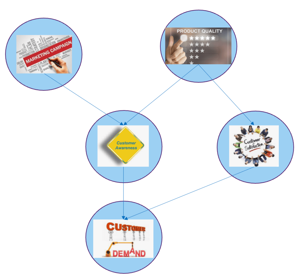
For example, consider a study investigating the impact of a new marketing campaign on product sales. A causal graph can depict the relationships between variables such as the marketing campaign (treatment), sales volume (outcome), and other variables like product quality, customer awareness, demand, customer satisfaction and loyalty. By analyzing the causal graph, we can identify the key factors influencing sales and estimate the true causal effect of the marketing campaign on sales, while accounting for other variables that may also impact sales.

In another example, let’s consider a healthcare study examining the effectiveness of a new drug in treating a specific disease. A causal graph can represent the relationships between variables such as the drug treatment (treatment), patient health outcomes (outcome), and potential confounding variables such as age, comorbidities, and lifestyle factors.

In both of these examples, causal graphs provide a clear visual representation of the causal relationships, helping us identify potential confounding factors and understand the pathways through which the treatment influences the outcome. This understanding is crucial for accurate estimation of causal effects and drawing meaningful conclusions from the data.
In the following sections, we will delve deeper into the construction and interpretation of causal graphs, exploring their significance in causal analysis and understanding how they guide the estimation of causal effects.
So, let’s embark on this journey into the world of causal graphs and unravel the secrets of cause and effect.
Representation of causality in causal graphs
In a causal graph, variables are represented as nodes, and the causal relationships between them are depicted using directed edges or arrows. The directionality of the arrows signifies the direction of causation. For example, if variable A influences variable B, there will be an arrow pointing from A to B in the graph.

The purpose of causal graphs is to provide a clear and structured representation of the causal relationships among variables. They help to identify the direct and indirect paths through which variables influence each other, facilitating the estimation of causal effects. Causal graphs also aid in identifying potential confounding variables, which are factors associated with both the treatment and the outcome, and guide the selection of appropriate statistical techniques to address confounding bias.
In our marketing campaign graph, we can understand the causal relationship between marketing campaign and sales. From the graph we can see that marketing campaigns help in creating customer awareness, which in turn creates demand ultimately leading to higher sales. There are also other causal paths which leads to higher sales from the node ‘product quality’. All these representations of the interrelationships between variables have to be derived based on our domain understanding. Causal graph in short can be considered as a visual representation of domain understanding through a web of causes and effects.
Examining causal graphs helps in identifying key variables which influence the final outcome. We can also understand the role of different confounding variables enabling estimation of the true causal effect of any variable with the desired outcome.
Components of Causal Graphs
Nodes are the fundamental components of a causal graph. They represent the variables involved in the analysis, such as the treatment, outcome, confounders, and mediators. Each node corresponds to a specific variable and plays a distinct role in the causal relationships depicted by the graph.

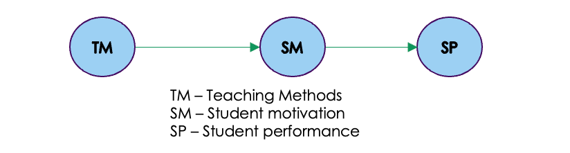
For example, in a study evaluating the impact of a new teaching method on student performance, the nodes could include the teaching method (treatment), student performance (outcome), student’s socioeconomic status (confounder), and student’s motivation (mediator). Each of these nodes represents a distinct variable that is of interest in the analysis. Let us now understand each of these components as shown in the above graph.
The different roles that variables can play in a causal graph are:
- Treatment: A treatment is a variable that is manipulated in the causal graph. For example, in a study of the effect of teaching methods on student performance, the treatment would be the different methods adopted by teachers in the school.
- Outcome: The outcome is the variable that we are interested in measuring. In our example the performance of the student is the outcome which manifests the effect of the treatment.
- Confounder: A confounder is a variable that is associated with both the treatment and the outcome. Confounders can bias the results of a study if they are not taken into account. For example, Socio Economic Status ( SES ) can also be a confounder, meaning that it is associated with both the new teaching method and student performance. For example, schools with higher SES are more likely to implement new teaching methods, and they are also more likely to have students who perform well. This means that it is difficult to say whether the new teaching method is actually causing the improvement in student performance, or whether it is simply because the students are from higher SES backgrounds.
- Mediator: A mediator is a variable that is affected by the treatment and then affects the outcome. Mediators can help to explain how the treatment works. In our case student motivation can be a mediator. The new teaching methods might motivate the students which in turn will influence their performance.
- Shared effects : In addition to the above mentioned variables, there can also be another type like the share effects. The variable that is caused by both the treatment and the outcome is called a common effect or a shared effect. In our example, the reputation of the school is influenced by both the teaching method (treatment) and student performance (outcome). The reputation of the school is a common effect of both the treatment and the outcome variables in this scenario.
Causal graphs depict the logical flow of causation, showing the connections between variables and how they interact. By following the arrows in the graph, we can trace the pathways of influence and identify the direct and indirect effects between variables. Having explored the roles of variables and the flow of causation, the next section will delve into the various ways in which the association flows between nodes in a causal graph. Understanding these different patterns of association is crucial for uncovering the underlying causal mechanisms and estimating the causal effects accurately.
Different modes for flow of association between nodes
In a causal graph, the association between nodes can flow in different ways, indicating various types of relationships and causal pathways. Here are some common ways in which association flows between nodes:
- Chain: A chain refers to a sequence of nodes connected by directed edges, where the association flows from one node to the next. In our example of the study on new teaching methods and student performance , we can see that there is a chain association between teaching methods, student motivation and student performance.
You can identify other chain associations within the causal network.
In a causal graph, a chain refers to a sequence of variables where each variable is influenced by the preceding variable in the chain. In a causal chain A -> B -> C, where A is the direct cause of B and B is the direct cause of C, changes in A can propagate through the chain and affect the subsequent variables. When A undergoes a change, it leads to a corresponding change in B. This change in B, in turn, influences C. The magnitude and direction of the changes in B and C are determined by the strength and nature of the causal relationships between the variables.
For example, in our example by introducing better teaching methods (change in A), it is likely to improve the motivation level of the students (change in B), which can subsequently lead to better exam performance (change in C).

To understand the unique and direct causal effect of each variable on the outcome variable, we need to introduce independence between variables which are not directly connected in the causal chain. Independence can be brought about by conditioning on the mediator variable. For example by conditioning on the motivation levels of students we can make teaching methods and student performance independent. Let us explore the intuition behind this with a detailed example

In the study comparing teaching methods A and B and their impact on student performance, the causal graph indicates that teaching methods influence student motivation, which subsequently affects their performance. To understand the effect of conditioning on motivation levels, let’s consider two groups: students with high motivation and those with low motivation.
Conditioning on motivation level means that we selectively analyze the performance of students within each motivation group. By doing so, we focus on the relationship between teaching methods and performance within each group, while considering motivation as a mediator variable.
In this context, conditioning on motivation level means that if we know a student is highly motivated, their performance is likely to be higher, regardless of the teaching method they receive. By conditioning on motivation, the information about the teaching method becomes redundant in predicting performance. Thus, conditioning blocks the influence of the teaching method on performance, as the impact is already explained by the student’s motivation level.
In simpler terms, conditioning on motivation level makes teaching methods and student performance independent. By taking into account the motivation level of students, we remove the direct influence of teaching methods on performance. Instead, performance is explained by the level of motivation, making the teaching method redundant in predicting performance within each motivation group.
Let us implement a simple exercise, to demonstrate the effect of conditioning based on the above use case.
import numpy as np
import pandas as pd
import seaborn as sns
import matplotlib.pyplot as plt
# Set a random seed for reproducibility
np.random.seed(42)
# Generate synthetic data
n_students = 100
teaching_methods = np.random.choice(['Method A', 'Method B'], size=n_students)
motivation_levels = np.random.choice(['Low', 'High'], size=n_students)
performance = np.random.normal(loc=60, scale=10, size=n_students)
# Create a DataFrame
data = pd.DataFrame({'Teaching Method': teaching_methods, 'Motivation Level': motivation_levels, 'Performance': performance})
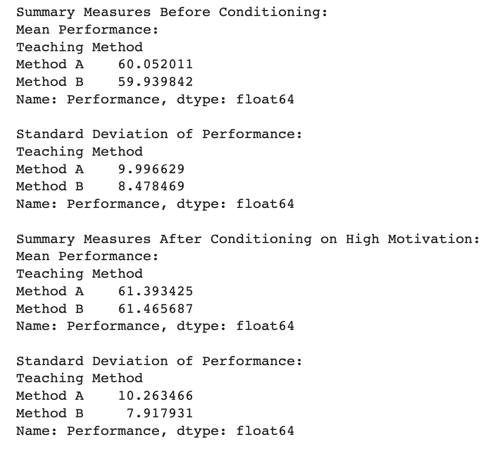
# Summary measures before conditioning
mean_performance_before = data.groupby('Teaching Method')['Performance'].mean()
std_dev_performance_before = data.groupby('Teaching Method')['Performance'].std()
# Summary measures after conditioning on high motivation
high_motivation_data = data[data['Motivation Level'] == 'High']
mean_performance_after = high_motivation_data.groupby('Teaching Method')['Performance'].mean()
std_dev_performance_after = high_motivation_data.groupby('Teaching Method')['Performance'].std()
# Display summary measures
print("Summary Measures Before Conditioning:")
print(f"Mean Performance:\n{mean_performance_before}\n")
print(f"Standard Deviation of Performance:\n{std_dev_performance_before}\n")
print("Summary Measures After Conditioning on High Motivation:")
print(f"Mean Performance:\n{mean_performance_after}\n")
print(f"Standard Deviation of Performance:\n{std_dev_performance_after}\n")
Let’s break down the exercise and connect it with student performance:
Intuition Behind the Exercise:
- Teaching Methods Influence Motivation: In the causal graph, teaching methods are shown to influence student motivation, which then affects student performance. This suggests that the choice of teaching method may indirectly impact performance through its influence on motivation.
- Conditioning on Motivation: Conditioning on a variable means that we are controlling for its effects. In this case, conditioning on motivation involves considering student performance while holding motivation levels constant. It allows us to isolate the impact of teaching methods on performance within specific motivation groups.
Connection with Student Performance:
- Before Conditioning:
- Mean Performance: Calculating the mean performance before conditioning gives us an overall average performance for each teaching method, considering all students irrespective of their motivation levels.
- Standard Deviation: The standard deviation provides a measure of the variability or spread of performance scores.
- After Conditioning on High Motivation:
- Mean Performance: Calculating the mean performance after conditioning on high motivation provides an average performance for each teaching method but only among highly motivated students. This isolates the effect of teaching methods on performance within the high motivation group.
- Standard Deviation: The standard deviation after conditioning gives us a measure of how performance varies within the high motivation group for each teaching method.
Connection with Student Performance (Intuitive Perspective):
- Before Conditioning: If we only look at mean performance without considering motivation levels, it might be influenced by both the direct impact of teaching methods and the indirect impact through motivation. The standard deviation gives us a sense of the overall variability in performance.
- After Conditioning on High Motivation: By focusing on highly motivated students, we aim to remove the potential influence of motivation on performance. If, after conditioning, the mean performance still differs between teaching methods, it suggests a direct impact of teaching methods on performance within the highly motivated subgroup.
In simpler terms, the exercise helps us understand how teaching methods might independently affect the performance of highly motivated students when we control for the variable of motivation. It provides insights into whether the observed performance differences are primarily due to teaching methods or if motivation plays a significant role.
Having learned about the flow of association through chains, let us understand the type of influence through forks.
- Fork: A fork occurs when two or more nodes have a common cause, and their association is explained by this shared cause. It represents an indirect effect, where the association flows through a common parent node.

In a causal graph, a fork structure represents a scenario where a common cause influences two variables independently, leading to a causal association between these variables. Let’s consider the example of student performance we dealt earlier, where socio-economic status (SES) acts as the common cause for both teaching methods (Method A and Method B) and student performance.
In this context, socio-economic status can affect a student’s access to educational resources, parental support, and overall learning environment. Now, let’s examine the flow of association from socio-economic status to teaching methods and student performance:
- Socio-economic status (SES) → Teaching Methods:
Students from different socio-economic backgrounds may have varying opportunities to access certain teaching methods. For instance, schools in low-income neighborhoods might have limited resources, leading to a preference for a particular teaching method (Method A or Method B). Thus, SES indirectly influences the selection of teaching methods. - Socio-economic status (SES) → Student Performance:
Students with higher socio-economic status often have access to better educational resources and a supportive learning environment. This can positively impact their academic performance. Conversely, students from lower socio-economic backgrounds may face challenges due to limited resources and support, potentially affecting their performance.
In the fork structure, socio-economic status acts as the common cause, influencing both teaching methods and student performance . The presence of socio-economic status in the causal graph can create an association between teaching methods and student performance, but it’s crucial to remember that this association is not causal. Instead, it’s the result of both variables being influenced by a common underlying factor, SES.

In the fork structure of a causal graph, there is a flow of influence from Teaching Methods (TM) to Student Performance (SP) through the common cause, Socio-Economic Status (SES). This means that the choice of teaching methods can indirectly impact student performance via its influence on SES. Let’s explore some intuitive examples to understand this flow of influence:
- Example 1 – High-Performing Schools:
Consider a high-performing school in an affluent neighborhood where students have access to well-funded schools, highly qualified teachers, and various educational resources. In this scenario, the school might prefer a specific teaching method (Method A) that has shown promising results in previous years. As a result, students from this school, influenced by the selected teaching method and other resources, tend to perform well in exams and achieve higher academic outcomes. In this case, the causal influence from Method A to Student Performance passes through the higher SES associated with the school’s location. - Example 2 – Low-Performing Schools:
Now, let’s consider a low-performing school situated in a socioeconomically disadvantaged area. Due to budget constraints and limited resources, the school may opt for a different teaching method (Method B) that fits within their financial constraints. Students in this school may face challenges related to their SES, such as lack of access to tutoring or extracurricular activities. Consequently, the academic performance of these students might be adversely affected by these socio-economic factors. Here, the causal influence from Method B to Student Performance is mediated through the lower SES associated with the school’s location.
In both examples, we see how the choice of teaching methods (Method A and Method B) indirectly impacts student performance by acting through the common cause, Socio-Economic Status (SES). The flow of influence through SES highlights the importance of considering and accounting for confounding factors like SES in causal analysis to accurately estimate the true causal effect of teaching methods on student performance.
Conditioning on Socio-Economic Status (SES) can make Teaching Methods (TM) and Student Performance (SP) independent in the fork structure of the causal graph. By controlling for the common cause (SES), we can eliminate the indirect influence that Teaching Methods might have on Student Performance through SES, thereby making them independent. Let’s explore some intuitive examples to understand this concept:

Example 1 – SES as an Equalizer:
Consider a scenario where two schools, School X and School Y, have different teaching methods (Method A and Method B) but similar SES levels. School X follows Method A, while School Y adopts Method B. However, both schools are located in the same socio-economic neighborhood with comparable resources and facilities. When we compare the academic performance of students from both schools, we find that there is no significant difference between the groups. In this case, conditioning on SES equalizes the influence of the teaching methods on student performance, and the variables become independent.
Example 2 – SES as a Confounder:
Now, let’s consider another situation where two schools, School P and School Q, implement different teaching methods (Method C and Method D). However, School P is located in a higher SES area with ample educational resources, while School Q is situated in a lower SES neighborhood with limited access to educational facilities. When we compare the student performance between the schools, we may observe that School P’s students perform better on average than School Q’s students. In this case, SES acts as a confounding factor, as it influences both the choice of teaching methods and student performance. By conditioning on SES, we can control for this confounding effect and analyze the true causal impact of teaching methods on student performance independently.
By conditioning on Socio-Economic Status can help disentangle the causal relationship between Teaching Methods and Student Performance by removing the influence of the common cause. This process ensures that any observed associations between the variables are not biased by the influence of SES, leading to a more accurate understanding of the causal effects of different teaching methods on student performance.
Having understood the chain and fork structure let us understand the next important causal association structure which is the collider.
- Collider: A collider is a node in a causal graph where two or more causal paths converge. It is a point of intersection that can induce a spurious association between its parents when conditioning on the collider.

Colliders are quite different from chains and forks . Chains represent a direct causal relationship between variables, where one variable causally influences the other in a sequential manner. In contrast, forks indicate two variables that are causally influenced by a common cause, but they are not directly related to each other. On the other hand, colliders represent a scenario where two variables have a common effect, and conditioning on the collider variable can lead to spurious associations between its parent variables. Unlike chains and forks, colliders are unique in that they block the path between its parent variables and make them independent when it is not conditioned on. Let us understand the collider in detail with our example
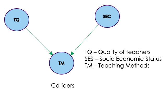
In the context of our example, a collider, also known as an immoral node, plays a significant role in the causal graph. The teaching methods variable acts as a collider because it has incoming edges from both Teacher Quality and Socio-Economic Status (SES). Colliders represent a specific scenario where two variables have a common effect, and conditioning on the collider can lead to spurious associations between its parent variables.
In this case, Teacher Quality and SES are likely to influence the choice of teaching methods. For instance, in schools with high-quality teachers and resources (higher SES), there might be a preference for adopting innovative teaching methods. Conversely, schools with limited resources and lower teacher quality might stick to traditional teaching methods. However, the teaching methods themselves do not directly influence either Teacher Quality or SES.

When we condition on the teaching methods variable, it opens up a pathway of influence from Teacher Quality to SES. For instance, if we compare schools with different teaching methods, we might observe that schools with innovative teaching methods have higher teacher quality and higher SES. However, this association is spurious, as the true relationship between Teacher Quality and SES is not influenced by teaching methods but rather by their shared influence on teaching methods.

Colliders or immorality in a causal graph can create spurious associations when conditioning on the collider variable. It highlights the importance of careful analysis and understanding of causal graphs to avoid making erroneous inferences based on observed associations that are not truly causal.
Conditioning on any descendant of a collider can also lead to the flow of association between the parents of the colliders. In our education example, where Teaching methods is the collider variable, conditioning on its descendant, Student motivation, can open a path between the parents of the collider, which are Teacher quality and Socioeconomic status (SES).
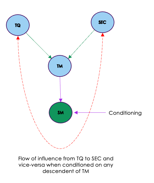
Let’s illustrate this scenario further:
- Teacher Quality (Parent of Teaching methods): This variable influences the choice of Teaching methods in a school. Schools with high-quality teachers may adopt different teaching methods compared to schools with lower-quality teachers.
- Socioeconomic Status (Parent of Teaching methods): SES of students’ families can also influence the selection of Teaching methods in schools. Schools in areas with higher SES might have access to more resources and funding, allowing them to implement different teaching methods.
- Teaching Methods (Collider): As previously discussed, this variable is influenced by both Teacher quality and SES. Conditioning on its descendant, Student motivation, may happen unintentionally when we study the relationship between Teaching methods and Student performance.
- Student Motivation (Descendant of Teaching methods): Teaching methods can affect students’ motivation, as certain teaching approaches may inspire and engage students more effectively.
Now, if we condition on Student motivation (by comparing the performance of students who are highly motivated and those with low motivation), we may inadvertently open a path between Teacher quality and Socioeconomic status. This means that any observed association between Teacher quality and Student performance may not be solely due to the direct causal relationship but may also be influenced by the path through Teaching methods and Student motivation.
This illustrates the importance of understanding the causal structure in a causal graph and the potential for bias when conditioning on descendants of colliders. Proper handling of colliders and their descendants is essential to draw accurate causal inferences and avoid spurious associations in causal analysis.
The different type of associations, flow of associations, blocking flow of association are all important in the context of understanding an important concept in causal graphs called D-seperation. Let us see that now
D-Separation
D-separation, short for “dependency separation,” is a concept used in causal inference and graphical models to determine whether two sets of variables in a causal graph are independent or conditionally independent given a third set of variables. It helps to identify which paths between variables are blocked or unblocked based on the observed data and the causal relationships represented in the graph.
In D-separation, we use the concept of “blocking” to determine whether paths between variables are open (unblocked) or closed (blocked) for information flow. A path between two variables is considered open if there is no blocking variable in the path, and it allows information flow between those variables. On the other hand, a path is considered blocked if there is at least one blocking variable in the path, which prevents information flow between the variables.
D-separation involves three types of relationships between sets of variables in a causal graph:
- Active Paths: An active path is an open path that allows information flow between variables. It is not blocked by any of the conditioning variables.
- Inactive Paths: An inactive path is a closed path that does not allow information flow between variables. It is blocked by at least one of the conditioning variables.
- Potentially Active Paths: A potentially active path can be either active or inactive depending on the specific values of the conditioning variables.
By identifying the active and inactive paths between sets of variables, we can determine whether those variables are independent or conditionally independent given the conditioning variables. D-separation is a powerful tool in causal inference as it allows us to identify which associations between variables are likely due to causal relationships and which are spurious.
Let us now look at various graphs and find D-separation between the variables.
Examples of D-separation
To understand concept of blocked paths, active paths and d-separation, let us go back to the example we have been discussing so far as depicted below

Let us now consider the flow of association between Teaching Quality ( TQ ) and Student Performance ( SP ). As seen from the below figure there are three paths to for the flow of association from TQ to SP
Path1 : TQ >> TM >> SR >> SP
Path2 : TQ >> TM >> SM >> SP
Path3 : TQ >> TM >> SEC >> SP

Let us now look at how these paths can be blocked. As we saw in the previous examples on chains, forks and colliders, paths can be blocked by conditioning on these variables. Let us start with conditioning on an empty set i.e no conditioning at all.
Case 1 : Conditioning on empty set ( No conditioning )
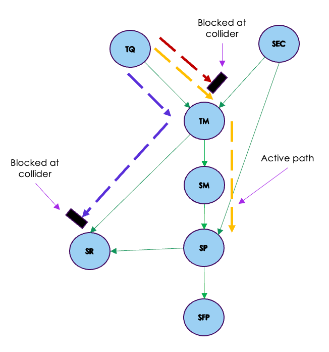
In this case as seen in the figure above, the only active path is through the chain type association in Path 2.
Path 1 and Path 3 would be blocked because SR and TM are colliders for those paths and you have seen that in the case of collider when there is no conditioning on the collider, then the path is blocked.
Having seen the example let us look at the definition of d-separation. D-separation is a concept used in causal analysis and graphical models to determine the independence or conditional independence between two sets of nodes, X and Y. It involves examining all the possible paths connecting any node in set X to any node in set Y and evaluating whether these paths are blocked or influenced by another set of nodes, Z. When all paths between X and Y are blocked by Z, we say that X and Y are d-separated by Z, indicating that they are independent or conditionally independent given Z. D-separation plays a crucial role in analyzing causal relationships and making causal inferences from observational data, helping researchers identify valid causal effects and avoid spurious associations in complex causal structures.
In our case TQ ( set X ) and SP ( set Y )are not d-separated when conditioning on the empty set ( set Z )as there is one active path between these nodes.
Case 2 : Conditioning on SM

Let us look at the case when we condition on SM. In this case, like the earlier case path 1 is blocked at the collider SR. Path 2 becomes blocked in this case as there is a conditioning at SM which will block the influence flowing from TQ. Patch 3 opens at the collider TM because of the conditioning on SM. This is because SM is a descendant of TM and any conditioning on the collider or any descendants of the collider opens the path for the influence to flow from TQ >> TM >> SEC >> SP.
As we have an open path between TQ and SP, these variables are not D-separated.
Case 2 : Conditioning on SM and SEC

When we condition on both SM and SEC, we block Path 3 also. This is because, SEC is a fork and conditioning on the fork blocks the path.
Now we have a condition where all the paths between TQ and SP are blocked. This entails that TQ and SP are d-separated which entails these variables are independent when conditioning on SM and SEC.
Case 3 : Conditioning on SM , SEC and SR
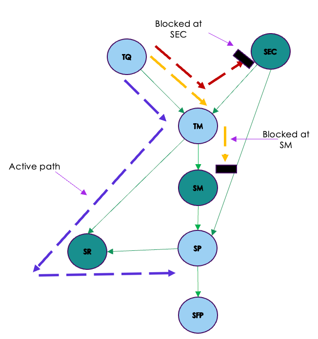
When we condition on SR, Path 1 opens up as SR is a collider. The other paths remain blocked as seen from the previous case. This means that TQ and SP are not d-separated.
Intuition for d-separation
The concept of D-separation is fundamental to causal analysis and provides a framework to understand how the presence of certain nodes can block or open causal paths between other nodes in the graph.
When we have a set of nodes Z, D-separation helps us identify whether Z acts as a “shield” that blocks the flow of influence between two other sets of nodes, X and Y. If all the paths between X and Y are blocked by Z, it implies that X and Y are independent or conditionally independent given Z. In other words, conditioning on the nodes in set Z eliminates the confounding effects that may exist between X and Y due to their shared relationships with Z.
This concept is highly relevant in causal analysis because it enables to discern true causal relationships from spurious associations. By identifying the nodes that act as “confounders” we can appropriately adjust for these variables when estimating causal effects and making valid causal inferences from observational data.
Conclusion
In conclusion, causal graphs play a pivotal role in advancing causal analysis and enhancing our understanding of cause-and-effect relationships in complex systems. By visually representing the causal relationships between variables, these graphs provide valuable insights into the underlying mechanisms that drive outcomes in various fields. They help us identify and control for confounding factors, mediating variables, and colliders, allowing for more accurate and reliable causal inference from observational data.
Embracing causal graphs in our research and decision-making processes can lead to better policy recommendations, improved healthcare interventions, and enhanced understanding of social dynamics. As we continue to delve into the world of causal analysis, we are encouraged to explore further the diverse applications of causal graphs in tackling real-world problems.
In our future blog posts, we will delve into more advanced topics in causal analysis, including counterfactual reasoning, sensitivity analysis, and techniques for causal identification and estimation. By expanding our knowledge and utilization of causal graphs, we can make more informed decisions, contribute to cutting-edge research, and shape a better understanding of the cause-and-effect relationships that govern the world around us.
