In our last blog, we covered the basics of causal analysis, starting from defining problems to creating simulated data. We explored key concepts like back door, front door, and instrumental variables for handling complex causal relationships. Now, we’re taking the next step, focusing on estimation methods, understanding causal effects, and diving into the world of propensity score estimation. Join us as we delve deeper into causal analysis, applying these concepts to Member Loyalty Programs. In this part of the series, we’ll be tackling the following:
Structure
- Causal Estimation
- Deciphering causation. Exploring diverse methods for causal estimation
- Selection of causal estimation method
- Estimation of causal effect using propensity score matching
- Implementing causal estimation using PSM
- Model fitting
- Matching
- Estimation
- Implementing PSM code from scratch
- Building propensity model using classification model
- Matching of groups using Nearest Neighbour
- Calculating ATT, ATC and ATE
- Interpretation of results
- Implementing PSM using DoWhy library
- Conclusion
1.0 Causal estimation

Now that we’ve tackled, the initial steps in causal analysis — defining the problem, preparing the data, creating causal graphs, and identifying causation ,in our previous blog — it’s time for the next phase: causal estimation. Simply put, this step is about figuring out how much the treatment influences the outcome. Whether we’re studying the impact of a marketing campaign on sales or a new drug on patient health, causal estimation moves us beyond just finding connections. The key features we explored earlier, like defining valid instruments and identifying backdoor and frontdoor paths, play a crucial role in choosing the right methods for estimation. This ensures our estimated causal effects are robust and reliable.
1.1 Deciphering Causation: Exploring Diverse Methods for Causal Estimation
As we delve into estimating causation, we encounter a variety of methods, each tailored to address specific aspects of the relationship between treatment and outcome. Regression Analysis is a foundational approach, using statistical models to untangle treatment effects. Matching Methods come into play for direct comparisons, pairing treated and untreated units based on similar covariate profiles. Propensity Score Matching, a subset of matching, estimates the likelihood of receiving treatment based on observed covariates, leading to more accurate matches. Instrumental Variable (IV) Analysis, which we introduced during causal identification, reappears to handle endogeneity concerns. Difference-in-Differences (DiD), a temporal method, contrasts changes in treatment and control groups over time. Regression Discontinuity Design (RDD) excels when treatment hinges on a threshold, revealing causal effects around that point. This array of causal estimation methods provides flexibility, with each being a powerful tool in deciphering causation from correlation for more accurate insights. To learn more on different causal estimation methods, you can refer to some of the previous blogs in our series
1.2 Selection of causal estimation method
In the context of the membership program, individuals self-select into the treatment group (those who signed up for the program) or the control group (those who did not sign up). This self-selection introduces potential confounding, as individuals who choose to sign up for the program may have different characteristics and behaviors compared to those who do not sign up. For example, individuals who are more loyal or already have higher spending patterns may be more inclined to sign up for the program.
Based on our business context Propensity score matching (PSM) can be an appropriate method for estimating the causal effect of a membership program as the program’s signup is not randomized and based on observational data. PSM aims to reduce selection bias and create comparable treatment and control groups by matching individuals with similar propensity scores.
To address the confounding, referred to in the first paragraph, PSM estimates the propensity scores, which represent the probability of an individual signing up for the program given their observed covariates. The propensity scores are then used to match individuals in the treatment group with individuals in the control group who have similar scores. By creating comparable groups, PSM reduces the selection bias and allows for a more valid estimation of the causal effect.
PSM provides several advantages in estimating the causal effect of the membership program. Firstly, it allows for the utilization of observational data, which is often more readily available compared to experimental data from randomized controlled trials. Secondly, PSM can handle a large number of covariates, making it suitable for complex datasets with multiple confounding factors. Thirdly, PSM does not require assumptions about the functional form of the relationship between covariates and the outcome, providing flexibility in modeling.
Now that we have selected an appropriate method for estimating the causal effect let us go ahead and estimate the effect.
2.0 Estimation of Causal Effect using PSM
Estimating the effect in causal analysis refers to the process of quantifying the causal relationship or the impact of a particular treatment or intervention on an outcome of interest. Causal analysis aims to answer questions such as
“What is the effect of X on Y?” or
“Does the treatment T cause a change in the outcome Y?”
Estimating the effect in our context entails quantifying the causal relationship or the impact of a membership program (treatment ) on customer spending patterns (outcome of interest). The goal is to determine whether the membership program causes a change in the customers’ post-spending behavior.
To estimate this effect, causal analysis aims to isolate the causal relationship between the membership program (treatment) and post-spends from other factors that may influence customer spending. These factors can include variables such as customers’ purchasing habits prior to signing up for the program, seasonality, and other unobserved factors. Addressing these potential confounding variables is crucial to obtain an accurate estimation of the causal effect of the membership program on post-spends. In our case we only have a single confounding factor which is the sign up month variable. We will be adjusting the effect of the confounding variable in our estimation.
By carefully accounting for confounding variables through methods like propensity score matching the causal analysis aims to provide reliable estimates of the treatment effect. These estimates help answer questions about the effectiveness of the membership program in influencing customer spending patterns and provide valuable insights for decision-making and program evaluation. Let us now look at the steps to estimate the effect using propensity score matching. The estimation would entail the following steps.
3.0 Steps in implementing causal estimation using PSM
Propensity Score Matching (PSM) unfolds in three pivotal steps. The journey begins with model fitting, often employing logistic regression to craft propensity scores that signify the likelihood of receiving treatment based on observed covariates. Following this, the matching phase seeks balance between treated and control groups, ensuring a fair and unbiased comparison. This involves pairing individuals with similar or identical propensity scores, akin to creating a controlled experiment from observational data. Finally, we estimate effects, scrutinizing the outcomes for the matched pairs to discern the causal impact of the treatment variable.
Model Fitting
- Fit a model (e.g., logistic regression) to estimate the propensity scores. The model predicts the probability of receiving the treatment based on the observed covariates.
Matching:
- Match each treated unit with one or more control units from the control group who have similar or close propensity scores.
- The matching process aims to balance the covariates between the treatment and control groups, making them comparable.
Estimation:
- Calculate the average treatment effect (ATE) or the average treatment effect on the treated (ATT) using the matched data.
- The treatment effect is estimated by comparing the outcomes between the treated and matched control units.
We will explain each of these steps when we implement them. To implement these steps let us get back to the data frame we created in the previous blog and the separate out the data for the treatment, outcome and confounding variables
# Separating the treatment, outcome and confounding data
treatment_name = ['treatment']
outcome_name = ['post_spends']
common_cause_name = ['signup_month']
# Extracting the relevant data
treatment = df_i_signupmonth[treatment_name]
outcome = df_i_signupmonth[outcome_name]
common_causes = df_i_signupmonth[common_cause_name]
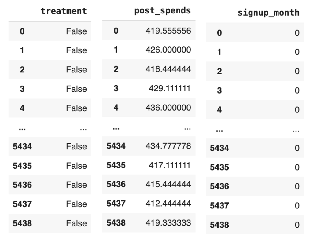
Figure 1: Snap shot of the treatment, outcome and common causes data
Let us now define the propensity score model, which we will fit with a logistic regression model.
from sklearn import linear_model
# Defining the propensity score model
propensity_score_model = linear_model.LogisticRegression()
Let us take a step back and understand the intuition behind defining a logistic regression model as our propensity score model.
The choice of a logistic regression model as the propensity score model in the context of the membership program is to estimate the probability of customers signing up for the program (treatment) based on their characteristics (common causes).
In causal analysis, the propensity score is defined as the conditional probability of receiving the treatment given the observed covariates. In the context of estimating the effect in causal analysis, the conditional probability helps address the issue of confounding variables. Confounding occurs when there are factors or variables that are associated with both the treatment and the outcome, and they distort the estimation of the causal effect. By conditioning on or adjusting for the common causes, we aim to create comparable groups of treated and control individuals with similar characteristics.
The propensity score model, such as logistic regression, estimates this conditional probability by modeling the relationship between the common causes and the probability of treatment.In the context of the membership program, by estimating the propensity score, we can adjust for the potential confounding variable (sign-up month) which may influence both the treatment assignment (being a member) and the outcome of interest (post spend). Confounding occurs when there are factors that are associated with both the treatment and the outcome, and failing to account for them can lead to biased estimates of the treatment effect.
Using the propensity score, we can match individuals who have similar probabilities of signing up for the program, effectively creating comparable groups in terms of their likelihood of being members. This matching process ensures that any differences in post spend between the treatment and control groups can be attributed primarily to the treatment itself, rather than the confounding effect of sign-up month. By isolating the causal effect of the membership program through propensity score matching, we can more accurately estimate how the program influences post spend for customers who have signed up.
Let us now estimate the propensity scores by fitting the model with the common causes and the treatment variable. Before we actually fit the model we have to reformat the data sets a bit.
# Reformatting the common causes and treatment variables
common_causes = pd.get_dummies(common_causes, drop_first=True)
treatment_reshaped = np.ravel(treatment)
# Fit the model using these variables
propensity_score_model.fit(common_causes, treatment_reshaped)
# Getting the propensity scores by predicting with the model
df_i_signupmonth['propensity_scores'] = propensity_score_model.predict_proba(common_causes)[:, 1]
df_i_signupmonth
Line 13 of code uses the pd.get_dummies() function to convert the common_causes variable into a one-hot encoded variable. This means that each of the categorical variables in the common_causes variable will be converted into a new binary variable. The drop_first=True argument tells the pd.get_dummies() function to drop the first level of the categorical variable. This is done because the first level is usually the reference level, and it does not provide any additional information.
Line 14 uses the np.ravel() function to convert the treatment variable into a 1D array. This is necessary because the propensity_score_model.fit() function expects a 1D array as the dependent variable.
Line 16 uses the propensity_score_model.fit() function to fit the model to the common_causes and treatment_reshaped variables. This function will estimate the coefficients of the model, which will be used to predict the propensity scores.
Line 18 uses the propensity_score_model.predict_proba() function to predict the propensity scores for each individual in the df_i_signupmonth DataFrame. The [:, 1] slice tells the propensity_score_model.predict_proba() function to return only the probability of receiving the treatment, which is the second column of the output array.
The new data frame with the prediction will be as below
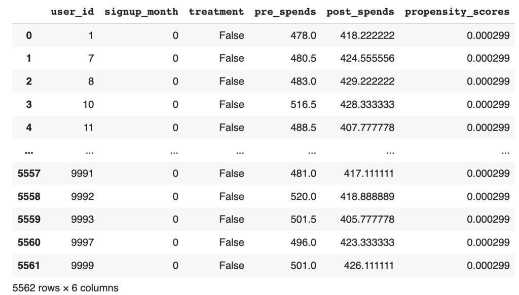
Figure 2 : Dataframe with the propensity score predicted
From the data frame, the output propensity_scores represents the estimated probability of an individual signing up for the program given their observed characteristics (common causes). A higher propensity score indicates a higher probability of signing up for the membership program, and vice versa. By fitting the model and predicting the propensity scores, we obtain a quantitative measure of the likelihood of an individual being a member based on their observed characteristics.
These propensity scores are valuable in causal analysis because they allow for matching or stratification of individuals who have similar probabilities of treatment. By grouping individuals with similar propensity scores, we can create comparable treatment and control groups that are balanced in terms of their observed characteristics. This enables more accurate estimation of the causal effect by isolating the impact of the treatment (membership program) from other confounding factors. Let us now start the process
# Seperate the treated and control groups
treated = df_i_signupmonth.loc[df_i_signupmonth[treatment_name[0]] == 1]
control = df_i_signupmonth.loc[df_i_signupmonth[treatment_name[0]] == 0]
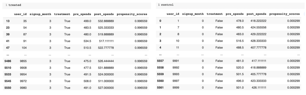
Figure 3: Treated and Control groups with predicted propensity score
From the separate data frames of treated and control, you can see the difference in the propensity scores. The treated group has much higher likelihood than the control group. Next we will find the neighbours for the treated and control groups respectively to find individuals of similar propensities.
In propensity score matching, the goal is to identify individuals in the control group who are similar to those in the treatment group based on their propensity scores. This is done to create a matched comparison group that closely resembles the treated group in terms of their likelihood of receiving the treatment.
# Import the required libraries
from sklearn.neighbors import NearestNeighbors
# Fit the nearest neighbour on the control group ( Have not signed up) propensity score
control_neighbors = NearestNeighbors(n_neighbors=1, algorithm="ball_tree").fit(control["propensity_scores"].values.reshape(-1, 1))
# Find the distance of the control group to each member of the treated group ( Individuals who signed up)
distances, indices = control_neighbors.kneighbors(treated["propensity_scores"].values.reshape(-1, 1))
Line 26 fits a nearest neighbors model on the control group’s propensity scores. This model will find the nearest neighbors of each individual in the control group, based on their propensity scores.
Line 28 then finds the distance of the control group to each member of the treated group. This is done by using the nearest neighbors model that was fit on the control group. The distance is calculated by finding the Euclidean distance between the propensity scores of the individuals in the control group and the propensity scores of the individuals in the treated group.
The reason why we fit the nearest neighbors model on the control group and then find its distance on the treated group is because we want to find the individuals in the control group who are most similar to the individuals in the treated group. By fitting the model on the control group, we can ensure that the distances are calculated based on the propensity scores of the control group.
This is important because we want to match individuals who are similar in terms of their propensity scores, so that we can control for confounding variables. If we were to fit the nearest neighbors model on the treated group, we would be matching individuals who are similar in terms of their propensity scores, but who may not be similar in terms of other confounding variables.
Having found the indices of the individuals in the control group, we will be able to calculate the average treatment effect of the treated ( ATT ).
ATT refers to the average causal effect of the treatment on the treated group. It estimates the average difference in the outcome variable between the treated group (those who received the treatment, in this case, signed up for the membership program) and their matched counterparts in the control group (those who did not receive the treatment).
The calculation of ATT involves comparing the outcomes of the treated group with their nearest neighbors in the control group, who have similar propensity scores. By matching individuals based on their propensity scores, we aim to create balanced comparison groups, where the only systematic difference between the treated and control group is the treatment itself. Let us look at how this is done
# Calculation of the ATT
att = 0
numtreatedunits = treated.shape[0]
for i in range(numtreatedunits):
  treated_outcome = treated.iloc[i][outcome_name].item()
  control_outcome = control.iloc[indices[i][0]][outcome_name].item()
  att += treated_outcome - control_outcome
att /= numtreatedunits
print('Average treatment effect of treated',att)

The provided code snippet calculates the ATT by computing the difference in outcomes between the treated group and their matched counterparts in the control group.
Line 32 iterates over each individual in the treated group and retrieves their outcome value. In lines 33-34, using the indices obtained from the nearest neighbor search, the corresponding control unit is identified and its outcome value is retrieved. The difference between the treated outcome and the matched control outcome is then computed and added to the ATT variable, as shown in line 35. This process is repeated for each treated individual. The resulting ATT value represents the average difference in outcomes between the treated and matched control group, providing an estimate of the causal effect of the membership program on the treated individuals. Finally the ATT is calculated by dividing by the number of treated individuals. We get a value of 93.45 for ATT.
An Average Treatment Effect of Treated (ATT) value of 93.45 suggests that, on average, individuals who received the treatment experienced an increase or improvement in the outcome variable by 93.45 units compared to if they had not received the treatment. In other words, the treatment is associated with a positive impact on the outcome.
ATT is relevant because it provides an estimate of the causal effect of the treatment specifically for those who received it. It helps us understand the impact of the membership program on the treated individuals’ outcomes, such as post-spending behavior, by accounting for potential confounding factors through propensity score matching.
Similarly let us calculate ATC which is the average treatment effect on the control group.
# Computing ATC
treated_neighbors = NearestNeighbors(n_neighbors=1, algorithm="ball_tree").fit(treated["propensity_scores"].values.reshape(-1, 1))
distances, indices = treated_neighbors.kneighbors(control["propensity_scores"].values.reshape(-1, 1))
# Calculating ATC from the neighbours of the control group
atc = 0
numcontrolunits = control.shape[0]
for i in range(numcontrolunits):
  control_outcome = control.iloc[i][outcome_name].item()
  treated_outcome = treated.iloc[indices[i][0]][outcome_name].item()
  atc += treated_outcome - control_outcome
atc /= numcontrolunits
print('Average treatment effect on control',atc)

We follow a similar process to find the ATC. Here the nearest neighbour is first fitted on the treatment group propensity score. Then the distance or similarity of each individual in the control group to a corresponding individual in the treated group is found out. After finding the neighbours the calculation of ATC is done similar to what we did for ATT.
Having found both ATT and ATC , we are in a position to calculate the estimate for Average Treatment Effect (ATE).
To calculate the ATE , we combine the ATT and ATC weighted by their respective proportion. The ATE represents the average causal effect of the treatment across both the treated and control groups.
The ATE can be calculated using the following formula:
ATE = (ATT * proportion of treated) + (ATC * proportion of control).
Let us now calculate the ATE
# Calculation of Average Treatment Effect
ate = (att * numtreatedunits + atc * numcontrolunits) / (numtreatedunits + numcontrolunits)
print('Average treatment effect',ate)

In the context of the membership program, the ATE holds significant relevance in understanding the impact of the program on customer spending behavior. Through causal analysis, we can estimate the ATE to assess the average causal effect of the program on post-spends. This involves considering factors such as the treatment group (customers who signed up for the program) and the control group (customers who did not sign up) while accounting for potential confounding variables.
By estimating the Average Treatment Effect on the Treated (ATT) and the Average Treatment Effect on the Control (ATC), we can gain valuable insights. A positive ATT would indicate that customers who signed up for the membership program have higher post-spends compared to those who did not sign up. Conversely, a negative ATT would suggest that signing up for the program leads to lower post-spends. The ATC provides a counterfactual comparison, indicating the outcomes that customers in the control group would have had if they had signed up for the program.
The ATE serves as a crucial measure to evaluate the overall impact of the membership program. A positive ATE would suggest that, on average, the program has a positive causal effect on customer post-spends. Conversely, a negative ATE would indicate a negative average causal effect. These findings help stakeholders assess the effectiveness of the program and make informed decisions regarding its implementation and continuation.
Implementing Causal analysis using do-why
In the last blog of the series we dealt with the processes involved in the causal identification namely, creating the causal graph, and then identifying different paths through which causal effect can flow like, back door paths, front door paths and instrumental variables. In our manual analysis of the causal graph we identified the presence of both back door and instrumental variables. Our causal graph did not have a front door variable. We did all the identification manually. We can implement all those processes in do-why also. Let us now see how the identification process can be done using do-why.
# Identification process
identified_estimand = model.identify_effect(proceed_when_unidentifiable=True)
print(identified_estimand)
The output generated from this process is as shown below. The output describes the various estimand’s or paths which are relevant. We can see that both the back door path and the instrumental variables have been identified.

Figure 4: Estimand for the causal analysis
Let us now understand above estimands and the different expressions used
Estimand 1 ( Back door )
Estimand Expression: This represents the causal effect of treatment on post_spends, adjusted for signup_month.

This expression is calculating the derivative of the expected value of post_spends with respect to the treatment variable treatment while controlling for the variable signup_month. In simpler terms, it’s looking at how the average post_spends changes when you change the treatment, considering the influence of signup_month to account for potential confounding.
Estimand Assumption 1 (Unconfoundedness): Assumes that there are no unobserved confounders (U) that simultaneously affect the treatment and outcome.The assumption of unconfoundedness is a fundamental requirement for making causal inferences using observational data. Let’s break down the statement:

This part of the assumption is saying that there are no unobserved confounders (U) that directly influence the treatment assignment. In other words, any factor that might influence both the treatment assignment and the outcome is already observed and included in the variables.

Similarly, there are no unobserved confounders that directly influence the outcome variable (post_spends).
Now, the main part of the assumption:

This is asserting that, conditional on treatment assignment (treatment), the month of signup (signup_month), and any observed variables (U), the distribution of post_spends is the same as if we condition only on treatment and signup_month. In simpler terms, it’s saying that, given what we know (treatment assignment, signup month, and any observed factors), the unobserved factors (represented by U) do not introduce bias or confounding.
Estimand 2 (Instrumental Variable):
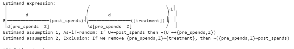
Figure 5: Estimand expressions
This expression involves more complex calculus but, in essence, it’s estimating the causal effect of the treatment on post_spends using pre_spends and Z as instrumental variables. It’s essentially calculating the ratio of changes in post_spends with respect to changes in treatment, adjusted for changes in pre_spends and Z. The inverse of this is taken to estimate the causal effect.
Estimand Assumption 1: As-if-random
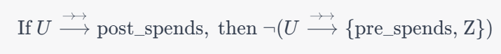
This assumption is related to the instrumental variable (Z). It’s asserting that if there are unobserved factors (U) that influence post_spends (as indicated by �⟶→ →U⟶→→), then those unobserved factors are not related to both the instrumental variable (Z) and the variables we’re controlling for (pre_spends). In other words, the instrumental variable is not correlated with the unobserved factors influencing the outcome, ensuring that it acts as a good instrument.
Estimand Assumption 2: Exclusion

This assumption is crucial for instrumental variables. It states that the instrumental variable (Z) and the variable we’re controlling for (pre_spends) do not have a direct effect on the outcome variable (post_spends). The idea is that the only influence these variables have on the outcome is through their impact on the treatment (treatment).
These assumptions ensure that the instrumental variable is a valid instrument for estimating the causal effect of the treatment on the outcome. The first part ensures that the instrumental variable is not correlated with unobserved factors affecting the outcome, and the second part ensures that the instrumental variable only affects the outcome through its impact on the treatment, not directly. Violations of these assumptions could lead to biased estimates.
Estimand 3 (Frontdoor):
No expression is provided in your example because DoWhy did not find a valid front door path.
The above are the processes which happen in the identification step. Once the identification process is complete we go on to the estimation method which we will see next.
# Estimation process
estimate = model.estimate_effect(identified_estimand,
                                 method_name="backdoor.propensity_score_matching",
                                target_units="ate")
print(estimate)
Let us look at the outputs and then unravel its content.

Figure 6: Estimand expressions
The above identified estimand expression aims to capture the causal effect of the treatment variable on post-spending while controlling for the covariate signup_month. The expression represents the derivative of the expected post-spending with respect to the treatment. The assumption of unconfoundedness ensures that there are no unobserved confounders affecting both the treatment assignment and post-spending.
The mean value of 112.27 for the Average Treatment Effect suggests that, on average, the treatment is associated with an increase of approximately 112.27 units in post-spending compared to the control group. Now in our manual method the estimate came to around 95. There is slight difference in both which can be attributed to the difference in random generation of data. However the direction in both the methods is the same.
Conclusion
In this dual-series exploration of causal analysis within the context of our loyalty membership program, we embarked on a comprehensive journey from the foundational principles to the advanced techniques that underpin causal inference. Our journey began with an elucidation of causal analysis, dissecting Average Treatment Effects (ATE), front door, back door, and instrumental variables. We navigated through the landscape of causal graphs, unraveling the relationships and dependencies that characterize our loyalty program dynamics. The second part of our exploration delved into causal identification and estimation, where we meticulously defined our causal questions and applied sophisticated methods to estimate causal effects. These blogs collectively provide a holistic understanding of the intricacies involved in discerning causation from correlation, equipping us with powerful tools to uncover the true impact of our loyalty membership program on customer behavior. As we conclude this series, we’ve not only enhanced our theoretical grasp of causal analysis but have also gained practical insights that can be applied across various domains, illuminating the path toward more informed decision-making in loyalty program management.
“Discover Data Science Wonders: Subscribe Now!”

Embark on a journey through the fascinating world of data science with our blog!
“Whether you’re a data enthusiast or just starting, we simplify complex concepts, turning data science into a delightful experience.”
Subscribe today to unravel the mysteries and gain insights.
But there’s more!
Join our YouTube channel for visual learning adventures.
Dive into data with us and make learning simple and fun.
Subscribe for your dose of data magic today! 🚀✨