Causal Estimation methods for Machine learning and Data Science Part III – Instrument Variable Analysis

1.0 Introduction

In the past two blogs of this series we’ve been discussing causal estimation, a very important subject in data science, we delved into causal estimation using regression method and propensity score matching. Now, let’s venture into the world of instrumental variable analysis—a powerful method for unearthing causal relationships from observational data. Let us look at the structure of this blog.

2.0 Structure

  • Instrument variables – An introduction
  • Instrument variable analysis – The process
  • Implementation of instrument variable analysis from scratch using linear regression
  • Implementation of instrument variable analysis using DoWhy
  • Implementation of instrument variable analysis using Ordinary Least Squares (OLS) Method
  • Conclusion

3.0 Instrument Variables – An introduction

Let us start the explanation on the instrument variable analysis with an example.

We all know education is important, but figuring out how much it REALLY boosts your future earnings is tricky. Its not easy to tell how big a difference an extra year of school makes because we also don’t know how smart someone already is. Some people are just naturally good at stuff, and that might be why they earn more, not just because they went to school longer. This confusing mix makes it hard to see the true effect of education.

But there’s a way out of this impasse!!

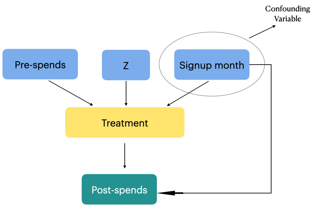
Imagine that you have a mechanism to separate the real link between education and earnings while ignoring how smart someone is. That’s what an instrument variable is. It helps us see the clear path between education and income, without getting fooled by other factors. In our example, an instrument variable that could be considered could be something like compulsory schooling laws. These laws force everyone to spend a certain amount of time in school, regardless of their natural talent. So, by studying how those laws affect people’s earnings, we can get a clearer picture of what education itself does, apart from just naturally-smart people earning more.

With this tool, we can finally answer the big question: is education really the key to unlocking a brighter financial future?

4.0 Instrument variable analysis – The process

Here’s how it works:

  1. Effect of instrument on treatment: We analyze how compulsory schooling laws (the instrument variable) affect education (the treatment).
  2. Estimate the effect of education on outcome: We use the information from the above to estimate how education (treatment) actually affects earnings (outcome), ignoring the influence of natural talent (the unobserved confounders).

By using this method, we can finally isolate the true effect of education on earnings, leaving the confusing influence of natural talent behind. Now, we can confidently answer the question:

Does more education truly lead to a brighter financial future?

Remember, this is just one example, and finding the right instrument variable for your situation can be tricky. But with the right tool in hand, you can navigate the maze of confounding factors and uncover the true causal relationships in your data.

Implementation of Causal estimation using Instrument Variables from scratch

Let us now explain the concept through code. First we will use the linear regression method to take you through the estimation process.

To start off, lets generate some synthetic data set which describes the relationship between the variables.

# Importing the necessary packages
import numpy as np
from sklearn.linear_model import LinearRegression

Now let’s create the synthetic dataset

# Generate sample data (replace with your actual data)
n = 1000
ability = np.random.normal(size=n)
compulsory_schooling = np.random.binomial(1, 0.5, size=n)
education = 5 + 2 * compulsory_schooling + 0.5 * ability + np.random.normal(size=n)
earnings = 10 + 3 * education + 0.8 * ability + np.random.normal(size=n)

This section creates simulated data for n individuals (1000 in this case):

  • ability: Represents unobserved individual ability (normally distributed).
  • compulsory_schooling: Binary variable indicating whether someone was subject to compulsory schooling (50% chance).
  • education: Years of education, determined by compulsory schooling (2 years difference), ability (0.5 years per unit), and random error.
  • earnings: Annual earnings, influenced by education (3 units per year), ability (0.8 units per unit), and random error.

We can see that the variables are defined in such a way that education depends on both schooling laws ( instrument variable) and ability ( unobserved confounder) and the earnings ( outcome ) depends on education ( Treatment ) and ability. The outcome is not directly influenced by the instrument variable, which is one of the condition of selecting an instrument variable.

Let us now implement the first regression model.

# Stage 1: Regress treatment (education) on instrument (compulsory schooling)
stage1_model = LinearRegression()
stage1_model.fit(compulsory_schooling.reshape(-1, 1), education)  # Reshape for 2D input
predicted_education = stage1_model.predict(compulsory_schooling.reshape(-1, 1))

This stage uses linear regression to model how compulsory schooling (compulsory_schooling) affects education (education).

In line 13, we reshape the data to the required 2D format for scikit-learn’s LinearRegression model. The model estimates the effect of compulsory schooling on education, isolating the variation in education directly caused by the instrument (compulsory schooling) and removing the influence of ability (confounding variable).

In line 14, The resulting model predicts the “purified” education values (predicted_education) for each individual, eliminating the confounding influence of ability.

Now that we have found the education variable which is precluded of the influence from unobserved confounder ( ability ), we will build the second regression model.

# Stage 2: Regress outcome (earnings) on predicted treatment from stage 1
stage2_model = LinearRegression()
stage2_model.fit(predicted_education.reshape(-1, 1), earnings)  # Reshape for 2D input

This stage uses linear regression to model how the predicted education (predicted_education) affects earnings (earnings).

Again, in line 16 we reshape the data for compatibility with the model and fit the model to estimate the causal effect of education on earnings. Here we use the “cleaned” education values from stage 1 to isolate the true effect, holding the influence of ability constant.

Let us now extract the coefficients of this model. The coefficient of predicted_education represents the estimated change in earnings associated with a one-unit increase in education, adjusting for the confounding effect of ability.

# Print coefficients (equivalent to summary in statsmodels)
print("Intercept:", stage2_model.intercept_)
print("Coefficient of education:", stage2_model.coef_[0])

Intercept (9.901): This indicates the predicted earnings for someone with zero years of education.

Coefficient of education (3.004): This shows that, on average, each additional year of education is associated with an increase of $3.004 in annual earnings, holding ability constant with the help of the instrument.

Let us try to get some intuition on the exercise we just performed. In the first stage, we estimate how changes in the instrument (here, compulsory schooling laws) impact education. Then in the second stage, we examine how changes in education, predicted from the first stage, impact earnings. The first stage helps address the issue of unobserved confounding by using a variable (the instrument) that only affects the outcome through its impact on the treatment variable. Thus we are able to estimate the real effect of education on the earning capacity, by eliminating any influence from the unobserved confounding variables like ability.

We implemented this exercise using linear regression to get an intuitive understanding of what is going on under the hood. Now let us implement the same exercise using DoWhy library.

5.0 Implementation using DoWhy

We will start by importing the required libraries.

from dowhy import CausalModel

We will be using the same data frame which we used earlier. Let us now define the data frame for our analysis.

# Create a pandas DataFrame
data = pd.DataFrame({
    'ability': ability,
    'compulsory_schooling': compulsory_schooling,
    'education': education,
    'earnings': earnings
})

Next let us define the causal model.

# Define the causal model
model = CausalModel(
    data=data,
    treatment='education',
    outcome='earnings',
    instruments=['compulsory_schooling']
)

The above code creates the causal model using DoWhy.

Let’s break down the key components and the processes happening behind the scenes:

model = CausalModel(...): This line initializes a causal model using the DoWhy library.

data: The dataset containing the variables of interest.

treatment='education': Specifies the treatment variable, i.e., the variable that is believed to have a causal effect on the outcome.

outcome='earnings': Specifies the outcome variable, i.e., the variable whose changes we want to attribute to the treatment.

instruments=['compulsory_schooling']: Specifies the instrumental variable(s), if any. In this case, ‘compulsory_schooling’ is used as an instrument.

In the provided code snippet, there is no explicit specification of common causes, which in our case is the variable ‘ability’. The absence of common causes in the CausalModel definition may imply that the common causes are either not considered or are left unspecified. In our case we have said that the common causes or confounders are unobserved. That is why we use the instrument variable ( compulsory_schooling) to negate the effect of unobserved confounders.

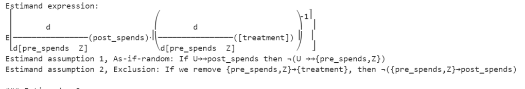
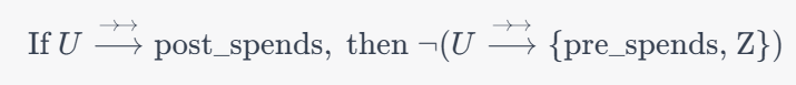
When the causal model is defined as shown above, DoWhy performs an identification step where it tries to identify the causal effect using graphical models and do-calculus. It checks if the causal effect is identifiable given the specified variables. To know more about the identification steps you can refer our previous blogs on the subject.

Once identification is successful, the next step is to estimate the causal effect. Let us proceed with the estimation process.

# Identify the causal effect using instrumental variable analysis
identified_estimand = model.identify_effect(proceed_when_unidentifiable=True)
estimate = model.estimate_effect(identified_estimand, method_name="iv.instrumental_variable")

Line 17 , identified_estimand = model.identify_effect(proceed_when_unidentifiable=True): In this step, the identify_effect method attempts to identify the causal effect based on the specified causal model. The proceed_when_unidentifiable=True parameter allows the analysis to proceed even if the causal effect is unidentifiable, with the understanding that this might result in less precise estimates.

Line 18 estimate = model.estimate_effect(identified_estimand, method_name="iv.instrumental_variable"): This method takes the identified estimand and specifies the method for estimating the causal effect. In this case, the method chosen is instrumental variable analysis, specified by method_name="iv.instrumental_variable". Instrumental variable analysis helps in addressing potential confounding in observational studies by finding an instrument (a variable that is correlated with the treatment but not directly associated with the outcome) to isolate the causal effect.The intuition for the instrument variable was earlier described when we built the linear regression model.

Finally the estimate object contains information about the estimated causal effect. Let us print the causal effect in our case

# Print the causal effect estimate
print("Causal Effect Estimate:", estimate.value)

From the output we can see that its similar to our implementation using the linear regression method. The idea of implementing the linear regression method is to unravel the intuition which is often hidden in black box implementations like that in the DoWhy package.

Now that we have a fair idea and intuition on what is happening in the instrument variable analysis, let us see one more method of implementation called the two-stage least squares (2SLS) regression method. We will be using the statsmodels library for the implementation.

6.0 Ordinary Least Squares (OLS) Method method

Let us see the full implementation using least squares method.

import numpy as np
import pandas as pd
import statsmodels.api as sm

# Set seed for reproducibility
np.random.seed(42)

# Generate synthetic data
n_samples = 1000

# True coefficients
beta_education = 3.5  # True causal effect of education on earnings
gamma_instrument = 2.0  # True effect of the instrument on education
delta_intercept = 5.0  # Intercept in the second stage equation

# Generate data
instrument_z = np.random.randint(0, 2, size=n_samples)  # Instrument (0 or 1)
education_x = 2 * instrument_z + np.random.normal(0, 1, n_samples)  # Education affected by the instrument
earnings_y = delta_intercept + beta_education * education_x + gamma_instrument * instrument_z + np.random.normal(0, 1, n_samples)

# Create a DataFrame
data = pd.DataFrame({'Education': education_x, 'Earnings': earnings_y, 'Instrument': instrument_z})

# First stage regression: Regress education on the instrument
first_stage = sm.OLS(data['Education'], sm.add_constant(data['Instrument'])).fit()
data['Predicted_Education'] = first_stage.predict()

# Second stage regression: Regress earnings on the predicted education
second_stage = sm.OLS(data['Earnings'], sm.add_constant(data['Predicted_Education'])).fit()

In line 6, we set the seed for reproducibility. Then in lines 12-14, we define the true coefficients for the simulation. This step is done only to compare the final results with the actual coefficients, since we have the luxury of defining the data itself.

In lines 17-19, we generate synthetic data for the analysis. The variables for this data are the following.

  • instrument_z represents the instrument (0 or 1).
  • education_x is affected by the instrument.
  • earnings_y is generated based on the true coefficients and some random noise.

In line 22, we create a DataFrame to hold the simulated data.

In lines 25-26, we perform the first stage regression: regress education on the instrument.

  • sm.OLS: This is creating an Ordinary Least Squares (OLS) regression model. OLS is a method for estimating the parameters in a linear regression model.
  • data['Education']: This is specifying the dependent variable in the regression, which is education (X).
  • sm.add_constant(data['Instrument']): This part is adding a constant term to the independent variable, which is the instrument (Z). The constant term represents the intercept in the linear regression equation.
  • .fit(): This fits the model to the data, estimating the coefficients.

We finally store the predictions in a variable ‘Predicted_Eduction

In the second stage regression in line 29, earnings is regressed on the predicted education from the first stage.This stage estimates the causal effect of education on earnings, considering the predicted education from the first stage.The coefficient of the predicted education in the second stage represents the causal effect.

Let us look at the results from each stage .

# Print results
print("First Stage Results:")
print(first_stage.summary())

print("\nSecond Stage Results:")
print(second_stage.summary())

Let’s interpret the results obtained from both the first and second stages:

First stage results:

Constant (Intercept): The constant term (const) is estimated to be 0.0462, but its p-value (P>|t|) is 0.308, indicating that it is not statistically significant. This suggests that the instrument is not systematically related to the baseline level of education.

Instrument: The coefficient for the instrument is 1.9882, and its p-value is very close to zero (P>|t| < 0.001). This implies that the instrument is statistically significant in predicting education.

R-squared: The R-squared value of 0.497 indicates that approximately 49.7% of the variability in education is explained by the instrument.

F-statistic:The F-statistic (984.4) is highly significant with a p-value close to zero. This suggests that the instrument as a whole is statistically significant in predicting education.

The overall fit of the first stage regression is reasonably good, given the significant F-statistic and the instrument’s significant coefficient.

The coefficient for the instrument (Z) being 1.9882 with a very low p-value suggests a statistically significant relationship between the instrument (compulsory schooling laws) and education (X). In the context of instrumental variable analysis, this implies that the instrument is a good predictor of the endogenous variable (education) and helps address the issue of endogeneity.

The compulsory schooling laws (instrument) affect education levels. The positive coefficient suggests that when these laws are in place, education levels tend to increase. This aligns with the intuition that compulsory schooling laws, which mandate individuals to stay in school for a certain duration, positively influence educational attainment.

In the context of the broader problem—examining whether education causally increases earnings—the significance of the instrument is crucial. It indicates that the laws that mandate schooling have a significant impact on the educational levels of individuals in the dataset. This, in turn, supports the validity of the instrument for addressing the potential endogeneity of education in the relationship with earnings.

Second stage results:

Constant (Intercept): The constant term (const) is estimated to be 5.0101, and it is statistically significant (P>|t| < 0.001). This represents the baseline earnings when the predicted education is zero.

Predicted Education: The coefficient for predicted education is 4.4884, and it is highly significant (P>|t| < 0.001). This implies that, controlling for the instrument, the predicted education has a positive effect on earnings.

R-squared: The R-squared value of 0.605 indicates that approximately 60.5% of the variability in earnings is explained by the predicted education.

F-statistic: The F-statistic (1530.0) is highly significant, suggesting that the model as a whole is statistically significant in predicting earnings.

The overall fit of the second stage regression is good, with significant coefficients for the constant and predicted education.

The coefficient for predicted education is 4.4884, and its high level of significance (P>|t| < 0.001) indicates that predicted education has a statistically significant and positive effect on earnings. In the second stage of instrumental variable analysis, predicted education is used as the variable to estimate the causal effect of education on earnings while controlling for the instrument (compulsory schooling laws).The intercept (baseline earnings) is also significant, representing earnings when the predicted education is zero.

The positive coefficient suggests that an increase in predicted education is associated with a corresponding increase in earnings. In the context of the overall problem—examining whether education causally increases earnings—this finding aligns with our expectations. The positive relationship indicates that, on average, individuals with higher predicted education levels tend to have higher earnings.

In summary, these results suggest that, controlling for the instrument, there is evidence of a positive causal effect of education on earnings in this example.

7.0 Conclusion

In the course of our exploration of causal estimation in the context of the education and earnings we traversed three distinct methods to unravel the causal dynamics:

Implementation from Scratch using Linear Regression: We embarked on the journey of causal analysis by implementing from scratch using linear regression. This method, was aimed to understand the intuition on the use of instrument variable to estimate the causal link between education and earnings.

Dowhy Implementation: Implementation using DoWhy facilitated a structured causal analysis, allowing us to explicitly define the causal model, identify key parameters, and estimate causal effects. The flexibility and transparency offered by DoWhy proved instrumental in navigating the complexities of causal inference.

Ordinary Least Squares (OLS) Method: We explored the OLS method to enrich our toolkit, for instrumental variable analysis. This method introduced a different perspective, by carefully selecting and leveraging instrumental variables. Employing this method were were able to isolate the causal effect of education on earnings.

Instrumental variable analysis, have impact across diverse domains like finance, marketing, retail,manufacturing etc. Instrumental variable analysis comes into play when we’re concerned about hidden factors affecting our understanding of cause and effect.This method ensures that we get to the real impact of changes or decisions without being misled by other influences. Let us look at its use cases in different domains.

Marketing: In marketing, figuring out the real impact of strategies and campaigns is crucial. Sometimes, it gets complicated because there are hidden factors that can cloud our understanding. Imagine a company launching a new ad approach – instrumental variables, like the reach of the ad, can help cut through the noise, letting marketers see the true effects of the campaign on things like customer engagement, brand perception, and, of course, sales.

Finance: In finance understanding why things happen is a big deal. For example assessing how changes in interest rates affect economic indicators. Instrumental variables help us here, making sure our predictions are solid and helping policymakers and investors make better choices.

Retail: In retail it’s not always clear why people buy what they buy. That’s where instrumental variable analysis can be a handy tool for retailers. Whether it’s figuring out if a new in-store gimmick or a pricing trick really works, instrumental variables, like things that aren’t directly related to what’s happening in the store, can help retailers see what’s really driving customer behavior.

Manufacturing: Making things efficiently in manufacturing involves tweaking a lot of stuff. But how do you know if the latest tech upgrade or a change in how you get materials is actually helping? Enter instrumental variable analysis. It helps you separate the real impact of changes in your manufacturing process from all the other stuff that might be going on. This way, decision-makers can fine-tune their production strategies with confidence.

Instrumental variable analysis helps people in these different fields see things more clearly. It’s not fooled by hidden factors, making it a go-to method for getting to the heart of why things happen in marketing, finance, retail, and manufacturing.

That’s a wrap! But the journey continues…

So, we’ve dipped our toes into the fascinating (and sometimes frustrating) world of causal estimation using instrumental variables. It’s a powerful tool, but it’s not a magic bullet.

The world Causal AI and in general AI is ever evolving, and we’re here to stay ahead of the curve. Want to dive deeper, unlock industry secrets, and gain valuable insights?

Then subscribe to our blog and YouTube channel!

We’ll be serving up fresh content regularly, packed with expert interviews, practical tips, and engaging discussions. Think of it as your one-stop shop for all things business, delivered straight to your inbox and screen. ✨

Click the links below to join the community and start your journey to mastery!

YouTube Channel: [Bayesian Quest YouTube channel]

Remember, the more we learn together, the greater our collective success! Let’s grow, connect, and thrive .

P.S. Don’t forget to share this post with your fellow enthusiasts! Sharing is caring, and we love spreading the knowledge.

Unlocking Business Insights: Part II – Analyzing the Impact of a Member Rewards Program Using Causal Analysis

In our last blog, we covered the basics of causal analysis, starting from defining problems to creating simulated data. We explored key concepts like back door, front door, and instrumental variables for handling complex causal relationships. Now, we’re taking the next step, focusing on estimation methods, understanding causal effects, and diving into the world of propensity score estimation. Join us as we delve deeper into causal analysis, applying these concepts to Member Loyalty Programs. In this part of the series, we’ll be tackling the following:

Structure

  • Causal Estimation
    • Deciphering causation. Exploring diverse methods for causal estimation
    • Selection of causal estimation method
  • Estimation of causal effect using propensity score matching
  • Implementing causal estimation using PSM
    • Model fitting
    • Matching
    • Estimation
  • Implementing PSM code from scratch
    • Building propensity model using classification model
    • Matching of groups using Nearest Neighbour
    • Calculating ATT, ATC and ATE
    • Interpretation of results
  • Implementing PSM using DoWhy library
  • Conclusion

1.0 Causal estimation

Now that we’ve tackled, the initial steps in causal analysis — defining the problem, preparing the data, creating causal graphs, and identifying causation ,in our previous blog — it’s time for the next phase: causal estimation. Simply put, this step is about figuring out how much the treatment influences the outcome. Whether we’re studying the impact of a marketing campaign on sales or a new drug on patient health, causal estimation moves us beyond just finding connections. The key features we explored earlier, like defining valid instruments and identifying backdoor and frontdoor paths, play a crucial role in choosing the right methods for estimation. This ensures our estimated causal effects are robust and reliable.

1.1 Deciphering Causation: Exploring Diverse Methods for Causal Estimation

As we delve into estimating causation, we encounter a variety of methods, each tailored to address specific aspects of the relationship between treatment and outcome. Regression Analysis is a foundational approach, using statistical models to untangle treatment effects. Matching Methods come into play for direct comparisons, pairing treated and untreated units based on similar covariate profiles. Propensity Score Matching, a subset of matching, estimates the likelihood of receiving treatment based on observed covariates, leading to more accurate matches. Instrumental Variable (IV) Analysis, which we introduced during causal identification, reappears to handle endogeneity concerns. Difference-in-Differences (DiD), a temporal method, contrasts changes in treatment and control groups over time. Regression Discontinuity Design (RDD) excels when treatment hinges on a threshold, revealing causal effects around that point. This array of causal estimation methods provides flexibility, with each being a powerful tool in deciphering causation from correlation for more accurate insights. To learn more on different causal estimation methods, you can refer to some of the previous blogs in our series

1.2 Selection of causal estimation method

In the context of the membership program, individuals self-select into the treatment group (those who signed up for the program) or the control group (those who did not sign up). This self-selection introduces potential confounding, as individuals who choose to sign up for the program may have different characteristics and behaviors compared to those who do not sign up. For example, individuals who are more loyal or already have higher spending patterns may be more inclined to sign up for the program.

Based on our business context Propensity score matching (PSM) can be an appropriate method for estimating the causal effect of a membership program as the program’s signup is not randomized and based on observational data. PSM aims to reduce selection bias and create comparable treatment and control groups by matching individuals with similar propensity scores.

To address the confounding, referred to in the first paragraph, PSM estimates the propensity scores, which represent the probability of an individual signing up for the program given their observed covariates. The propensity scores are then used to match individuals in the treatment group with individuals in the control group who have similar scores. By creating comparable groups, PSM reduces the selection bias and allows for a more valid estimation of the causal effect.

PSM provides several advantages in estimating the causal effect of the membership program. Firstly, it allows for the utilization of observational data, which is often more readily available compared to experimental data from randomized controlled trials. Secondly, PSM can handle a large number of covariates, making it suitable for complex datasets with multiple confounding factors. Thirdly, PSM does not require assumptions about the functional form of the relationship between covariates and the outcome, providing flexibility in modeling.

Now that we have selected an appropriate method for estimating the causal effect let us go ahead and estimate the effect.

2.0 Estimation of Causal Effect using PSM

Estimating the effect in causal analysis refers to the process of quantifying the causal relationship or the impact of a particular treatment or intervention on an outcome of interest. Causal analysis aims to answer questions such as

“What is the effect of X on Y?” or

“Does the treatment T cause a change in the outcome Y?”

Estimating the effect in our context entails quantifying the causal relationship or the impact of a membership program (treatment ) on customer spending patterns (outcome of interest). The goal is to determine whether the membership program causes a change in the customers’ post-spending behavior.

To estimate this effect, causal analysis aims to isolate the causal relationship between the membership program (treatment) and post-spends from other factors that may influence customer spending. These factors can include variables such as customers’ purchasing habits prior to signing up for the program, seasonality, and other unobserved factors. Addressing these potential confounding variables is crucial to obtain an accurate estimation of the causal effect of the membership program on post-spends. In our case we only have a single confounding factor which is the sign up month variable. We will be adjusting the effect of the confounding variable in our estimation.

By carefully accounting for confounding variables through methods like propensity score matching the causal analysis aims to provide reliable estimates of the treatment effect. These estimates help answer questions about the effectiveness of the membership program in influencing customer spending patterns and provide valuable insights for decision-making and program evaluation. Let us now look at the steps to estimate the effect using propensity score matching. The estimation would entail the following steps.

3.0 Steps in implementing causal estimation using PSM

Propensity Score Matching (PSM) unfolds in three pivotal steps. The journey begins with model fitting, often employing logistic regression to craft propensity scores that signify the likelihood of receiving treatment based on observed covariates. Following this, the matching phase seeks balance between treated and control groups, ensuring a fair and unbiased comparison. This involves pairing individuals with similar or identical propensity scores, akin to creating a controlled experiment from observational data. Finally, we estimate effects, scrutinizing the outcomes for the matched pairs to discern the causal impact of the treatment variable.

Model Fitting

  • Fit a model (e.g., logistic regression) to estimate the propensity scores. The model predicts the probability of receiving the treatment based on the observed covariates.

Matching:

  • Match each treated unit with one or more control units from the control group who have similar or close propensity scores.
  • The matching process aims to balance the covariates between the treatment and control groups, making them comparable.

Estimation:

  • Calculate the average treatment effect (ATE) or the average treatment effect on the treated (ATT) using the matched data.
  • The treatment effect is estimated by comparing the outcomes between the treated and matched control units.

We will explain each of these steps when we implement them. To implement these steps let us get back to the data frame we created in the previous blog and the separate out the data for the treatment, outcome and confounding variables

# Separating the treatment, outcome and confounding data
treatment_name = ['treatment']
outcome_name = ['post_spends']
common_cause_name = ['signup_month']
# Extracting the relevant data
treatment = df_i_signupmonth[treatment_name]
outcome = df_i_signupmonth[outcome_name]
common_causes = df_i_signupmonth[common_cause_name]

Figure 1: Snap shot of the treatment, outcome and common causes data

Let us now define the propensity score model, which we will fit with a logistic regression model.

from sklearn import linear_model
# Defining the propensity score model
propensity_score_model = linear_model.LogisticRegression()

Let us take a step back and understand the intuition behind defining a logistic regression model as our propensity score model.

The choice of a logistic regression model as the propensity score model in the context of the membership program is to estimate the probability of customers signing up for the program (treatment) based on their characteristics (common causes).

In causal analysis, the propensity score is defined as the conditional probability of receiving the treatment given the observed covariates. In the context of estimating the effect in causal analysis, the conditional probability helps address the issue of confounding variables. Confounding occurs when there are factors or variables that are associated with both the treatment and the outcome, and they distort the estimation of the causal effect. By conditioning on or adjusting for the common causes, we aim to create comparable groups of treated and control individuals with similar characteristics.

The propensity score model, such as logistic regression, estimates this conditional probability by modeling the relationship between the common causes and the probability of treatment.In the context of the membership program, by estimating the propensity score, we can adjust for the potential confounding variable (sign-up month) which may influence both the treatment assignment (being a member) and the outcome of interest (post spend). Confounding occurs when there are factors that are associated with both the treatment and the outcome, and failing to account for them can lead to biased estimates of the treatment effect.

Using the propensity score, we can match individuals who have similar probabilities of signing up for the program, effectively creating comparable groups in terms of their likelihood of being members. This matching process ensures that any differences in post spend between the treatment and control groups can be attributed primarily to the treatment itself, rather than the confounding effect of sign-up month. By isolating the causal effect of the membership program through propensity score matching, we can more accurately estimate how the program influences post spend for customers who have signed up.

Let us now estimate the propensity scores by fitting the model with the common causes and the treatment variable. Before we actually fit the model we have to reformat the data sets a bit.

# Reformatting the common causes and treatment variables
common_causes = pd.get_dummies(common_causes, drop_first=True)
treatment_reshaped = np.ravel(treatment)
# Fit the model using these variables
propensity_score_model.fit(common_causes, treatment_reshaped)
# Getting the propensity scores by predicting with the model
df_i_signupmonth['propensity_scores'] = propensity_score_model.predict_proba(common_causes)[:, 1]
df_i_signupmonth

Line 13 of code uses the pd.get_dummies() function to convert the common_causes variable into a one-hot encoded variable. This means that each of the categorical variables in the common_causes variable will be converted into a new binary variable. The drop_first=True argument tells the pd.get_dummies() function to drop the first level of the categorical variable. This is done because the first level is usually the reference level, and it does not provide any additional information.

Line 14 uses the np.ravel() function to convert the treatment variable into a 1D array. This is necessary because the propensity_score_model.fit() function expects a 1D array as the dependent variable.
Line 16 uses the propensity_score_model.fit() function to fit the model to the common_causes and treatment_reshaped variables. This function will estimate the coefficients of the model, which will be used to predict the propensity scores.

Line 18 uses the propensity_score_model.predict_proba() function to predict the propensity scores for each individual in the df_i_signupmonth DataFrame. The [:, 1] slice tells the propensity_score_model.predict_proba() function to return only the probability of receiving the treatment, which is the second column of the output array.

The new data frame with the prediction will be as below

Figure 2 : Dataframe with the propensity score predicted

From the data frame, the output propensity_scores represents the estimated probability of an individual signing up for the program given their observed characteristics (common causes). A higher propensity score indicates a higher probability of signing up for the membership program, and vice versa. By fitting the model and predicting the propensity scores, we obtain a quantitative measure of the likelihood of an individual being a member based on their observed characteristics.

These propensity scores are valuable in causal analysis because they allow for matching or stratification of individuals who have similar probabilities of treatment. By grouping individuals with similar propensity scores, we can create comparable treatment and control groups that are balanced in terms of their observed characteristics. This enables more accurate estimation of the causal effect by isolating the impact of the treatment (membership program) from other confounding factors. Let us now start the process

# Seperate the treated and control groups
treated = df_i_signupmonth.loc[df_i_signupmonth[treatment_name[0]] == 1]
control = df_i_signupmonth.loc[df_i_signupmonth[treatment_name[0]] == 0]

Figure 3: Treated and Control groups with predicted propensity score

From the separate data frames of treated and control, you can see the difference in the propensity scores. The treated group has much higher likelihood than the control group. Next we will find the neighbours for the treated and control groups respectively to find individuals of similar propensities.

In propensity score matching, the goal is to identify individuals in the control group who are similar to those in the treatment group based on their propensity scores. This is done to create a matched comparison group that closely resembles the treated group in terms of their likelihood of receiving the treatment.

# Import the required libraries
from sklearn.neighbors import NearestNeighbors
# Fit the nearest neighbour on the control group ( Have not signed up) propensity score
control_neighbors = NearestNeighbors(n_neighbors=1, algorithm="ball_tree").fit(control["propensity_scores"].values.reshape(-1, 1))
# Find the distance of the control group to each member of the treated group ( Individuals who signed up)
distances, indices = control_neighbors.kneighbors(treated["propensity_scores"].values.reshape(-1, 1))

Line 26 fits a nearest neighbors model on the control group’s propensity scores. This model will find the nearest neighbors of each individual in the control group, based on their propensity scores.

Line 28 then finds the distance of the control group to each member of the treated group. This is done by using the nearest neighbors model that was fit on the control group. The distance is calculated by finding the Euclidean distance between the propensity scores of the individuals in the control group and the propensity scores of the individuals in the treated group.

The reason why we fit the nearest neighbors model on the control group and then find its distance on the treated group is because we want to find the individuals in the control group who are most similar to the individuals in the treated group. By fitting the model on the control group, we can ensure that the distances are calculated based on the propensity scores of the control group.

This is important because we want to match individuals who are similar in terms of their propensity scores, so that we can control for confounding variables. If we were to fit the nearest neighbors model on the treated group, we would be matching individuals who are similar in terms of their propensity scores, but who may not be similar in terms of other confounding variables.

Having found the indices of the individuals in the control group, we will be able to calculate the average treatment effect of the treated ( ATT ).

ATT refers to the average causal effect of the treatment on the treated group. It estimates the average difference in the outcome variable between the treated group (those who received the treatment, in this case, signed up for the membership program) and their matched counterparts in the control group (those who did not receive the treatment).

The calculation of ATT involves comparing the outcomes of the treated group with their nearest neighbors in the control group, who have similar propensity scores. By matching individuals based on their propensity scores, we aim to create balanced comparison groups, where the only systematic difference between the treated and control group is the treatment itself. Let us look at how this is done

# Calculation of the ATT
att = 0
numtreatedunits = treated.shape[0]
for i in range(numtreatedunits):
  treated_outcome = treated.iloc[i][outcome_name].item()
  control_outcome = control.iloc[indices[i][0]][outcome_name].item()
  att += treated_outcome - control_outcome
att /= numtreatedunits
print('Average treatment effect of treated',att)

The provided code snippet calculates the ATT by computing the difference in outcomes between the treated group and their matched counterparts in the control group.

Line 32 iterates over each individual in the treated group and retrieves their outcome value. In lines 33-34, using the indices obtained from the nearest neighbor search, the corresponding control unit is identified and its outcome value is retrieved. The difference between the treated outcome and the matched control outcome is then computed and added to the ATT variable, as shown in line 35. This process is repeated for each treated individual. The resulting ATT value represents the average difference in outcomes between the treated and matched control group, providing an estimate of the causal effect of the membership program on the treated individuals. Finally the ATT is calculated by dividing by the number of treated individuals. We get a value of 93.45 for ATT.

An Average Treatment Effect of Treated (ATT) value of 93.45 suggests that, on average, individuals who received the treatment experienced an increase or improvement in the outcome variable by 93.45 units compared to if they had not received the treatment. In other words, the treatment is associated with a positive impact on the outcome.

ATT is relevant because it provides an estimate of the causal effect of the treatment specifically for those who received it. It helps us understand the impact of the membership program on the treated individuals’ outcomes, such as post-spending behavior, by accounting for potential confounding factors through propensity score matching.

Similarly let us calculate ATC which is the average treatment effect on the control group.

# Computing ATC
treated_neighbors = NearestNeighbors(n_neighbors=1, algorithm="ball_tree").fit(treated["propensity_scores"].values.reshape(-1, 1))
distances, indices = treated_neighbors.kneighbors(control["propensity_scores"].values.reshape(-1, 1))
# Calculating ATC from the neighbours of the control group
atc = 0
numcontrolunits = control.shape[0]
for i in range(numcontrolunits):
  control_outcome = control.iloc[i][outcome_name].item()
  treated_outcome = treated.iloc[indices[i][0]][outcome_name].item()
  atc += treated_outcome - control_outcome
atc /= numcontrolunits
print('Average treatment effect on control',atc)

We follow a similar process to find the ATC. Here the nearest neighbour is first fitted on the treatment group propensity score. Then the distance or similarity of each individual in the control group to a corresponding individual in the treated group is found out. After finding the neighbours the calculation of ATC is done similar to what we did for ATT.

Having found both ATT and ATC , we are in a position to calculate the estimate for Average Treatment Effect (ATE).

To calculate the ATE , we combine the ATT and ATC weighted by their respective proportion. The ATE represents the average causal effect of the treatment across both the treated and control groups.

The ATE can be calculated using the following formula:

ATE = (ATT * proportion of treated) + (ATC * proportion of control).

Let us now calculate the ATE

# Calculation of Average Treatment Effect
ate = (att * numtreatedunits + atc * numcontrolunits) / (numtreatedunits + numcontrolunits)
print('Average treatment effect',ate)

In the context of the membership program, the ATE holds significant relevance in understanding the impact of the program on customer spending behavior. Through causal analysis, we can estimate the ATE to assess the average causal effect of the program on post-spends. This involves considering factors such as the treatment group (customers who signed up for the program) and the control group (customers who did not sign up) while accounting for potential confounding variables.

By estimating the Average Treatment Effect on the Treated (ATT) and the Average Treatment Effect on the Control (ATC), we can gain valuable insights. A positive ATT would indicate that customers who signed up for the membership program have higher post-spends compared to those who did not sign up. Conversely, a negative ATT would suggest that signing up for the program leads to lower post-spends. The ATC provides a counterfactual comparison, indicating the outcomes that customers in the control group would have had if they had signed up for the program.

The ATE serves as a crucial measure to evaluate the overall impact of the membership program. A positive ATE would suggest that, on average, the program has a positive causal effect on customer post-spends. Conversely, a negative ATE would indicate a negative average causal effect. These findings help stakeholders assess the effectiveness of the program and make informed decisions regarding its implementation and continuation.

Implementing Causal analysis using do-why

In the last blog of the series we dealt with the processes involved in the causal identification namely, creating the causal graph, and then identifying different paths through which causal effect can flow like, back door paths, front door paths and instrumental variables. In our manual analysis of the causal graph we identified the presence of both back door and instrumental variables. Our causal graph did not have a front door variable. We did all the identification manually. We can implement all those processes in do-why also. Let us now see how the identification process can be done using do-why.

# Identification process
identified_estimand = model.identify_effect(proceed_when_unidentifiable=True)
print(identified_estimand)

The output generated from this process is as shown below. The output describes the various estimand’s or paths which are relevant. We can see that both the back door path and the instrumental variables have been identified.

Figure 4: Estimand for the causal analysis

Let us now understand above estimands and the different expressions used

Estimand 1 ( Back door )

Estimand Expression: This represents the causal effect of treatment on post_spends, adjusted for signup_month.

This expression is calculating the derivative of the expected value of post_spends with respect to the treatment variable treatment while controlling for the variable signup_month. In simpler terms, it’s looking at how the average post_spends changes when you change the treatment, considering the influence of signup_month to account for potential confounding.

Estimand Assumption 1 (Unconfoundedness): Assumes that there are no unobserved confounders (U) that simultaneously affect the treatment and outcome.The assumption of unconfoundedness is a fundamental requirement for making causal inferences using observational data. Let’s break down the statement:

This part of the assumption is saying that there are no unobserved confounders (U) that directly influence the treatment assignment. In other words, any factor that might influence both the treatment assignment and the outcome is already observed and included in the variables.

Similarly, there are no unobserved confounders that directly influence the outcome variable (post_spends).

Now, the main part of the assumption:

This is asserting that, conditional on treatment assignment (treatment), the month of signup (signup_month), and any observed variables (U), the distribution of post_spends is the same as if we condition only on treatment and signup_month. In simpler terms, it’s saying that, given what we know (treatment assignment, signup month, and any observed factors), the unobserved factors (represented by U) do not introduce bias or confounding.

Estimand 2 (Instrumental Variable):

Figure 5: Estimand expressions

This expression involves more complex calculus but, in essence, it’s estimating the causal effect of the treatment on post_spends using pre_spends and Z as instrumental variables. It’s essentially calculating the ratio of changes in post_spends with respect to changes in treatment, adjusted for changes in pre_spends and Z. The inverse of this is taken to estimate the causal effect.

Estimand Assumption 1: As-if-random

This assumption is related to the instrumental variable (Z). It’s asserting that if there are unobserved factors (U) that influence post_spends (as indicated by �⟶→ ⁣→U⟶→→​), then those unobserved factors are not related to both the instrumental variable (Z) and the variables we’re controlling for (pre_spends). In other words, the instrumental variable is not correlated with the unobserved factors influencing the outcome, ensuring that it acts as a good instrument.

Estimand Assumption 2: Exclusion

This assumption is crucial for instrumental variables. It states that the instrumental variable (Z) and the variable we’re controlling for (pre_spends) do not have a direct effect on the outcome variable (post_spends). The idea is that the only influence these variables have on the outcome is through their impact on the treatment (treatment).

These assumptions ensure that the instrumental variable is a valid instrument for estimating the causal effect of the treatment on the outcome. The first part ensures that the instrumental variable is not correlated with unobserved factors affecting the outcome, and the second part ensures that the instrumental variable only affects the outcome through its impact on the treatment, not directly. Violations of these assumptions could lead to biased estimates.

Estimand 3 (Frontdoor):

No expression is provided in your example because DoWhy did not find a valid front door path.

The above are the processes which happen in the identification step. Once the identification process is complete we go on to the estimation method which we will see next.

# Estimation process
estimate = model.estimate_effect(identified_estimand,
                                 method_name="backdoor.propensity_score_matching",
                                target_units="ate")
print(estimate)

Let us look at the outputs and then unravel its content.

Figure 6: Estimand expressions

The above identified estimand expression aims to capture the causal effect of the treatment variable on post-spending while controlling for the covariate signup_month. The expression represents the derivative of the expected post-spending with respect to the treatment. The assumption of unconfoundedness ensures that there are no unobserved confounders affecting both the treatment assignment and post-spending.

The mean value of 112.27 for the Average Treatment Effect suggests that, on average, the treatment is associated with an increase of approximately 112.27 units in post-spending compared to the control group. Now in our manual method the estimate came to around 95. There is slight difference in both which can be attributed to the difference in random generation of data. However the direction in both the methods is the same.

Conclusion

In this dual-series exploration of causal analysis within the context of our loyalty membership program, we embarked on a comprehensive journey from the foundational principles to the advanced techniques that underpin causal inference. Our journey began with an elucidation of causal analysis, dissecting Average Treatment Effects (ATE), front door, back door, and instrumental variables. We navigated through the landscape of causal graphs, unraveling the relationships and dependencies that characterize our loyalty program dynamics. The second part of our exploration delved into causal identification and estimation, where we meticulously defined our causal questions and applied sophisticated methods to estimate causal effects. These blogs collectively provide a holistic understanding of the intricacies involved in discerning causation from correlation, equipping us with powerful tools to uncover the true impact of our loyalty membership program on customer behavior. As we conclude this series, we’ve not only enhanced our theoretical grasp of causal analysis but have also gained practical insights that can be applied across various domains, illuminating the path toward more informed decision-making in loyalty program management.

“Discover Data Science Wonders: Subscribe Now!”

Embark on a journey through the fascinating world of data science with our blog!

Whether you’re a data enthusiast or just starting, we simplify complex concepts, turning data science into a delightful experience.

Subscribe today to unravel the mysteries and gain insights.

But there’s more!

Join our YouTube channel for visual learning adventures.

Dive into data with us and make learning simple and fun.

Subscribe for your dose of data magic today! 🚀✨

Causal Estimation methods for Machine learning and Data Science Part II – Propensity Score Matching

Image Source : Google images

1.0 Introduction

In the world of data science, uncovering cause-and-effect relationships from observational data can be quite challenging. In our earlier discussion, we dived into using linear regression for causal estimation, a fundamental statistical method. In this post, we introduce propensity score matching. This technique builds on linear regression foundations, aiming to enhance our grasp of cause-and-effect dynamics. Propensity score matching is crafted to deal with confounding variables, offering a refined perspective on causal relationships. Throughout our exploration, we’ll showcase the potency of propensity scores across various industries, emphasizing their pivotal role in the art of causal inference.

2.0 Structure

We will be traversing the following topics as part of this blog.

  • Introduction to Propensity Score Matching ( PSM )
  • Process for implementing PSM
    • Propensity Score Estimation
    • Matching Individuals
    • Stratification
    • Comparison and Causal Effect Estimation:
  • PSM implementation from scratch using python
    • Generating synthetic data and defining variables
    • Training the propensity model using logistic regression
    • Predicting the propensity scores for the data
    • Separating treated and control variables
    • Stratify the data using nearest neighbour algorithm to identify the neighbours for both treated and control groups
    • Calculate Average Treatment Effect on Treated ( ATT ) and Average Treatment Effect on Control ( ATC ) .
    • Calculation of ATE
  • Practical examples of PSM in Retail, Finance, Telecom and Manufacturing

3.0 Introduction to Propensity Score Matching

Propensity score matching is a statistical method used to estimate the causal effect of a treatment, policy, or intervention by balancing the distribution of observed covariates between treated and untreated units. In simpler terms, it aims to create a balanced comparison group for the treated group, making the treatment and control groups more comparable.

Consider a retail company evaluating the impact of a customer loyalty program on purchase behavior. The company wants to understand if customers enrolled in the loyalty program (treatment group) show a significant difference in their average purchase amounts compared to non-enrolled customers (control group). Covariates for these groups include customer demographics (age, income), historical purchase patterns, and frequency of interactions with the company.

To measure the the difference in purchase amounts between these two groups, we need to factor in the covariates in the group age, income, historical purchase patterns, and interaction frequency. This is because there can be substantial differences in the buying propensities between subgroups based on demographics like age or income. So to get a fair difference between these groups its imperative to make these groups comparable so that you can accurately measure the impact of the loyalty program.

The propensity score serves as a balancing factor. It’s like a ticket that each customer gets, representing their likelihood or “propensity” to join the loyalty program based on their observed characteristics (age, income, etc.). Propensity score matching then pairs customers from the treatment group (enrolled in the program) with similar scores to those from the control group (not enrolled). By doing this, you create comparable sets of customers, making it as if they were randomly assigned to either the treatment or control group.

4.0 Process to implement causal estimation using Propensity Score Matching ( PSM )

PSM is a meticulous process designed to balance the covariates between treated (enrolled in the loyalty program) and untreated (not enrolled) groups, ensuring a fair comparison that unveils the causal effect of the program on purchase behavior. Let’s delve into the steps of this approach, each crafted to enhance comparability and precision in our causal estimation journey.

4.1. Propensity Score Estimation: Unveiling Likelihoods

The journey commences with Propensity Score Estimation, employing a classification model like logistic regression to predict the probability of a customer enrolling in the loyalty program based on various covariates. The idea of the classification model is to capture the conditional probability of enrollment given the observed customer characteristics, such as demographics, historical purchase patterns, and interaction frequency.

The resulting propensity score (PS) for each customer represents the likelihood of joining the program, forming a key indicator for subsequent matching. Classification models like Logistic regression’s ability to discern these probabilities provides a nuanced understanding of enrollment likelihood, emphasizing the significance of each covariate in the decision-making process.

The PS serves as a foundational element in the Propensity Score Matching journey, guiding the way to a balanced and unbiased comparison between treated and untreated individuals.

4.2. Matching Individuals: Crafting Equivalence

Once we have the propensity scores, the next step is Matching Individuals. Think of it like finding “loyalty twins” for each customer – someone from the treatment group (enrolled in the loyalty program) matched with a counterpart from the control group (not enrolled), all based on similar propensity scores. The methods for this matching process vary, from simple nearest neighbor matching to more sophisticated optimal matching. Nearest neighbor matching pairs customers with the closest propensity scores, like pairing a loyalty member with a non-member whose characteristics align closely. On the other hand, optimal matching goes a step further, finding the best pairs that minimize differences in propensity scores. These methods aim for a quasi-random pairing, making sure our comparisons are as unbiased as possible. It’s like assembling pairs of customers who, based on their propensity scores, could have been randomly assigned to either group in the loyalty program evaluation.

4.3. Stratification: Ensuring Comparable Strata

Stratification is like sorting our matched customers into groups based on their propensity scores. This helps us organize the data and makes our analysis more accurate. It’s a bit like putting customers with similar likelihoods of joining the loyalty program into different buckets. Why? Well, it minimizes the chance of mixing up customers with different characteristics. For example, if we didn’t do this, we might end up comparing loyal customers who joined the program with non-loyal customers who have very different behaviors. Stratification ensures that, within each group, customers are pretty similar in terms of their chances of joining. It’s a bit like creating smaller, more manageable sets of customers, making our analysis more precise, especially when it comes to evaluating the impact of the loyalty program.

4.4. Comparison and Causal Effect Estimation: Unveiling Impact

Once we’ve organized our customers into strata based on propensity scores, we dive into comparing the mean purchase amounts of those who joined the loyalty program (treated, Y=1) and those who didn’t (untreated, Y=0) within each stratum.

Once the above is done we calculate the Average Causal Effect ( ACE ) for each stratum.

ACEs=Ys1​−Ys0​

This equation calculates the Average Causal Effect (ACE) for a specific stratum (s). It’s the difference between the mean purchase amount for treated ( Ys1​ ) and untreated ( Ys0​ ), individuals within that stratum.

Next we take the Weighted average of stratum specific ACE’s.

ACE = ∑sACEs * Ws

Here, we take the sum of all stratum-specific ACEs, each multiplied by its proportion (ws) of individuals in that stratum. It gives us an overall Average Causal Effect (ACE) that considers the contribution of each stratum based on its size.

ACE measures how much the loyalty program influenced purchase amounts. If ACEs is positive, it suggests the program had a positive impact on purchases in that stratum. The weighted average considers stratum sizes, providing a comprehensive assessment of the program’s overall impact.

5.0 Implementing PSM from scratch

Let us now work out an example to demonstrate the concept of propensity scoring. We will generate some synthetic data and then develop the code to implement the estimation method using propensity score matching.

We will start by importing the necessary library files

import numpy as np
import pandas as pd
from sklearn.linear_model import LogisticRegression
from sklearn.neighbors import NearestNeighbors
from sklearn.preprocessing import StandardScaler
from sklearn.metrics import mean_absolute_error

Next let us synthetically generate data for this exercise.

# Generate synthetic data
np.random.seed(42)
# Covariates
n_samples = 1000
age = np.random.normal(35, 5, n_samples)
income = np.random.normal(50000, 10000, n_samples)
historical_purchase = np.random.normal(100, 20, n_samples)
# Convert age as an integer
age = age.astype(int)
# Treatment variable (loyalty program)
treatment = np.random.choice([0, 1], n_samples, p=[0.7, 0.3])
# Outcome variable (purchase amount)
purchase_amount = 50 + 10 * treatment + 5 * age + 0.5 * income + 2 * historical_purchase + np.random.normal(0, 10, n_samples)

# Create a DataFrame
data = pd.DataFrame({
    'Age': age,
    'Income': income,
    'HistoricalPurchase': historical_purchase,
    'Treatment': treatment,
    'PurchaseAmount': purchase_amount
})
data.head()

Let us look in detail on the above code

  1. Setting Seed: np.random.seed(42) ensures reproducibility by fixing the random seed.
  2. Generating Covariates:
    • age: Simulates ages from a normal distribution with a mean of 35 and a standard deviation of 5.
    • income: Simulates income from a normal distribution with a mean of 50000 and a standard deviation of 10000.
    • historical_purchase: Simulates historical purchase data from a normal distribution with a mean of 100 and a standard deviation of 20.
  3. Converting Age to Integer: age = age.astype(int) converts the ages to integers.
  4. Generating Treatment and Outcome:
    • treatment: Simulates a binary treatment variable (0 or 1) representing enrollment in a loyalty program. The p=[0.7, 0.3] argument sets the probability distribution for the treatment variable.
    • purchase_amount: Generates an outcome variable based on a linear combination of covariates and a random normal error term.
  5. Creating DataFrame:
    • data: Creates a pandas DataFrame with columns ‘Age,’ ‘Income,’ ‘HistoricalPurchase,’ ‘Treatment,’ and ‘PurchaseAmount’ using the generated data.

This synthetic dataset serves as a starting point for implementing propensity score matching, allowing you to compare the outcomes of treated and untreated groups while controlling for covariates.

Next let us define the variables for the propensity modelling step

# Step 1: Propensity Score Estimation (Logistic Regression)
X_covariates = data[['Age', 'Income', 'HistoricalPurchase']]
y_treatment = data['Treatment']
# Standardize covariates
scaler = StandardScaler()
X_covariates_standardized = scaler.fit_transform(X_covariates)

First we start by selecting the covariates (features) that will be used to estimate the propensity score. In this case, it includes ‘Age,’ ‘Income,’ and ‘HistoricalPurchase.’

After that we select the treatment variable. This variable represents whether an individual is enrolled in the loyalty program (1) or not (0).

After this we standardize the covariates using the fit_transform method. Standardization involves transforming the data to have a mean of 0 and a standard deviation of 1.

The standardized covariates will then used in logistic regression to predict the probability of treatment. This propensity score is a crucial component in propensity score matching, allowing for the creation of comparable groups with similar propensities for treatment. Let us see that part next

# Fit logistic regression model
propensity_model = LogisticRegression()
propensity_model.fit(X_covariates_standardized, y_treatment)

The logistic regression model is trained to understand the relationship between the standardized covariates and the binary treatment variable.This model learns the patterns in the covariates that are indicative of treatment assignment, providing a probability score that becomes a key element in creating balanced treatment and control groups.

In the next step, this model will be used in calculating probabilities, and in this case, predicting the probability of an individual being in the treatment group based on their covariates.

# Predict propensity scores
propensity_scores = propensity_model.predict_proba(X_covariates_standardized)[:, 1]
# Addd the propensity scores to the data frame
data['propensity'] = propensity_scores
data.head()

Here we utilize the trained logistic regression model (propensity_model) to predict propensity scores for each observation in the dataset. The predict_proba method returns the predicted probabilities for both classes (0 and 1), and [:, 1] selects the probabilities for class 1 (treatment group). After predicting the probabilities we create a new column in the DataFrame (data) named ‘propensity’ and populates it with the predicted propensity scores.

The propensity scores represent the estimated probability of an individual being in the treatment group based on their covariates. In the context of the problem, the “treatment” refers to whether an individual has enrolled in the loyalty program of the company. A higher propensity score for an individual indicates a higher estimated probability or likelihood that this person would enroll in the loyalty program, given their observed characteristics.

As seen earlier propensity score matching aims to create comparable treatment and control groups. Adding the propensity scores to the dataset allows for subsequent steps in which individuals with similar propensity scores can be paired or matched.

# Find the treated and control groups
treated = data.loc[data['Treatment']==1]
control = data.loc[data['Treatment']==0]

# Fit the nearest neighbour on the control group ( Have not signed up) propensity score
control_neighbors = NearestNeighbors(n_neighbors=1, algorithm="ball_tree").fit(control["propensity"].values.reshape(-1, 1))

This section of the code is aimed at finding the nearest neighbors in the control group for each individual in the treatment group based on their propensity scores. Let’s break down the steps and provide intuition in the context of the problem statement:

Line 45 creates a subset of the data where individuals have received the treatment (enrolled in the loyalty program) and line 46 creates a subset for individuals who have not received the treatment.

Line 49 uses the Nearest Neighbors algorithm to fit the propensity scores of the control group. It’s essentially creating a model that can find the closest neighbor (individual) in the control group for any given propensity score. The choice of n_neighbors=1 means that for each individual in the treatment group, the algorithm will find the single nearest neighbor in the control group based on their propensity scores.

In the context of the loyalty program, this step is pivotal for creating a balanced comparison. Each treated individual is paired with the most similar individual from the control group in terms of their likelihood of enrolling in the program (propensity score). This pairing helps to mitigate the effects of confounding variables and allows for a more accurate estimation of the causal effect of the loyalty program on purchase behavior.

We will see the step of matching people from treated and control group next

# Find the distance of the control group to each member of the treated group ( Individuals who signed up)
distances, indices = control_neighbors.kneighbors(treated["propensity"].values.reshape(-1, 1))

In the above code, the goal is to find the distances and corresponding indices of the nearest neighbors in the control group for each individual in the treated group.

Line 51, uses the fitted Nearest Neighbors model (control_neighbors) to find the distances and indices of the nearest neighbors in the control group for each individual in the treated group.

  • distances: This variable will contain the distances between each treated individual and its nearest neighbor in the control group. The distance is a measure of how similar or close the propensity scores are.
  • indices: This variable will contain the indices of the nearest neighbors in the control group corresponding to each treated individual.

In propensity score matching, the objective is to create pairs of treated and control individuals with similar or close propensity scores. The distances and indices obtained here are crucial for assessing the quality of matching. Smaller distances and appropriate indices indicate successful pairing, contributing to a more reliable causal effect estimation.

Let us now see the process of causal estimation using the distance and indices we just calculated

# Calculation of the Average Treatment effect on the Treated ( ATT)
att = 0
numtreatedunits = treated.shape[0]
print('Number of treated units',numtreatedunits)
for i in range(numtreatedunits):
  treated_outcome = treated.iloc[i]["PurchaseAmount"].item()
  control_outcome = control.iloc[indices[i][0]]["PurchaseAmount"].item()
  att += treated_outcome - control_outcome
att /= numtreatedunits
print("Value of ATT",att)

The above code calculates the Average Treatment Effect on the Treated (ATT). Let us try to understand the intuition behind the above step.

Line 53, att : The ATT is a measure of the average causal effect of the treatment (loyalty program) on the treated group. It specifically looks at how the purchase amounts of treated individuals differ from those of their matched controls.

Line 54 : numtreatedunits: The total number of treated individuals.

Line 56, initiates a for loop to iterate through each of the treated individuals. For each treated individual, the difference between their observed purchase amount and the purchase amount of their matched control is calculated. The loop iterates through each treated individual, accumulating these differences in att.

A positive ATT indicates that, on average, the treated individuals had higher purchase amounts compared to their matched controls. This would suggest a positive causal effect of the loyalty program on purchase amounts.A negative ATT would imply the opposite, indicating that, on average, treated individuals had lower purchase amounts than their matched controls.

In our case the ATT is negative, indicating that on average treated individuals have lower purchase amount that their matched controls.

What these processes achieves is that by matching each treated individual with their closest counterpart in the control group (based on propensity scores), we create a balanced comparison, reducing the impact of confounding variables. The ATT represents the average difference in outcomes between the treated and their matched controls, providing an estimate of the causal effect of the loyalty program on purchase behavior for those who enrolled.

Next, similar to the ATT we calculate the Average treatment of Control ( ATC ). Let us look into those steps now.

# Computing ATC
treated_neighbors = NearestNeighbors(n_neighbors=1, algorithm="ball_tree").fit(treated["propensity"].values.reshape(-1, 1))
distances, indices = treated_neighbors.kneighbors(control["propensity"].values.reshape(-1, 1))
print(distances.shape)
# Calculating ATC from the neighbours of the control group
atc = 0
numcontrolunits = control.shape[0]
print('Number of control units',numcontrolunits)
for i in range(numcontrolunits):
  control_outcome = control.iloc[i]["PurchaseAmount"].item()
  treated_outcome = treated.iloc[indices[i][0]]["PurchaseAmount"].item()
  atc += treated_outcome - control_outcome
atc /= numcontrolunits
print("Value of ATC",atc)

Similar to the earlier step, we calculate the average treatment effect on the control group ( ATC ). The ATC measures the average causal effect of the treatment (loyalty program) on the control group. It evaluates how the purchase amounts of control individuals would have been affected had they received the treatment.The loop iterates through each control individual, accumulating the differences between the purchase amounts of the treated individuals’ matched controls and the purchase amounts of the controls themselves.

While ATT focuses on the treated group, comparing the outcomes of treated individuals with their matched controls, ATC focuses on the control group. It assesses how the treatment would have affected the control group by comparing the outcomes of treated individuals’ matched controls with the outcomes of the controls.

Having calculated ATT and ATC its time to calculate Average treatment effect ( ATE ). This can be calculated as follows

# Calculation of Average Treatment Effect
ate = (att * numtreatedunits + atc * numcontrolunits) / (numtreatedunits + numcontrolunits)
print("Value of ATE",ate)

ATE represents the weighted average of the Average Treatment Effect on the Treated (ATT) and the Average Treatment Effect on the Control (ATC). It combines the effects on the treated and control groups based on their respective sample sizes. ATE provides an overall measure of the average causal effect of the treatment (loyalty program) on the entire population, considering both the treated and control groups.

The calculated ate value i.e ( -140.38 ) indicates that, on average, the treatment has a negative impact on the purchase amounts in the entire population when considering both treated and control groups. Negative ATE suggests that, on average, individuals who received the treatment have lower purchase amounts compared to what would have been observed if they had not received the treatment, considering the control group. This also suggests that the loyalty program has not had the desired effect and should rather be discontinued.

Conclusion

Propensity score matching is a powerful technique in causal inference, particularly when dealing with observational data. By estimating the likelihood of receiving treatment (propensity score), we can create balanced groups, ensuring that treated and untreated individuals are comparable in terms of covariates. The step-by-step process involves estimating propensity scores, forming matched pairs, and calculating treatment effects. Through this method, we mitigate the impact of confounding variables, enabling more accurate assessments of causal relationships.

This method has good uses within multiple domains. Let us look at some of the important use cases.

Retail: Promotional Campaign Effectiveness

  • Treated Group: Customers exposed to a promotional campaign.
  • Control Group: Customers not exposed to the campaign.
  • Effects: Evaluate the impact of the promotional campaign on sales and customer engagement.
  • Covariates: Demographics, purchase history, and online engagement metrics.

In retail, understanding the effectiveness of promotional campaigns is crucial for allocating marketing resources wisely. The treated group in this scenario consists of customers who have been exposed to a specific promotional campaign, while the control group comprises customers who have not encountered the campaign. The goal is to assess the influence of the promotional efforts on sales and customer engagement. To ensure a fair comparison, covariates such as demographics, purchase history, and online engagement metrics are considered. Propensity score matching helps mitigate the impact of confounding variables, allowing for a more precise evaluation of the promotional campaign’s actual impact on retail performance.

Finance: Loan Default Prediction

  • Treated Group: Individuals who have received a specific type of loan.
  • Control Group: Individuals who have not received that particular loan.
  • Effects: Assess the impact of the loan on default rates and repayment behavior.
  • Covariates: Credit score, income, employment status.

In the financial sector, accurately predicting loan default rates is crucial for risk management. The treated group here consists of individuals who have received a specific type of loan, while the control group comprises individuals who have not been granted that particular loan. The objective is to evaluate the influence of this specific loan on default rates and overall repayment behavior. To account for potential confounding factors, covariates such as credit score, income, and employment status are considered. Propensity score matching aids in creating a balanced comparison between the treated and control groups, enabling a more accurate estimation of the causal effect of the loan on default rates within the financial domain.

Telecom: Customer Retention Strategies

  • Treated Group: Customers who have been exposed to a specific customer retention strategy.
  • Control Group: Customers who have not been exposed to any such strategy.
  • Effects: Evaluate the effectiveness of customer retention strategies on reducing churn.
  • Covariates: Contract length, usage patterns, customer complaints.

In the telecommunications industry, where customer churn is a significant concern, assessing the impact of retention strategies is vital. The treated group comprises customers who have experienced a particular retention strategy, while the control group consists of customers who have not been exposed to any such strategy. The aim is to examine the effectiveness of these retention strategies in reducing churn rates. Covariates such as contract length, usage patterns, and customer complaints are considered to control for potential confounding variables. Propensity score matching enables a more rigorous comparison between the treated and control groups, providing valuable insights into the causal effects of different retention strategies in the telecom sector.

Manufacturing: Production Process Optimization

  • Treated Group: Factories that have implemented a new and optimized production process.
  • Control Group: Factories continuing to use the old production process.
  • Effects: Evaluate the impact of the new production process on efficiency and product quality.
  • Covariates: Factory size, workforce skill levels, historical production performance.

In the manufacturing domain, continuous improvement is crucial for staying competitive. To assess the impact of a newly implemented production process, factories using the updated method constitute the treated group, while those adhering to the old process make up the control group. The effects under scrutiny involve measuring improvements in efficiency and product quality resulting from the new production process. Covariates such as factory size, workforce skill levels, and historical production performance are considered during the analysis to account for potential confounding factors. Propensity score matching aids in providing a robust causal estimation, enabling manufacturers to make data-driven decisions about process optimization.

Propensity score matching stands as a powerful tool allowing researchers and decision-makers to glean insights into the true impact of interventions. By carefully balancing treated and control groups based on covariates, we unlock the potential to discern causal relationships in observational data, overcoming confounding variables and providing a more accurate understanding of cause and effect. This method has widespread applications across diverse industries, from retail and finance to telecom, manufacturing, and marketing.

“Dive into the World of Data Science Magic: Subscribe Today!”

Ready to uncover the wizardry behind data science? Our blog is your spellbook, revealing the secrets of causal inference. Whether you’re a data enthusiast or a seasoned analyst, our content simplifies the complexities, making data science a breeze. Subscribe now for a front-row seat to unraveling data mysteries.

But wait, there’s more! Our YouTube channel adds a visual twist to your learning journey.

Don’t miss out—subscribe to our blog and channel to become a data wizard.

Let the magic begin!